This is a guest story by Lesley Wasserman from Appsee.
There’s an app for everything, as they say, and the idea that new ones are popping up daily is not just a feeling - it’s the reality. Want proof? Well, the App Store just celebrated its 10th birthday with over 2 million apps on its platform. But what separates the winners from the losers, the success stories from the flops? Sure, every solid app needs to be rooted in a good idea or product, but the journey doesn’t end there. For example, on the product side, perhaps apps like Gett Taxi or Starbucks were a shoe-in for success, but without stunning UX and proper monitoring, they could have been doomed.
Mobile app professionals know that it’s critical to track KPIs, but it’s not just about tracking any old metric for the sake of saying, “Sure, I track KPIs.” Without having a precise process or direction for what you’re tracking, the goal is dubious at best.
Which is why we’ve put together a list of ten critical KPIs for you to put to work when tracking your mobile app. Each metric is paired with a real-world example of a case study that could help you reap benefits by giving you a tangible means of applying the metric to your app.
Screens with Highest Crash Rate
Which screens are experiencing the most crashes with the consequence of the highest proportion of users quitting the app? How to go about it: You can quickly track and fix these issues with tools that allow you to see the sequence of events that led to a particular crash. Some of these tools include ones by Bugsnap, Appsee, or Google’s Firebase Crash Reporting. For example: If an app permits users to order food on a micro level (from a single restaurant), or on a macro level (for food apps that provide ordering/payment features from a variety of restaurants), it’s crucial to understand which screens are experiencing more crashes, ultimately causing users to quit. Is it happening during browsing? Just before placing an order? Seamless and successful food ordering is critical to the app’s success, which is why crashes on any screen (whether browsing or purchase screen) will make any user more and more “hangry.”
Number of Crashed Sessions
A high number of crashed sessions is any app professional’s worst nightmare. This can cause user frustration and/or a decrease in user trust, which will in due course lead to lower retention rates. 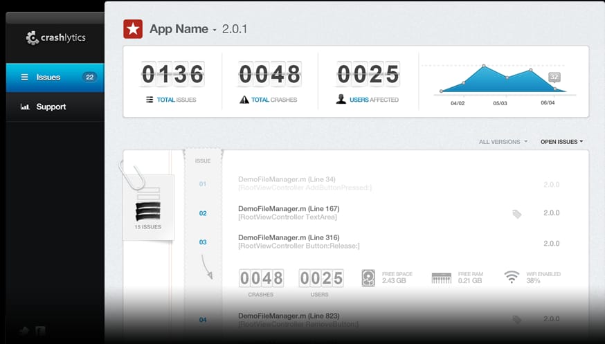
How Crashlytics tracks crashed sessions
How to go about it: This KPI can be measured with Crashlytics, a platform that considers a wide range of factors such as: device, battery status, charge in progress, proximity sensor, and Wi-Fi connection. For example: A user is in the middle of watching the last episode of a season, and suddenly the app crashes. As an entertainment app pro, ask yourself these questions: How often is this happening? How many users are experiencing this? Is the crash occurring on a certain connectivity type (e.g. Wi-Fi vs. data)?
Unresponsive Gestures
Perhaps a user is trying to interact with an app’s element that wasn’t designed to be interacted with at all (for example, a confusing image that looks like a button to tap on, but is in fact not tappable). Why is the user inclined to tap? Is this happening to more than one user? 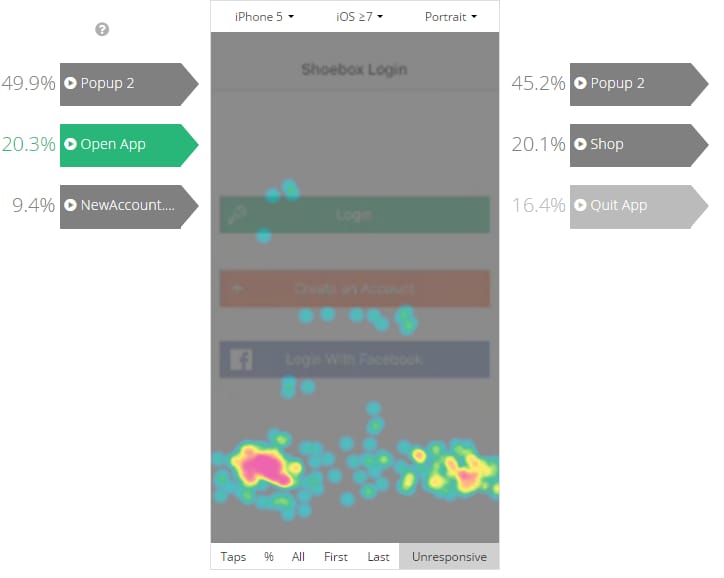
Tracking unresponsive gestures using touch heatmaps on Appsee
How to go about it: This KPI can swiftly measure the whys of these unresponsive gestures, for example, with Appsee. For example: Users are ready for their ration of daily news, and as they peruse the list of articles to read, they find one that piques their interest. They assume they can tap to open the piece, but the app was designed for the user to swipe left to open. Frustrated that they can’t open the article, they try for another, only to receive the same disappointing result. Unfortunately, this will leave a news junkie uninformed, frustrated, and probably heading to a different new source. If many users are experiencing this issue, a touch heatmap tool would display a high density of unresponsive gestures for the article browsing screen.
App Not Responding
ANR, App Not Responding, is another important metric to track. Has the app frozen on your user and there is simply no response to any gesture? You need to find out how often this is happening and how it is affecting your retention rates.
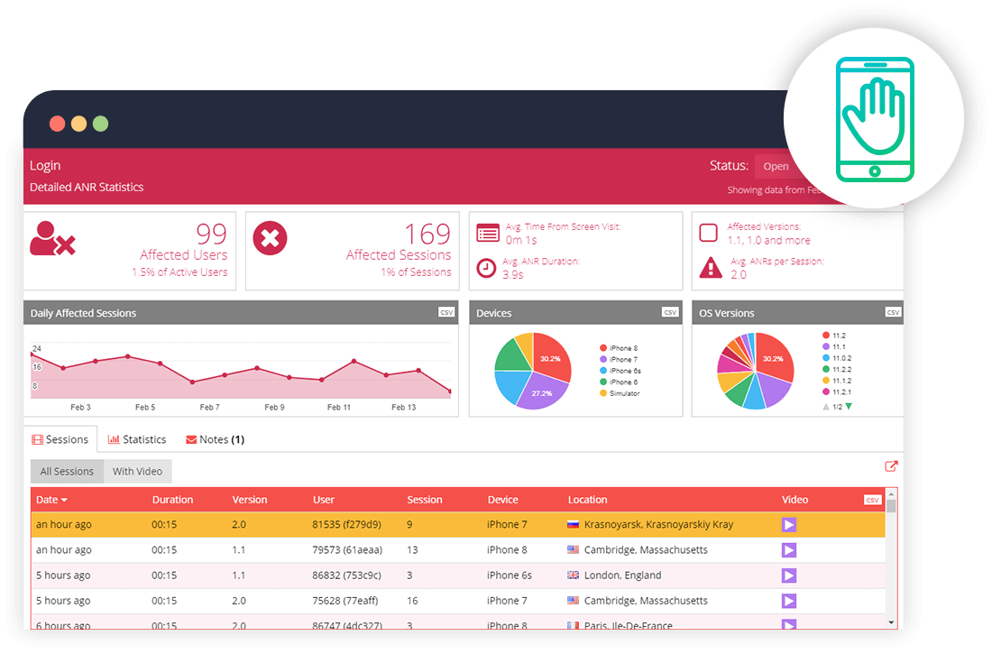
ANR statistics on Appsee's interface
How to go about it: This KPI can effortlessly be tracked through tools that have a user recording feature, so you can immediately understand what went wrong in your user’s journey. For example: In a gaming app, ANR can be a grim reality. Perhaps the user is in the middle of a game, perhaps about to beat a record, and the app stops responding. This is going to be a huge source of frustration (and possibly even anger) for the user, and if this becomes a persistent problem, it’s quite likely that the user will quit your app... for good.
Killed By User
Sometimes users kill the app because they think they’ll save battery life or even by force of habit. Other times, it’s more severe because the app is being killed off by way of frustration or confusion during the user’s journey. With this metric, you can understand where/when users are killing the app, both on an aggregate and single user level. For example: Whether the daily commute to work or a vacation itinerary, figuring out the best routes is key for efficiency. So why might a user be killing the app? It’s important to understand where it’s happening in their journey – is it in the middle of a journey, before they’ve begun, or at the end? Each of these moments could indicate major insights into your UI and UX.
Daily Active Users (DAU)
The name of this metric says it all: DAU represents the number of users who engage with your app at least once per day. This metric can help identify which days of the week are preferred by the majority of your users. Similarly, Monthly Active Users (MAU) is a metric that tracks how many people are using your app on a monthly basis and can help you identify seasonal trends where relevant. For example: Some people like to check their finances frequently. Others not so much. Nonetheless, understanding users’ needs/interests on a day-to-day basis is key. Are users engaging many of the diverse features on the app, or are they repeating the same actions over and over – checking balances, sending money, depositing checks, etc.? Do users tend to access the app more often on certain days versus others? Which features are being used the most on Monday, and why are some features being ignored on Friday?
Onboarding/Sign-Up Drop-Offs
It can be very challenging to build a smooth and successful sign-up screen, as users will often see this as a hurdle that they don’t want to leap over. What percentage of your users are dropping off during login, registration, or onboarding? Do you know why? For example: People are often seeking new fitness regimes, and any app that offers exciting features, and has a shiny and catchy sign-up UX will grab attention. Now why aren’t they completing the onboarding process? What’s stopping them from wrapping up the sign-up process?
Retention Rate
Closely monitoring your app’s retention rate is integral to providing you with insights about performance and user experience. How many users are downloading the app, using it once, and then never returning? What’s the rate of users who never return after just one action? 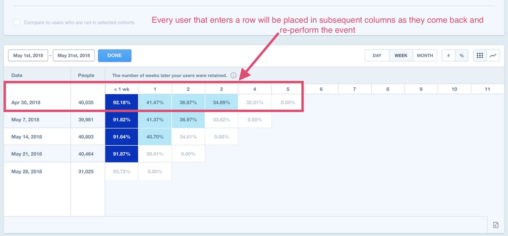
Tracking retention on Mixpanel
How to go about it: Tracking retention rates can be done through many different analytics platforms, one of them being Mixpanel, which measures retention stickiness and answers questions about how users engage with a product. For example: Users head to travel apps for easy browsing, booking, and convenient purchasing. But what if they downloaded the app, took one look around, and never returned? What happened to cause this casualty? It’s necessary to track where, when, and why they encountered issues, and hopefully understand why they didn’t return based on their user journey.
Average Time to First Action
After the initial download, roughly how long is it taking users to return and engage with your app. With tools analyzing cohorts, it’s easy to take two actions and understand how they relate to each other. For example: The idea of utilizing business apps to increase productivity is an excellent initiative, but sometimes that excitement wanes after the download and users never return. Then assuming they do return, how long is it taking them to complete their first action within the app? And if it’s taking a while, where are the trends and why could it be taking so long?
Purchase Flow CR & Drop-Offs
What percentage of users are making a purchase or completing an order? How many users are dropping off between each stage of the funnel? Moreover, which screens are they dropping off and why? 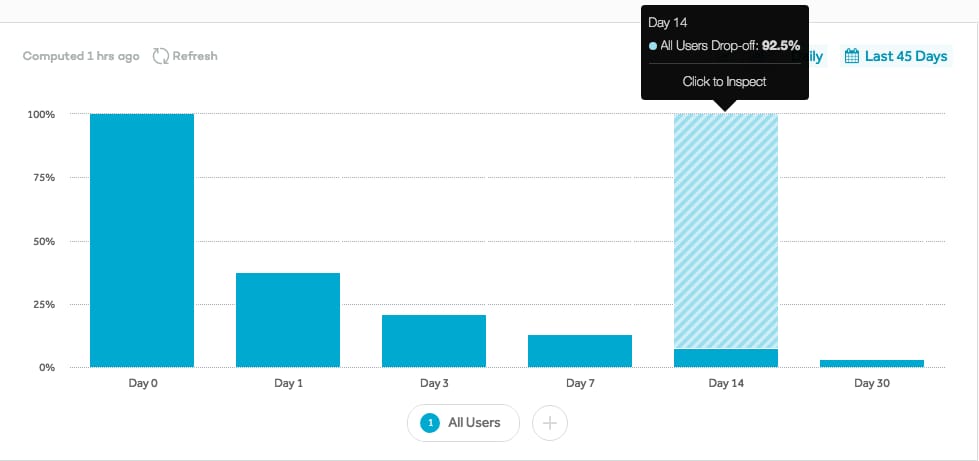
Drop-offs data on Amplitude
How to go about it: When analyzing funnels, it’s important to use the right tracking tools. Appsee and Amplitude are two top contenders in monitoring user activity through funnels and conversions. For example: Shoppers have downloaded the app, completed registration, and they’re still not making a purchase. In order to increase your bottom line (and increase retention!) it’ll be helpful to know when and why users are dropping off. Are they adding items to their cart and simply not checking out and paying? Or maybe they’ve made it all the way to the checkout, and they were unable to enter their address, got frustrated, and didn’t finish the journey. These are key elements to analyze for shopper optimization.
All This To Say…
Don’t have a shopping app, you say, and you’re wondering why you should track purchase flow? To which I’ll say that each KPI has its place and relevance based on your app’s category. The above examples are here to get your wheels turning, and explore more precisely how you can monitor and assess these metrics. There is relevance everywhere. It’s just a matter of manipulating the metrics to fit your app – and the application of qualitative analytics is the cherry on the sundae of understanding the whys.

Lesley Wasserman is an Inbound Marketing Manager at Appsee. She is an avid UX and tech trend-seeker and loves finding innovative ways to make life better! Lesley prefers vegetarian options, although occasionally has a hankering for a steak, and she's constantly on the lookout for new ways to decorate her home. You can follow her on Twitter @wassles.
Want to write an article for our blog? Read our requirements and guidelines to become a contributor.

