Advance seat reservation is one of the most popular arrangements flyers make in advance. Passengers are keen to make sure that they’ll be traveling together with their families or spend those hours in the air in comfort. The most common and convenient way to display the seat layout in a passenger aircraft is via a seating chart or a seat map.
Typically posted by airlines themselves, seat maps allow passengers to visually choose which seat would fit them better and where it’s positioned in relation to emergency exits, wings, or the toilet. Third-party services such as SeatGuru or ExpertFlyer benefit from this need by helping people locate the best seats based on even more information, such as legroom, view, or general feedback from other flyers.
Here, we want to talk about seat selection functionality: how airlines can share it with distributors and how distributors can access it from airlines.
Understanding seat inventory control and distribution
In most airlines, seat selection is an ancillary service, meaning that people can pay an extra fee on top of the base fare if they want to choose their seat. In 2020, seat reservation sales predictably soared, even more than other services. Along with such add-ons as meals, early boarding, and checked bags, ancillaries can take up to 15 percent of total revenue for the world’s largest airlines and over 50 percent for budget carriers.
So, seat selection is extremely important for passengers, airlines, and distributors such as OTAs. It does, however, pose a few challenges.
Ancillary sharing. Despite being so important for all carriers and almost a necessity for budget airlines, ancillary services can often be purchased only on airline websites. This is due to the fact that most of the flight distribution is operated by an oligopoly of middlemen -- global distribution systems or GDSs. The data exchange format they’re traditionally using has been around since the 80s and supports limited add-ons. So online travel agencies who get reservation data from GDSs can often publish only base fares, stripping carriers of extra sales. This injustice led to big transformations in travel distribution, which culminated in the creation and implementation of the NDC standard. Unfortunately, not everyone has adopted it.
Seat map customization. Seating information is typically provided by airlines in a form of code, which, of course, needs to be translated into usable charts. Using information about deck and seat dimensions, locations of facilities, and seat characteristics, online travel agencies (OTAs) must build their own charts. And considering that the same aircraft can have variations depending on the carrier, this may be a painstakingly difficult job. Let’s also mention here that not all airlines provide detailed information, so seat map accuracy will suffer. That’s why people often choose to use SeatGuru, where charts are created and updated manually.
User experience. While choosing a preferred seat shouldn’t be a difficult task, some seat map implementations make it seem so. Bulky interfaces that make you scroll down the whole length of the plane, lack of actually useful information (such as prices that appear only after you click on a seat), and distracting graphics all make this experience confusing, time-consuming, and not at all appealing.
These complications mean that retailers must go an extra mile and support seat selection functionality and airlines should find ways to share it with them. We will talk about best practices for tackling these challenges and integrating seating functionality further.
How airlines distribute seat information
All transactions between airlines and their customers are managed via a passenger service system (PSS) -- a complex software suite controlling reservations, inventory, and departure processes. Information about flight schedules, availability, passenger details, and basically everything is stored and managed from that central unit.
We’re currently experiencing a shift in flight distribution. You can read the full fascinating history of flight booking in a separate article, but today, the world's largest airlines are adopting a new, merchandising model. Its main characteristic is the unbundling of offers. Basically, passengers purchase a base fare and then personally choose what services they require. Preferred seat selection is part of the deal.
As we mentioned previously, GDSs (specifically Amadeus, Sabre, and Travelport) link most of the world’s carriers and distributors. Some airlines have come up with alternative distribution solutions and there are three sharing options.
Communication methods
EDIFACT. Proposed by the UN in pre-Internet days, EDIFACT (Electronic Data Interchange for Administration, Commerce and Transport) was a revolutionary standard for exchanging information between businesses. It’s still irreplaceable in many industries operating legacy software and has been the de facto method of communication between airlines and GDSs until recently. EDI messages are small and highly structured, which was important in the days when bandwidth costs mattered. Besides, with its own language, only a trained developer or another computer can understand it, making it costly to maintain EDI-based legacy systems.
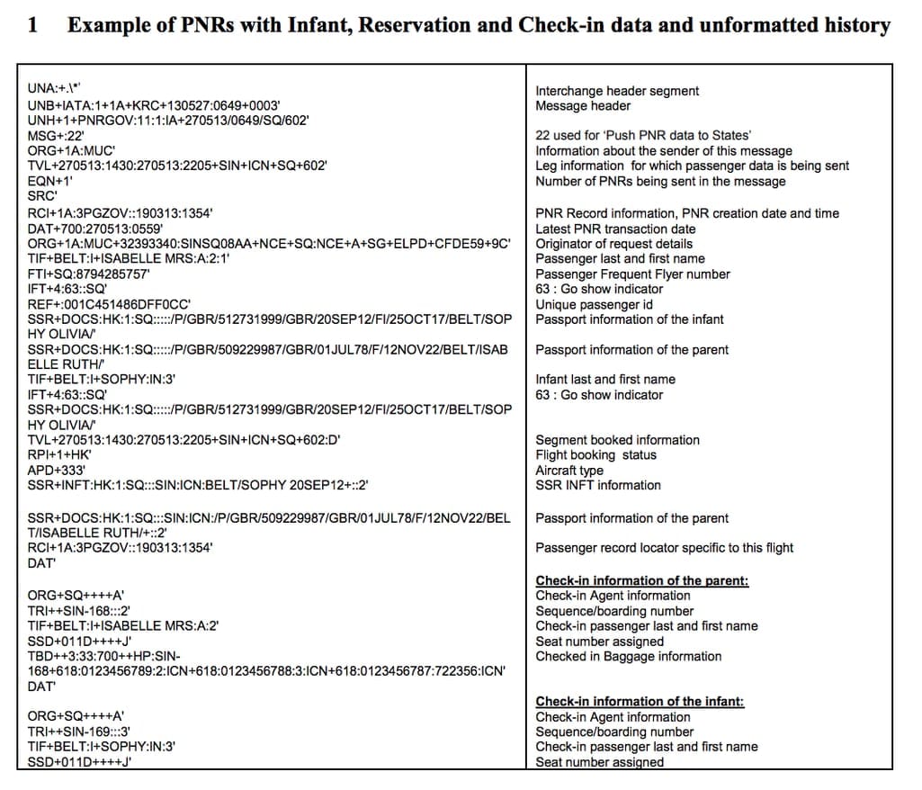
An example of an EDI message with translation. Source: IATA PADIS EDIFACT Implementation Guide
Proprietary APIs. In response to EDIFACT constraints, some airlines released independent XML APIs. XML is a relatively modern and flexible standard, widely used to exchange data between carriers and other intermediaries apart from GDSs. Some examples include:
- Lufthansa Open API returns seat maps for a chosen cabin class. Each seat has a set of characteristics indicating its location in relation to other cabin items such as lavatories and exits. Unfortunately, sometimes not all classes are available for every flight and seat rows might be missing or not displayed. Still, Lufthansa provides detailed charts of their whole fleet to allow you to create accurate seat maps.
- Singapore Airlines Seat Selection API has a feature for retrieving set maps and seat assigning after booking. Just like with Lufthansa, you send a request with flight information and class and receive seat maps that are returned with availability status and other characteristics.
Single API booking platforms. Somewhere in the middle between GDS and proprietary API access are travel booking platforms that offer a single API with access to many carriers’ seat maps and more. Here are two prominent examples.
- Duffel is a flight data aggregator that provides OTAs with booking capabilities for 74 airlines, including access to their seat map schemas. Although this becomes available for a hefty price of $1 per order, Duffel is like a more advanced and user-friendly GDS that works with most of the carriers you might wish for: KLM, Delta, American Airlines, easyJet, SAS, and many many more. Duffel returns a list of seat maps per segment and seat selection functionality is available during the order creation, not after it.
- Gordian is a similar platform, but it’s focused mostly on ancillaries like seat selection and baggage. Actually, Priceline, Kiwi, and Hopper among the others are using Gordian to access this data. To sell ancillaries to its 90 partner airlines, you can use a customizable widget or an API.
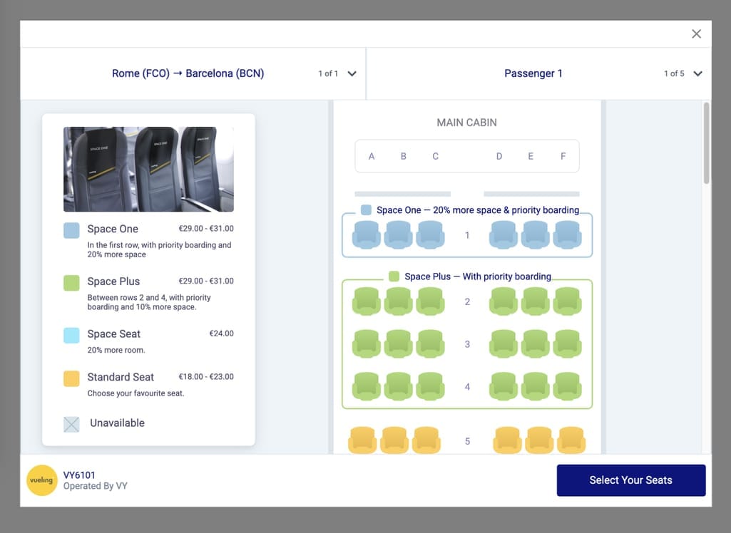
Gordian Dynamic Upsell widget. Source: Gordian
NDC APIs. The method of embracing direct APIs as an alternative to EDIFACT soon rendered itself impractical. The lack of standard connectivity and the growing web of commercial APIs urged IATA to suggest a solution. In 2015, they launched the New Distribution Capability (NDC) standard that allows airlines to adopt a separate engine outside of their legacy passenger service systems and simplifies API integration for OTAs. Currently all main GDSs -- Amadeus, Sabre, and Travelport -- support NDC-based data exchange. More specifically, these are:
- Amadeus SeatMap Display API provides information about aircraft cabin layout, in-flight amenities, seat availability, and pricing. You can retrieve this data at different stages of the flight booking process: after the booking and during it.
- Sabre Get Seats API displays flight seat maps, seat locations, facilities, information about non-chargeable seats, availability information, and pricing.
- Travelport Seats API is a part of their early adopter program and can also be requested for the existing order or before the booking is completed. It returns pricing, aircraft layout, seat availability, seat location and characteristics.
Please note that not all airlines have adopted the NDC standard and not all provide seat maps. So be sure to check with the provider the detailed list of carriers and data that can be obtained.
Data format
Every seat has several values known as characteristics, indicating whether it’s a window seat, an aisle seat, an exit row seat, etc. Universally such characteristics are coded according to the IATA Passenger and Airport Data Interchange Standards (PADIS), located at PADIS Extranet. These codes go back to the EDIFACT times, which is why there are characteristics such as Smoking/Non-smoking seats.
Here’s an example from Amadeus sample data. It says that the seat 20D is an aisle seat (A), which is also chargeable (CH) and located on the right side of the aircraft (RS).

These characteristics include, but are not limited to
- window seat and window seat without a window,
- center seat,
- aisle seat,
- seat with a bassinet,
- exit row seat,
- Economy or Business class seat,
- leg space seat,
- upper deck seat.
Now, how do you apply this information when building a custom seat map? Let’s talk about this.
Seat map customization
Travel agencies receive seat data in the form of XML code. Though it’s human readable, it’s far from beautiful, interactive seat maps customers will be using. You’ll need to turn the API response into a visual chart. Let’s discuss how it’s done.
You should fill your chart with information from the top down.
First come general configurations and layout. A seat map is inherently a grid consisting of rows and columns. For each aircraft, deck, and cabin class, you need to use specific configurations -- basically, dimensions of the grid. Depending on the API provider, look for the following data to construct a grid:
- deck dimensions -- usually provided using width and length parameters,
- location of wings and and exists -- typically described in relation to rows, for example, startWingsRow: 9,
- number of aisles to separate the grid into left, right, and middle sections
These dimensions will now allow you to display seats and amenities, which include
- Wi-Fi,
- entertainment,
- charging port,
- food and beverages.
By indicating zones where these accommodations are available, you make it easier for passengers to compare value and price.
Speaking of the latter, you continue filling your grid with seat characteristics. A common solution would be creating the filter that will allow passengers to click through available seats with chosen characteristics, such as a set with a bassinet or extra leg space.
In addition, fill the grid with locations of other cabin amenities, such as
- exit door,
- galley,
- lavatory,
- luggage storage,
- movie screen,
- table,
- stairs to upper deck, etc.
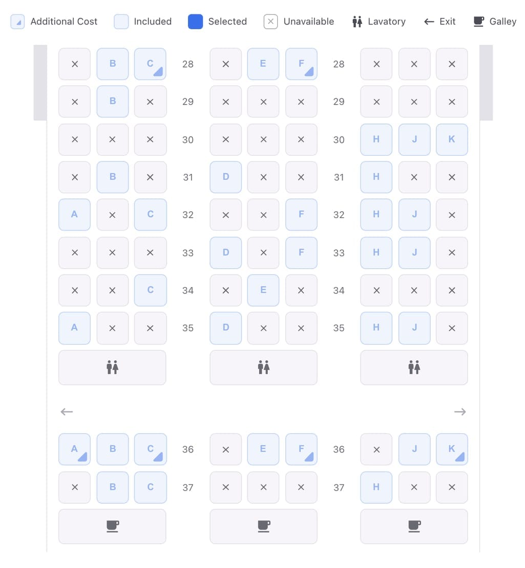
An example of a simple grid implementation. Source: Duffel
After the order is created, each seat will acquire two more characteristics -- availability and price. Our next topic -- the way you choose to display this information -- may vary.
Seat map UX best practices
Tons of people pay a monthly fee to such services as SeatGuru or ExpertFlyer to plan the best trips. So, it does matter if you provide a detailed overview of the seats and make it easy to navigate the seat map.
There are two types of customers going through the booking flow: those who pay for the preferred seat during the booking process and those who don’t. They have different motivations and concerns. The decisive ones are usually those who
- have specific preferences, such as sitting by the window or closer to the lavatory,
- travel with a group and need control over who sits where,
- travel frequently and know what to expect from the experience on a particular route.
Those who omit seat selection process have several reasons to do so.
- They hunt for the cheapest fare and don’t care about the extras.
- They travel alone and don’t care where they sit.
- They plan to be early for check-in and get good seats.
- They forget to select a seat.
While the first group needs a convenient interface that will highlight all their sought-after amenities, the second group needs to be gently reminded of the benefits. Let’s now talk about how to ensure that.
Provide visual cues. Booked, available, and picked seats as well as lower and upper decks must be colored accordingly but remember to provide icons and text as well. This example from Ryanair shows seats on sale and extra legroom seats with a convenient key on the side.
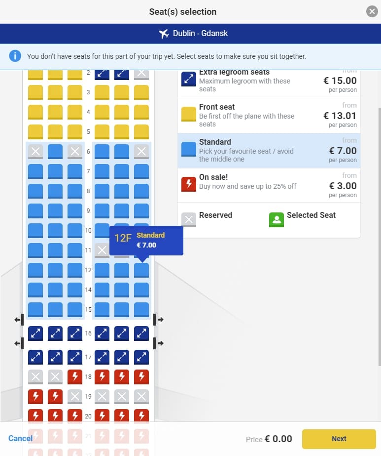
Simple and informative Ryanair seat map
Add details at hover. Engage people with detailed descriptions of both benefits and drawbacks of a particular seat. This honesty will allow them to understand the price differences and feel more inclined to try it.
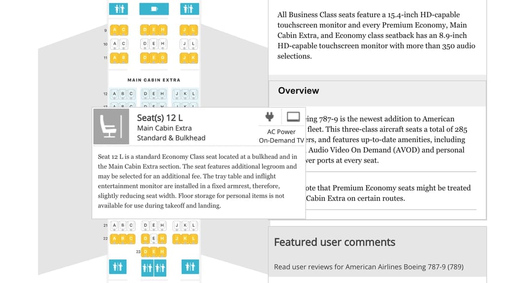
The very detailed seat maps on SeatGuru
Indicate focal elements. The seat map should contain information about the location of the washroom, wings, exit doors, minibars, power points, wheelchair accessibility bathrooms, and closets.
Stay mobile-friendly. According to different estimations, up to 60 percent of Americans booked their flights on mobile devices. While most travel platforms have already figured out the best mobile booking experience, seat maps still often fail in terms of usability. So, leave distance between seat icons to enable users to comfortably tap the needed one. And avoid really long seat maps by allowing users to first choose the section of the plane and then display it.
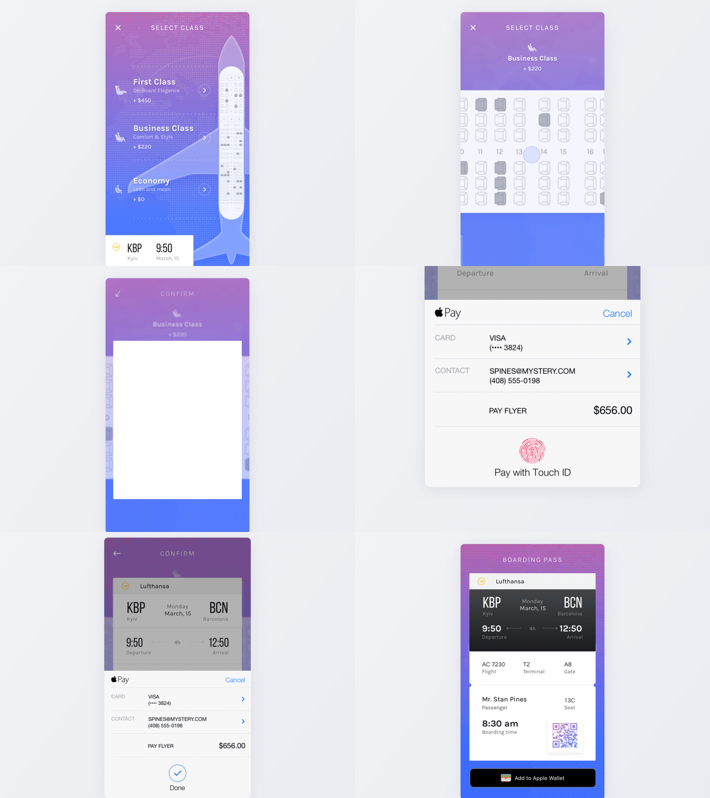
Mobile seat map example. Source: Vitaly Rubtsov
Gamify the process. A little bit of fun doesn’t hurt anyone and helps alleviate the stress of the choosing process. Animations, emojis, fun illustrations -- feel free to experiment without sacrificing simplicity and functionality.
Getting creative with seat maps
In 2019, Japan Airlines unveiled a fan favorite solution -- it marks seats occupied by babies with a special icon, allowing passengers to be aware of it when choosing their seats. An infant icon for children between 8 days and 2 years old is displayed when passengers are selecting their seats.
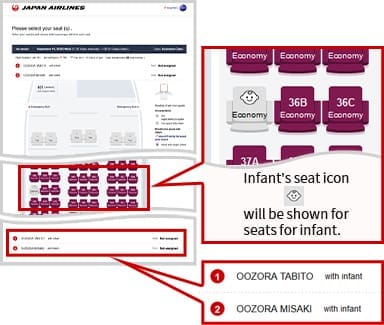
Child icons appearing on a seat map. Source: Japan Airlines
The decision was controversial to some, while celebrated by others, but it’s a fascinating example of how airlines can shape passenger experience in creative ways. But it's not perfect -- for example, seats booked via third-party websites won't appear with a child icon.
Unfortunately, today, not all airlines return seat selection details via GDSs or even directly. So if carriers want to show their customers the same experience regardless of the booking channel, we suggest they join the NDC program. And OTAs must invest in flight APIs integration to stay ahead of competition.
