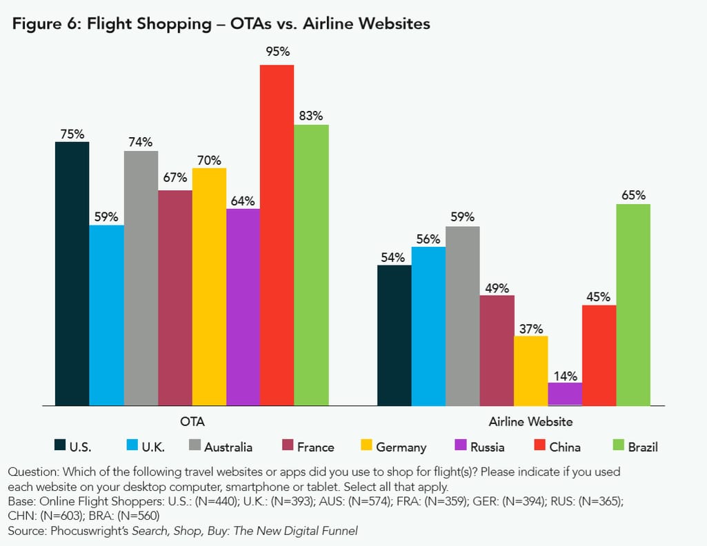
But shopping doesn’t necessarily mean buying; it may just mean browsing for prices. As we mentioned in our travel personalization breakdown, about half of all airfare searches on OTAs are price-driven, meaning that people go there to get the price perspective and pick the cheapest deal possible regardless of unforgiving seating and meal options. The same Phocuswright survey shows that 30 percent of OTA bookers prefer OTAs because they believe these websites suggest the best prices. That’s also partly true as OTAs have a wider supply availability across multiple airlines per destination, which in most cases isn’t so at supplier’s websites. Airlines don’t usually market their competitors.
Forty-seven percent of respondents claim that OTAs’ websites are easy to use, and 37 percent say that they are used to booking travel this way. To some extent, the latter also links to the user experience.
However, there are still a lot of reasons to book directly from carriers and that’s why the rates of direct bookings from airlines are generally higher than shopping.
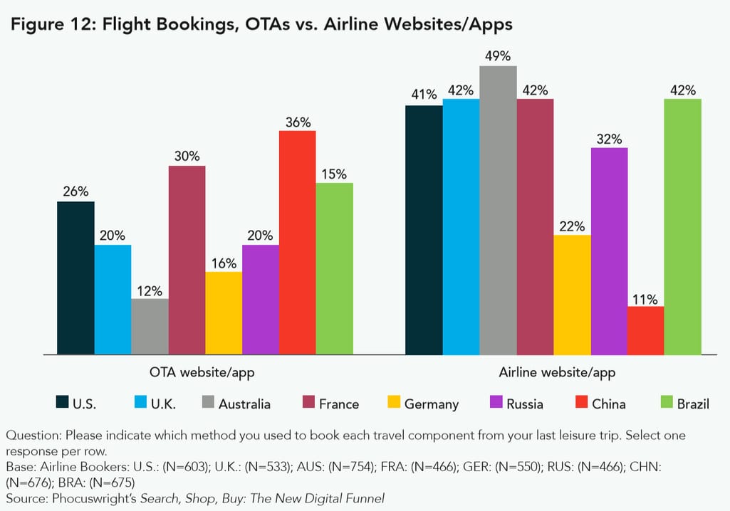
So, the behavioral pattern of many online users looks like this: They browse OTAs to find the best deals and then go directly to airlines to make a purchase. There are multiple reasons for that sort of behavior.
Price. Most of the time, you can’t really book the same flight (on the same date) by say JetBlue cheaper at an OTA than from JetBlue directly. The price belief is a matter of choice perspective that OTAs suggest. Don’t forget to include a transaction fee that’ll slip into the OTA’s pocket.
Membership programs. Mileage and various loyalty programs are the main reasons why people buy directly. Interestingly, millennials are more inclined to shop at OTAs than the older generations, thus 20-45 agers value ease of use higher than loyalty discounts.
Real-time visibility. Some airfare APIs used by OTAs return cached info. If you use flex search to get visibility on multiple dates and compare prices, a number of deals may no longer be available and you end up buying more expensive tickets.
Better seating. Generally, OTAs suggest seating options on aircrafts. But in many cases, this functionality isn’t guaranteed for all carriers.
Better disruption handling. In the event of a delay or any other disruption, OTAs must either negotiate recovery with an airline or let travelers deal with the problem themselves by contacting an airline directly.
Still one of the main stumbling blocks for users is a stressful interaction experience with airline websites compared to that of OTAs. It defines their shopping preferences.
Luckily, things have gotten better lately.
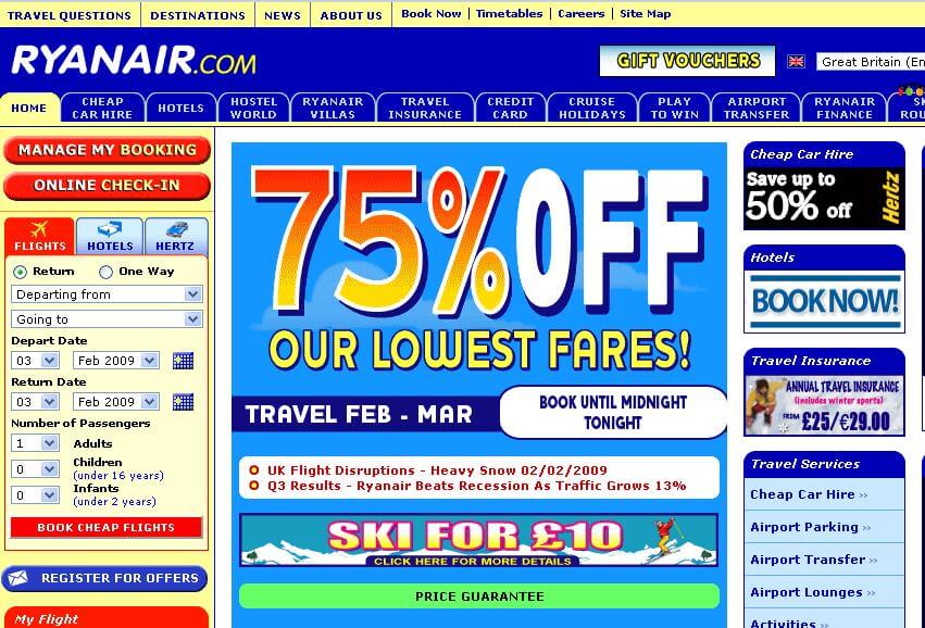
Apparently, travel web-surfing could have been a painful experience in 2009
Almost 10 have years passed and travelers still may find online booking from suppliers stressful and outright confusing. This time we’ll talk about the main UX drawbacks of airline websites that can and should be fixed.There may be many criteria and vantage points from which you can assess website interaction. And the experience of a business traveler and a budget tourist may be drastically different. That’s why we’ll focus on a casual, price-oriented leisure booking experience, and cover the following aspects of airline websites:
Localization
Dates and flex search
Check out: sign in, baggage, and seating
Mobile experience
Accessibility
1. Localization
We advocated automatic language and currency selection in our article about driving direct bookings to hotels. About 70 percent of all bookers prefer making purchases in their native languages. The same applies to airlines, as travelers would like to land on a website translated into their native tongue that uses the corresponding currency. However, this doesn’t always happen.Geolocation
The best-case scenario is automatic geolocation and language localization applying as soon as you enter a website. But there’s a problem with that. Even though some airlines request geolocation right after you land on the front page, this info is used to pre-type a departure location but doesn’t necessarily lead to a local version of a website. For instance, this behavior exists at Wizz Air, a Hungarian low-cost carrier.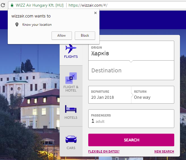
Wizz Air knows the search location but doesn’t automatically change the website language
Wizz Air does have a local (Ukrainian in our case) version, but it’s only available if you change the version manually by finding your country at the right top corner menu. Some airlines just refuse to geolocate users adding an additional level of complexity and asking travelers to define their departure location by themselves. Such examples are KLM and Czech Airlines.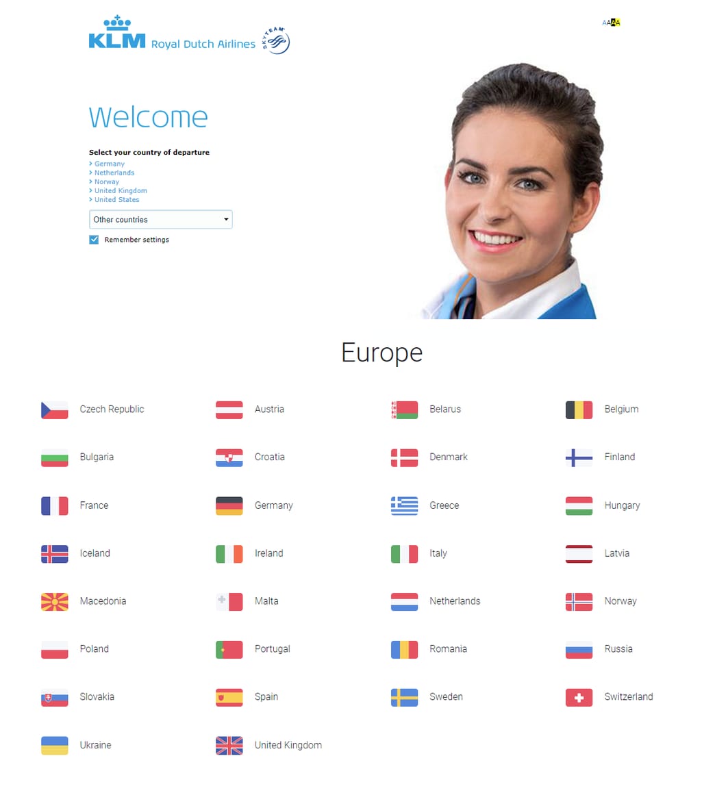
KLM (top), Czech Airlines (bottom)
You can’t go on before you specify your point of departure
Once a user has chosen a departure country, both services allow visitors to choose a language. This approach is understandable. A user isn’t necessarily native to a location from which he or she lands on a website, resulting in the need to specify. However, in most cases, people are booking flights from their native destinations and are likely to speak the local languages.Lufthansa, the largest German carrier, automatically detects your location and adjusts website language to it. So, a user can immediately jump to booking if satisfied with the language choice.
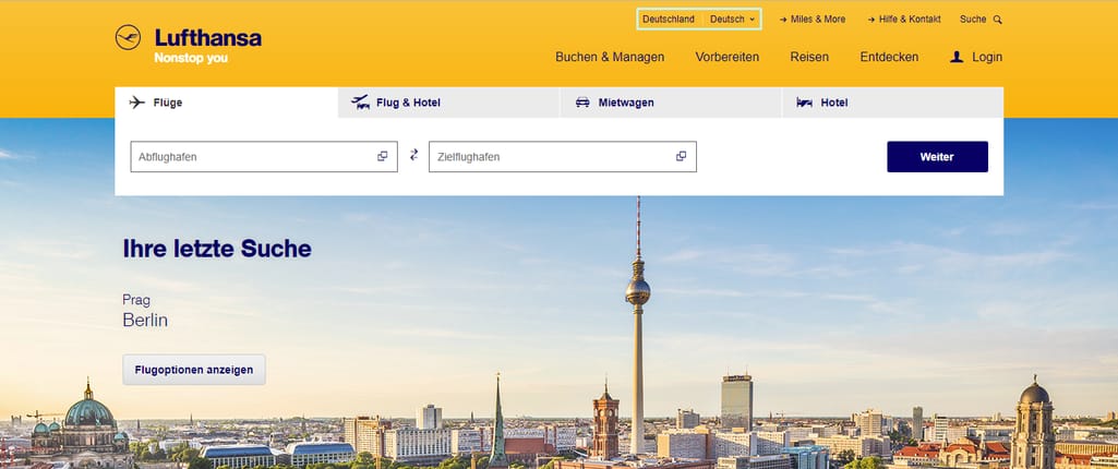
The language choice is easy to find at Lufthansa. So, even if a traveler isn’t local, they won’t experience the difficulties of switching languages
Best practice:- Make automated localization
- Allow users to change the language and location, if needed
- The language info can be selected based on the IP-address or the language of a user system. The latter would be even more precise to always match localization with the user's native language.
Currency selection
We aren’t going to talk about airfare policies that different airlines have and savvy travelers tend to exploit. The fare dependencies between a booking location, currency conversion fees, and website version deserve a separate article. Here, we’ll only approach this problem from the UX point of view.The premise is simple: Users want to see the fares in their relatable local currencies. Prices displayed in a local currency are merely convenient, especially if travelers do their initial exploration. Showing the prices in local currencies is a hallmark of most OTAs, including Booking.com and Airbnb.
Currently, airline websites can be divided into two main categories:
Showing fares in the origin currency. Regardless of what version of a website you use, you see fares in a currency used in a departure country. Examples: Lufthansa, KLM, Czech Airlines.
In most cases, this works perfectly. However, users who don’t purchase roundtrips - their population is continuously growing - may do extra work with currency conversion. Another group of travelers who may experience inconvenience are those who do multi-city trips and purchase from multiple airlines to cut their travel costs.
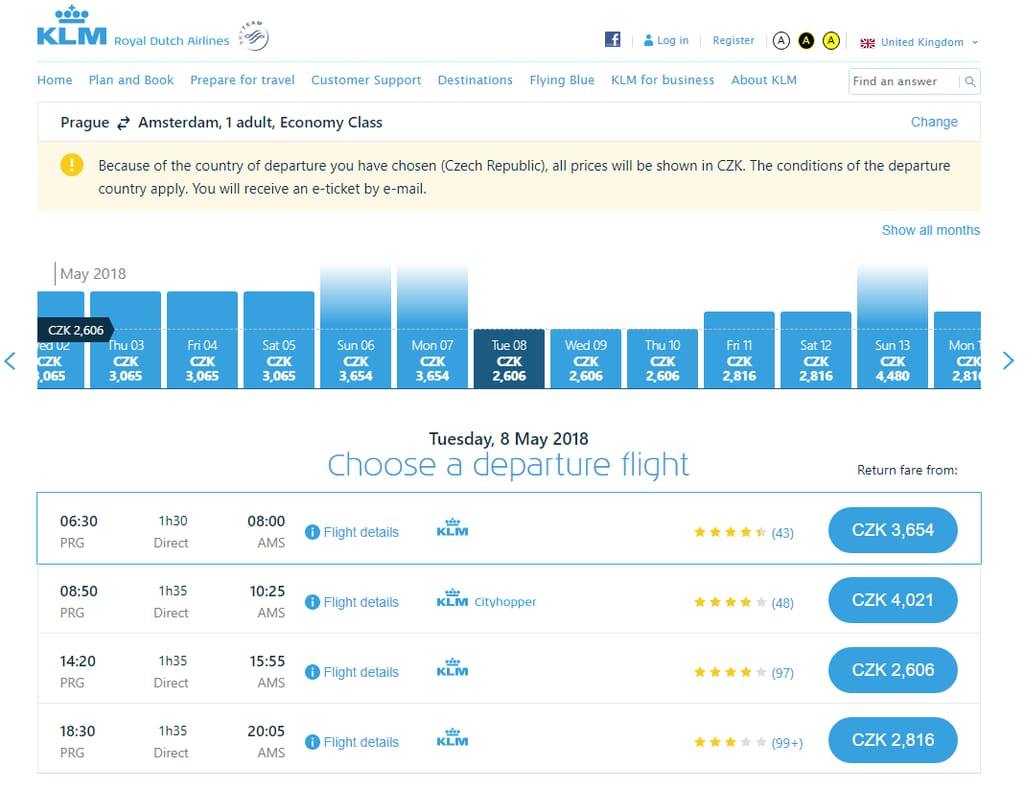
Regardless of a chosen local website version - the UK in this case - users must convert prices from Czech koruna to pounds or euros
Converting fares into the local currency. This method is pretty straightforward: Users see the currency relevant to their booking location and website version. Examples: LOT, Norwegian Air Shuttle, Icelandair.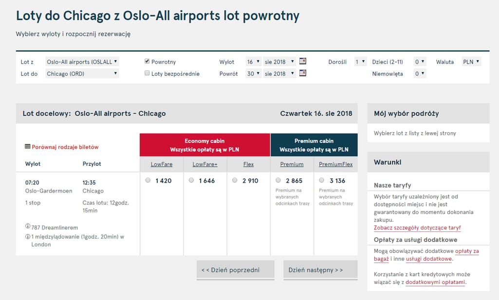
The Norwegian Air Shuttle fare for the trip from Oslo to Chicago is shown in Polish zlotys when you use the Polish localization
This method is more consistent and user-friendly. However, it’s also nowhere near to what OTAs suggest. For instance, Booking.com shows prices in native currencies by default but also allows users to switch to any currency at any time.Somewhat close to that principle is Lufthansa, as they provide a currency converter feature. Users have to deal with a separate browser window and choose a convert-to currency. The access to the feature is only available after a user has configured a flight and is ready to proceed to the checkout. Basically, the role of initial price exploration is lost.
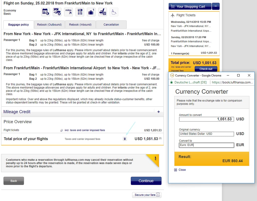
The blue arrow points to a tiny button that opens a converter. If this is the way it's going to be done, it’s better not to be done at all
Another contender that was so close to the ideal currency experience is Emirates Airline. Although Emirates uses the origin-based currency approach by default, it also provides a human-friendly interface to switch the currency on the go.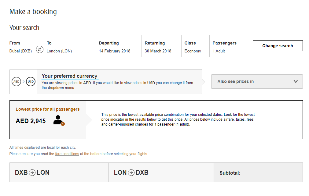
At this point, you may expect that this magical dropdown menu will make things much simpler for you
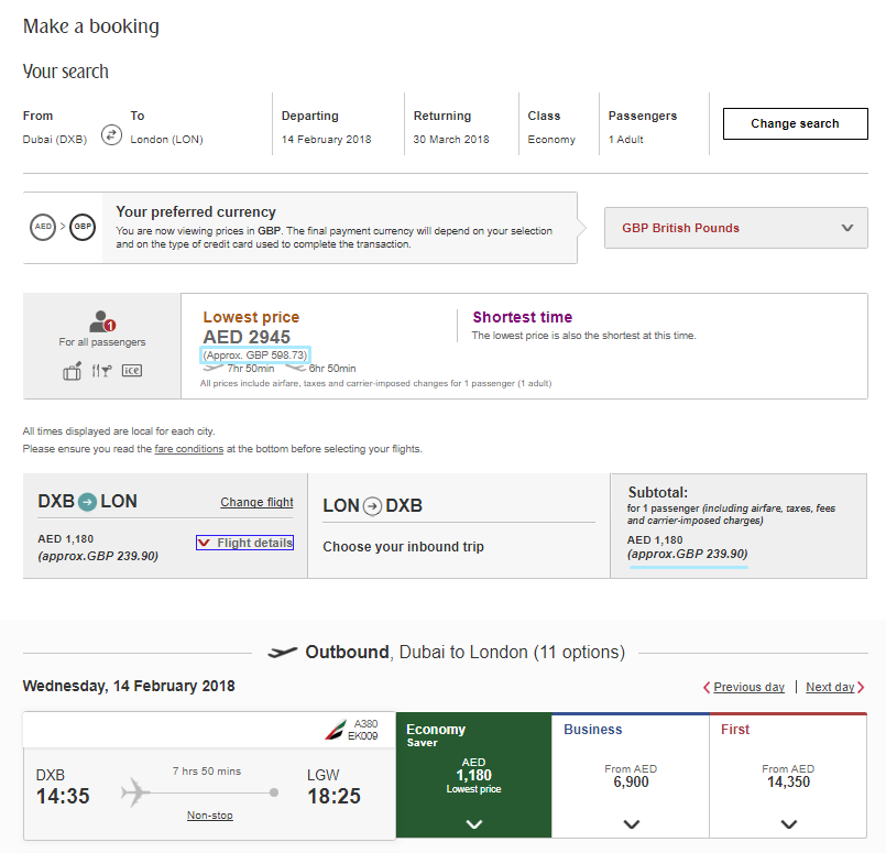
But, no. Do you see the little Approx. lines? That’s the extent of how helpful this feature is. On the other hand, Emirates hints yet another time that the final price may be different
Best practice:- Show fares in the currency relevant to a booking location
- Allow for switching between them
2. Dates and flex search
Another feature that is done in various but mostly confusing ways at airline websites is a date picker. Usually, there’s no problem with precise dates. Airlines tend to show two-month calendars, which are minimalistic enough and allow travelers to easily pick cross-month flights.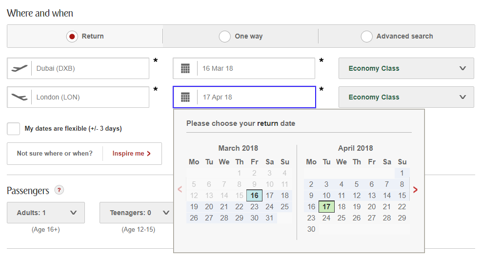
Emirates has a traditional roundtrip date picker common to most airlines
But the problems begin with flex search. Flex search is a feature that allows travelers to tinker with their flight dates to find better pricing. If you are a leisure traveler and you plan a trip several months in advance, there’s no big deal in pushing vacation dates a couple of days earlier or later to find the best airfare. As fares depend on various time-series factors (days of week, holidays, tourism seasons, destination temperature, etc.) there might be a great swing in pricing.However, much is left to be desired.
Frankly, flex search isn’t a simple feature to implement in terms of UX. Designers have to maintain a user flow, keep flexible search minimalistic, and avoid baffling users. Unlike a conventional date picker that looks mostly the same across airline websites, flex search is rather dissimilar. Let’s have a look at different types available and discuss their pros and cons.
Slider flex search
Some airlines don’t have an explicit flex search feature. Instead, they put a slider on the flights feed page that users see once they’ve specified destinations and dates. A slider captures a few dates and calls it a day. Examples: Icelandair, KLM, Ryanair.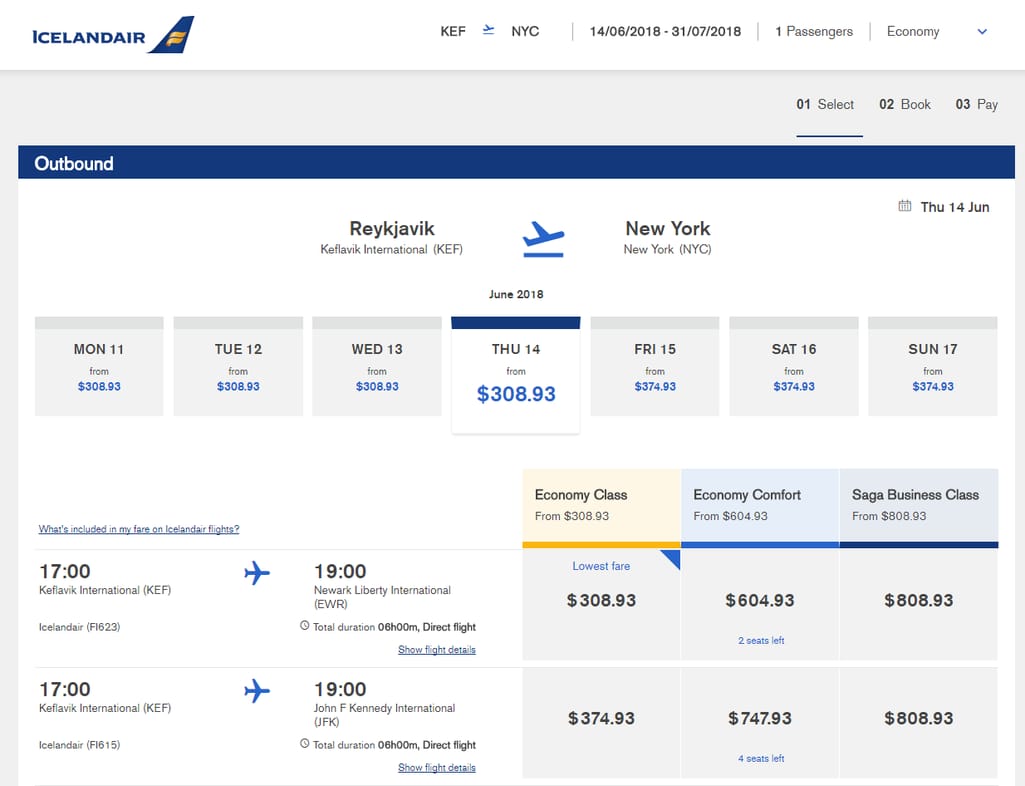
Sliders usually capture from 5 to 7 days, while the rest of the page allows travelers to assess flights available on a date certain for this destination
A slider is space-effective. So much for the benefits of this option. It simply doesn’t provide enough perspective to find the lowest fare.Calendars
A popular option for flex search is making calendars. They come in many flavors. United has a clear, minimalistic matrix flex search, but can you understand how it works from your first glance?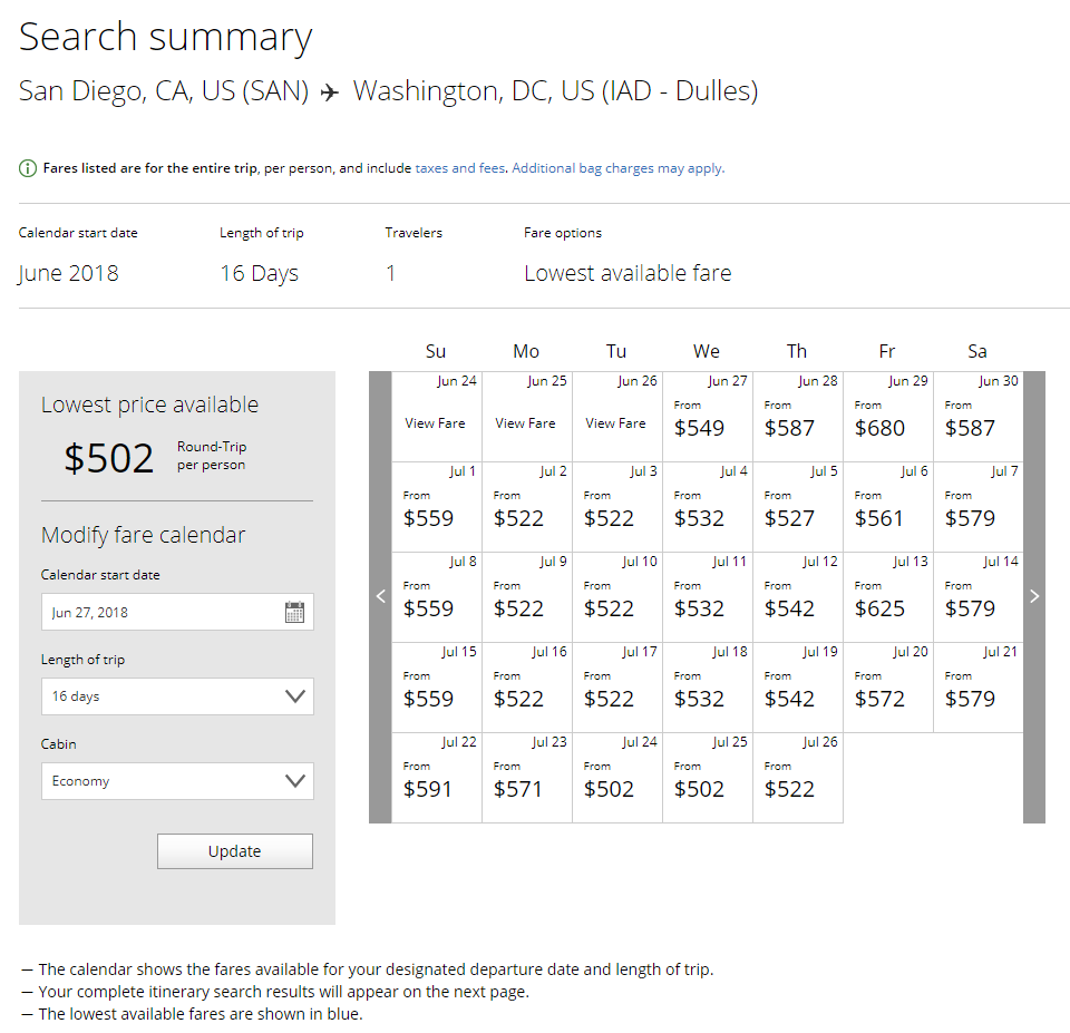
You aren’t looking at a black and white monitor from the 80s. United refrains from using colors where colors could be very useful
For some reason, United doesn’t highlight the lowest and the highest fares on the calendar and you have to glance over all columns and rows to find which date has the lowest price. If you’ve paid attention, there’s a line at the bottom claiming: The lowest available fares are shown in blue. Well, after ten or so tries with different dates, we weren’t able to find any signs of blue.Another confusing thing is the length of a trip. First, you must figure out that the calendar shows the departure dates. Then you’ve got to count down the number of stay dates to see when you are going to return.
But the biggest problem is that you can’t extend or shrink the length of stay depending on the lowest fares for departure and return because you already see the final roundtrip price. What if a user is fully satisfied with a departure fare but is ready to stay a couple of days longer to get back for the lower cost?
Delta uses a fairly tricky way to handle this problem introducing a departure and arrival axis. You’ll need some time to figure things out. Other examples: Travelocity, one of the largest OTAs, Cathay Airlines, Air Astana.
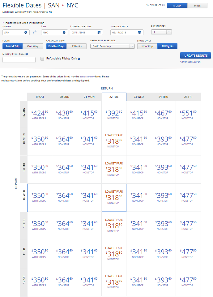
It’s good and functional, but it takes some training to get used to
EasyJet has also introduced an unusual flex search, but there are problems with actually launching it. First of all, there are no indications on the flight booking widget that flex search even exists. But as soon as you click on dates, the calendar menu slides from the right, and you may notice - but probably will not - there’s a switch to the lowest fares calendar. But there’s another block.Can you understand what’s wrong and why EasyJet can't show us the flex search calendar?
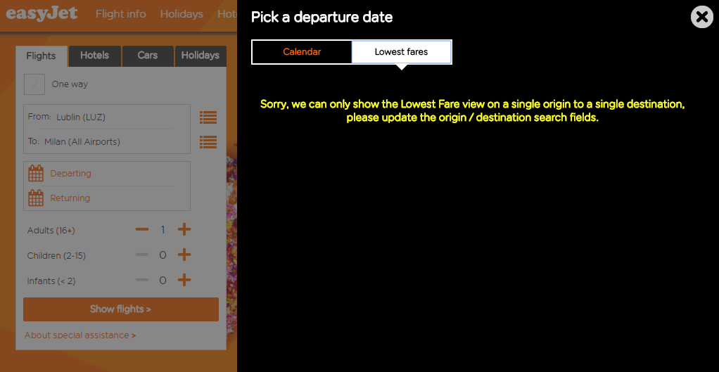
Did you get it?
It took several tries to realize that a single origin and a single destination - that this yellow message talks about - mean specific airports. If a city has multiple airports, you have to pick one to reach flex search. The reason we couldn't launch it is because we’ve set Milan (All Airports) as our destination. But once you’ve solved this little riddle, you can actually use a pretty functional but somewhat bulky calendar.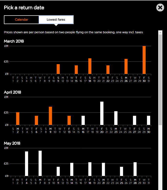
It’s stylish at least. Unfortunately, there’s no way to tell the exact prices for some dates, because the column chart doesn’t highlight them. Then it strangely jumps from 9 pounds to 25 pounds and then suddenly to 91 pounds!
If there was an award for the best flex search feature, it would definitely go to Norwegian Air Shuttle. First, it’s not picky about you choosing all airports. Second, you can launch it with predefined dates from the booking widget and these dates will be already highlighted, while you can tweak them a little bit to find a perfect time-price match. Or you can even leave the date fields empty and surf through a whole calendar to find what you need.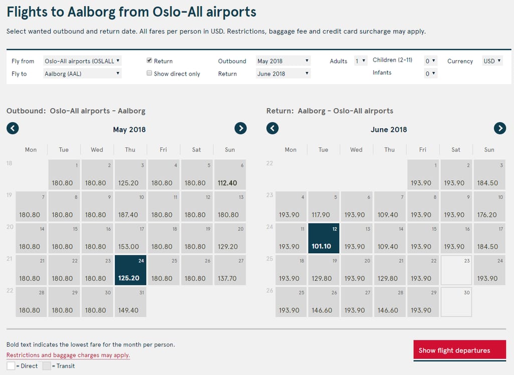
You can see two whole months with prices for departure and return, the lowest fares are marked bold, and it’s certainly compact enough
When you see it, the tool looks very simple, but there’s definitely a lot work behind this smooth experience. Maybe, the overall roundtrip price would make this feature even more useful, but it’s already close to perfect.The only flex search feature that we found even more useful than this one was introduced by a metasearch engine, Skyscanner. It looks similar to that of Norwegian Air but also provides more detailed color coding by prices. On top of that, Skyscanner uses an additional column chart calendar and allows travelers to choose the cheapest month of the whole year.
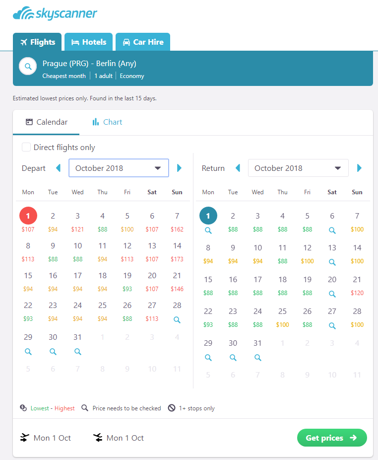
The only drawback of this flex search comes from technical limitations. OTAs and metasearch engines can’t display prices for the dates that users haven’t searched before
Best practice:- Provide calendar flex search
- Use the month-long price perspective both for outbound and return flights.
3. Check out: sign-in, baggage, and seating
The last stage, which can actually be divided into multiple sub-stages, is perhaps the most stressful one. Travelers have to type in all personal information correctly and complete a purchase, leaving meaningful sums of money to an airline. So, it’s better be smooth and simple.Sign-in
The check-out procedure is challenging by itself, so website sign-in should be optional and never get in the way of booking. Certainly, if you already have an account, this allows a website to autocomplete some forms and streamline your booking. But there may be many reasons to avoid doing that. A trick that some airlines abuse is breaking the booking flow and requesting sign-in at some unexpected point. This introduces a lot of frustration as you are already concentrating on the task and now you have to do some extra work.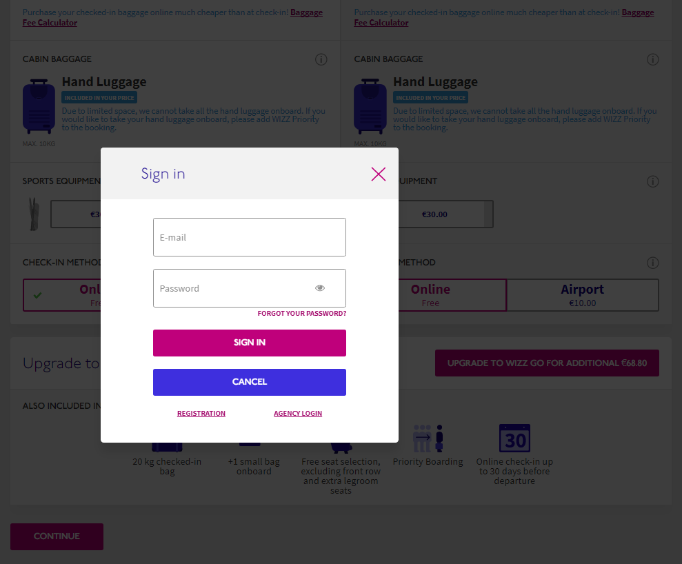
Once you’ve configured dates, baggage, and additional equipment, Wizz Air hits you in the face with this pop-up
Another low-cost carrier, EasyJet, follows this evil process heightening booking tension.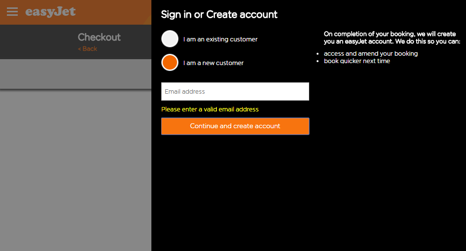
There are always problems associated with this black curtain sliding from the right at EasyJet
But luckily, most airlines allow travelers to check out without the sign-in experience. Some just mention that there’s an option but cease to explain what the benefits are.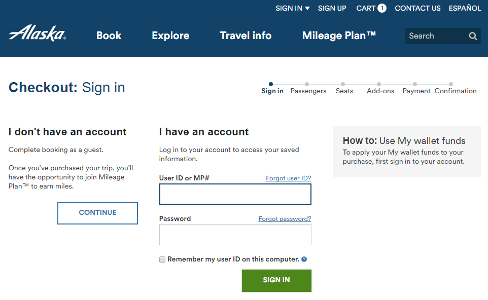
Alaska Airlines fails to communicate why you should have an account
Some gently remind travelers about additional conveniences.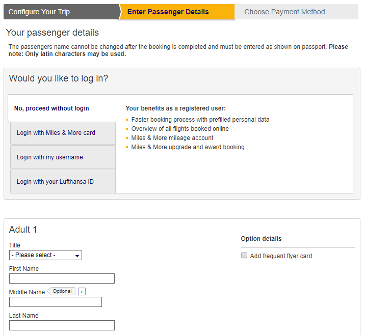
Log in at Lufthansa isn’t intrusive or aggressive, instead it makes you think twice before booking without an account
Best practice:- Allow for guest booking
- Provide clear reasons why sign-in is beneficial
Baggage
Baggage registration is another important booking step. While we haven’t seen an outright bad experience, there are always options that are better than the others. We encourage higher flexibility with baggage registration that allows travelers to pick the lowest fares but still be able to add additional baggage during the booking process.However, a common practice is to introduce baggage registration within choosing the ticket package process. This approach seems convenient as it removes an additional booking step. Examples: Ukrainian International Airlines, Lufthansa, United Airlines.
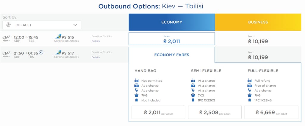
A semi-flexible package at Ukrainian International Airlines (UIA) includes a single 23 Kg bag, but what if a traveler needs to customize and add a couple of bags?
If a traveler needs more, Ukrainian International Airlines allows for using two separate features to add baggage. Once you’ve completed a purchase, the interface will ask to book extra baggage space, meals, and pick seating. That’s a questionable design choice as it doesn’t allow travelers to estimate the final price prior to spending the money.But if a traveler can’t decide that extra baggage is needed at this point, he or she will be challenged with a little quest to find the baggage interface on the main booking widget and then register the baggage separately. This, on the other hand, appears to be very convenient for those who can’t decide on their final load before all their stuff is packed.
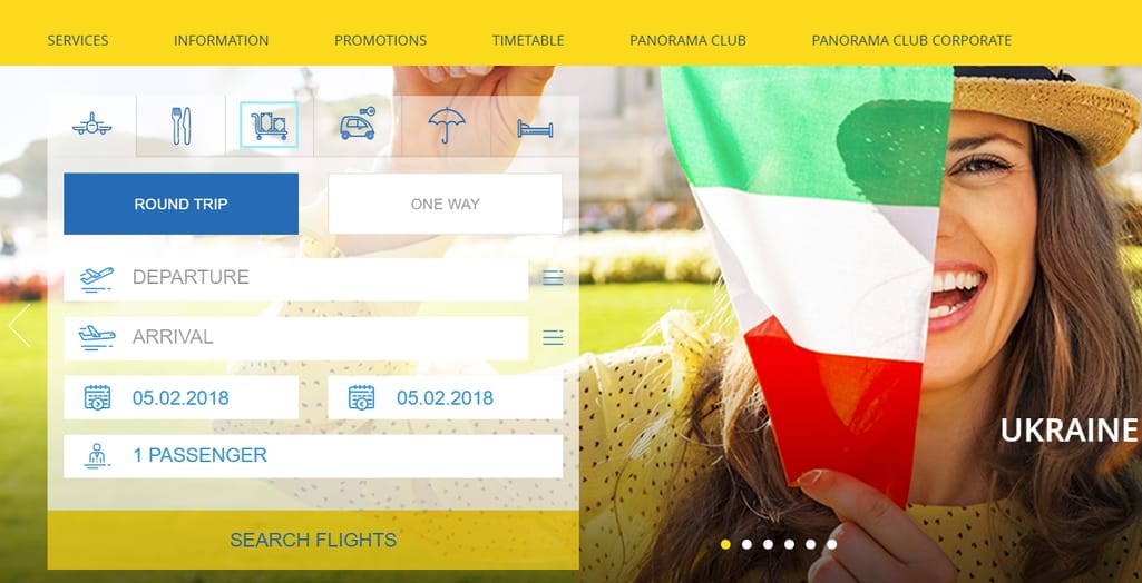
At UIA you can customize your baggage after the purchase by clicking at the baggage tab at the main booking widget
United Airlines is another example of this approach that unlike UIA doesn’t allow for additional baggage for the lowest fares unless you upgrade a ticket. And this limitation is served up in an aggressive and intimidating way to immediately present a remedy for extra 50 bucks per person.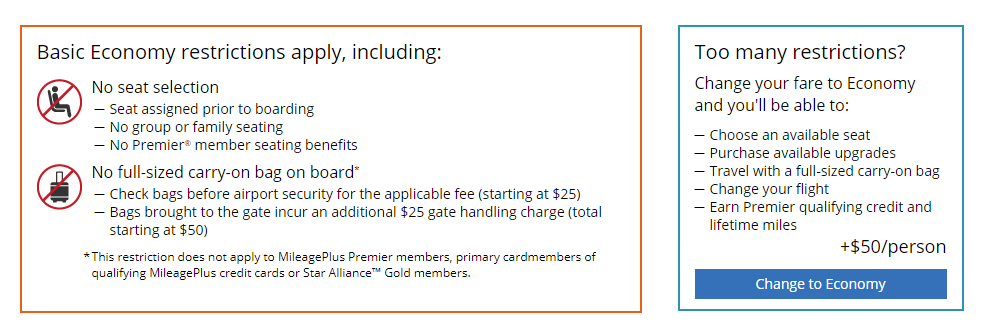
It looks like United Airlines won’t even let a passenger on board for this price, let alone take a bag
Actually, we had to google “United Airlines baggage” to find the flight package rules and allowances. For some reason, you can’t understand how much weight and what kind of baggage is permitted during booking.However, there are enough representatives of the second group, where travelers can configure their baggage at the booking stage and add additional bags to their heart’s content. Examples: KLM, LOT, Wizz Air.
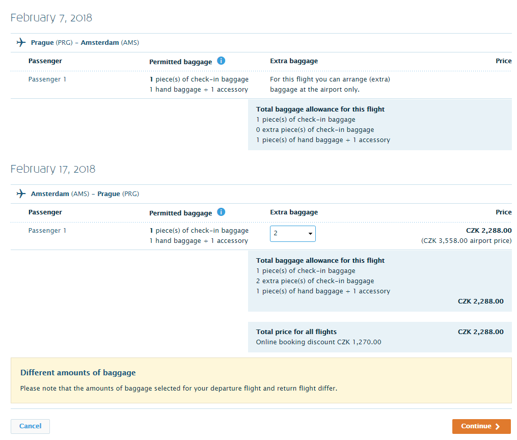
KLM distributes tickets by some other airlines, so, adding extra baggage is available for KLM flights only
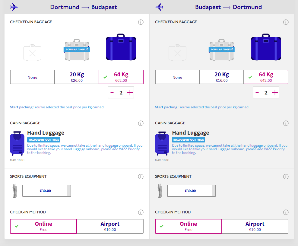
Wizz Air provides a straightforward and pleasing baggage customization experience
Best practice: Allow users to customize their baggage options separately from the chosen ticket packageSeating
Choosing priority seats is another important step in ticket booking. Generally, there are many options for choosing seats. Usually, travelers pick seats during flight check-in, either online or in the airport lobby. In this case, we wanted to explore seat selection that can occur before flight check-in during the initial flight booking.The airlines can be divided into two main groups using this parameter: those who allow for seating selection before you make a purchase and those who don’t. The examples of the latter group are Emirates and Icelandair. As you’ve guessed, we consider the best alternative is to make seating options available before payment. This allows travelers to estimate the final cost of their flight if they are picky about seating preferences. Some prefer flying next to a window; some need extra leg room.
There’s nothing extremely challenging in implementing decent seating selection functionality:
- Highlight specific seating zones and special seats
- Show which seats are already taken
- Define prices
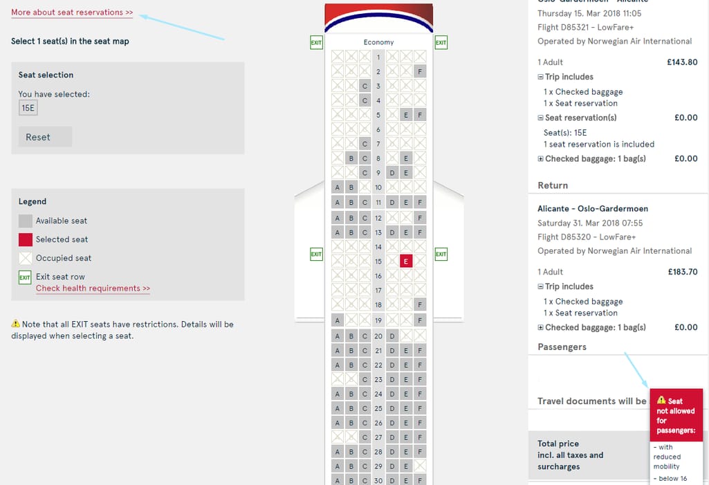
It seems there’s also a bug as the seat information tag appears somewhere in the corner of the screen
A number of airlines we checked had bulky seat selection interfaces but contained fairly limited amounts of useful info. The Turkish Airlines' seat selection feature consumes much screen space but remains rather uninformative.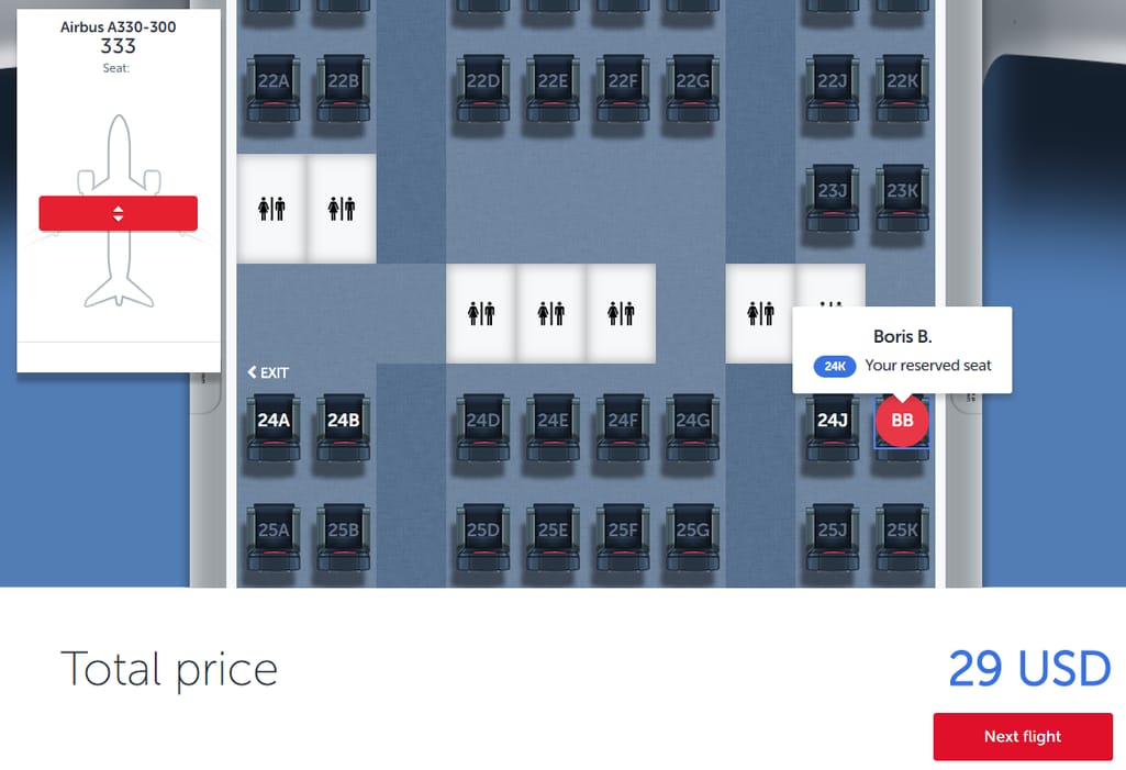
Turkish Airlines has an airplane minimap with a sliding handle to move along the aircraft (yes, it's big), but for some reason, seating doesn’t have zoning and special seats marked. Instead, you’re left to enjoy the graphics: Just look at how detailed those seats are!
Virgin Airlines also consumes much space but it provides all details about seating options and makes booking entertaining. Have a look at the seats taken by other passengers.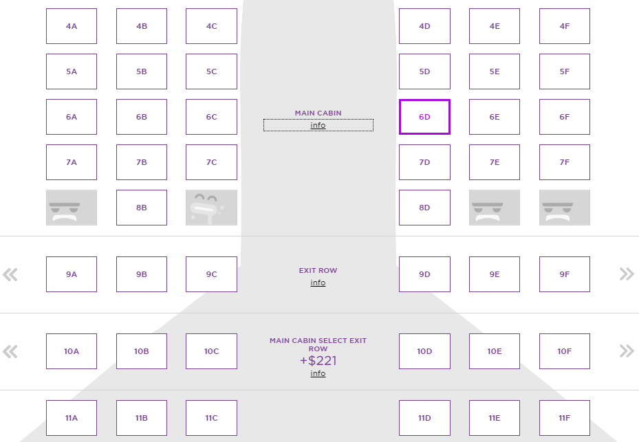
Every section has an info button which leads to vibrant photos of the aircraft interior
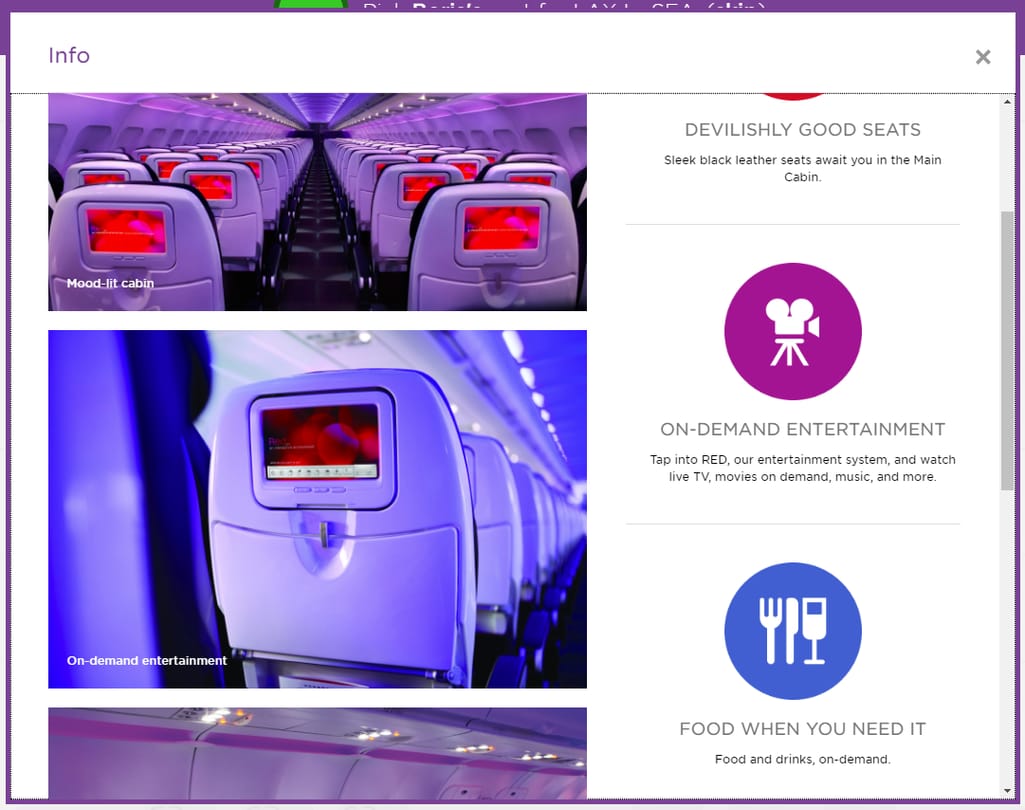
Virgin strives to make booking anything but a stressful and serious task
Virgin is perhaps the only airline that makes the booking experience amusing. Even if you aren’t planning to fly Virgin soon, try going through their steps just for fun. However, the example of the most informative and thus efficient seating selection comes from Ryanair.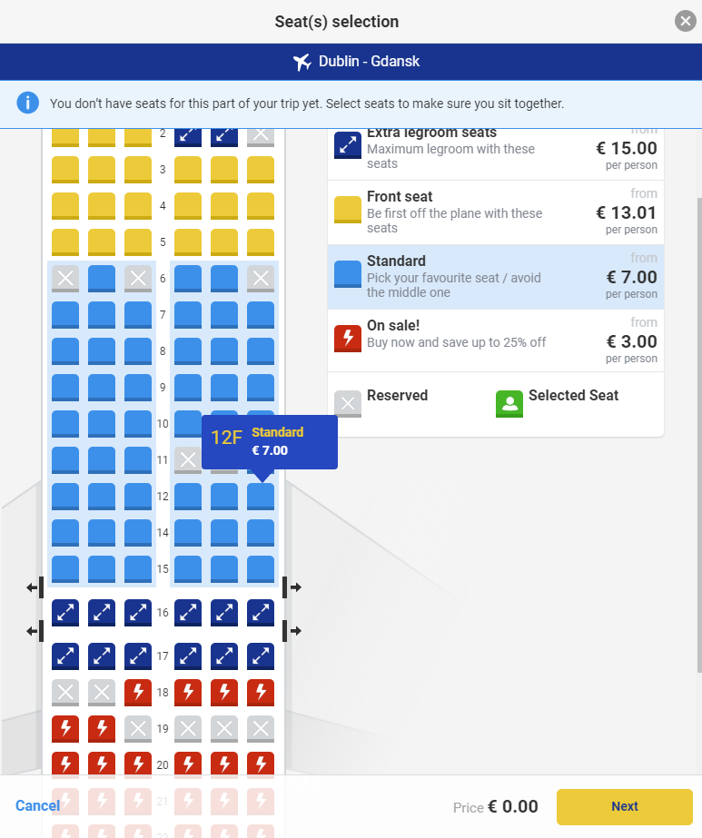
It’s compact and extremely informative
Unlike Turkish Airlines that consumes so much space without making reasonable use of it, and unlike Virgin with its amusing minimalism, Ryanair is the example of how to make a perfect informative interface. Zones can be clearly distinguished, benefits of each option are outlined in a concise copy, the prices are marked at three different spots, so a traveler won’t miss this information.Best practice:
- Make seating selection compact and informative
- Clearly show prices, zoning, and extra legroom seats
4. Mobile experience
Mobile shopping and booking are pain points for most suppliers in the travel market. Both airlines and hotels trail behind OTAs in mobile.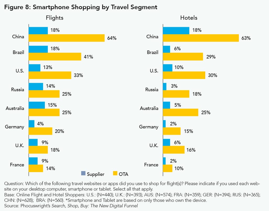
OTAs are better at mobile because they 1) aggregate a broad variety of offers, and 2) can leverage mobile applications better. Airlines do create apps but can only expect sporadic use of them, as most travelers won’t bother installing multiple apps from different suppliers. For this reason, the first choice for airlines should be making sure that their websites are responsive on mobile while providing the same functionality available on a desktop. Mobile applications, on the other hand, should support users in their after-purchase activities, like online check-in and mileage programs.
United, for instance, hasn’t even engaged in the mobile web race and insists on their app being downloaded. Otherwise, if you’re a mobile booker, this path won’t be easy.
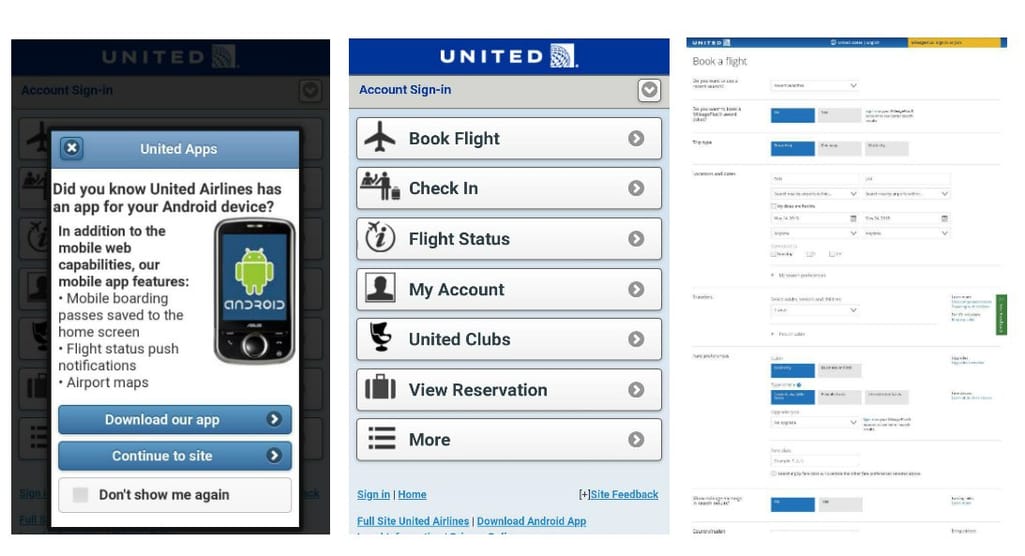
A short path to failed mobile booking: 1) Be warned that you shouldn't be here, 2) Be brave enough to click on this ‘book flight’ button from the 2008 web, 3) End up on a hardcore-level booking page
Interestingly, the desktop workflow at United is much simpler. The third screen that you end up on with mobile is actually an advanced search page that for some reason opens on mobile once you try booking a flight.
But not all airlines refuse to provide mobile booking experience. For instance, Delta does have a mobile version, which looks actually even more modern than their desktop website, but it lacks a flex search feature that we mentioned above. Similarly, mobile has limited capacities at EasyJet and for flex search, you still have to visit a desktop version.
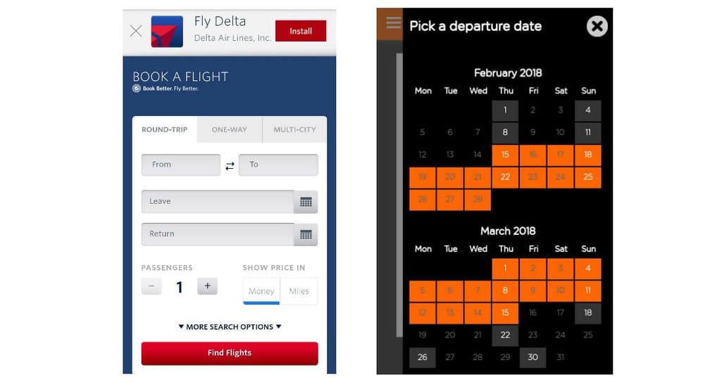
Delta asks us to install their app and EasyJet doesn’t have a switch to the low fare calendar as on the desktop version
However, those who had decent flex search on desktop mostly also have good experience on mobile. These are for instance Norwegian Air Shuttle, Virgin America, Wizz Air, and Cathay Pacific.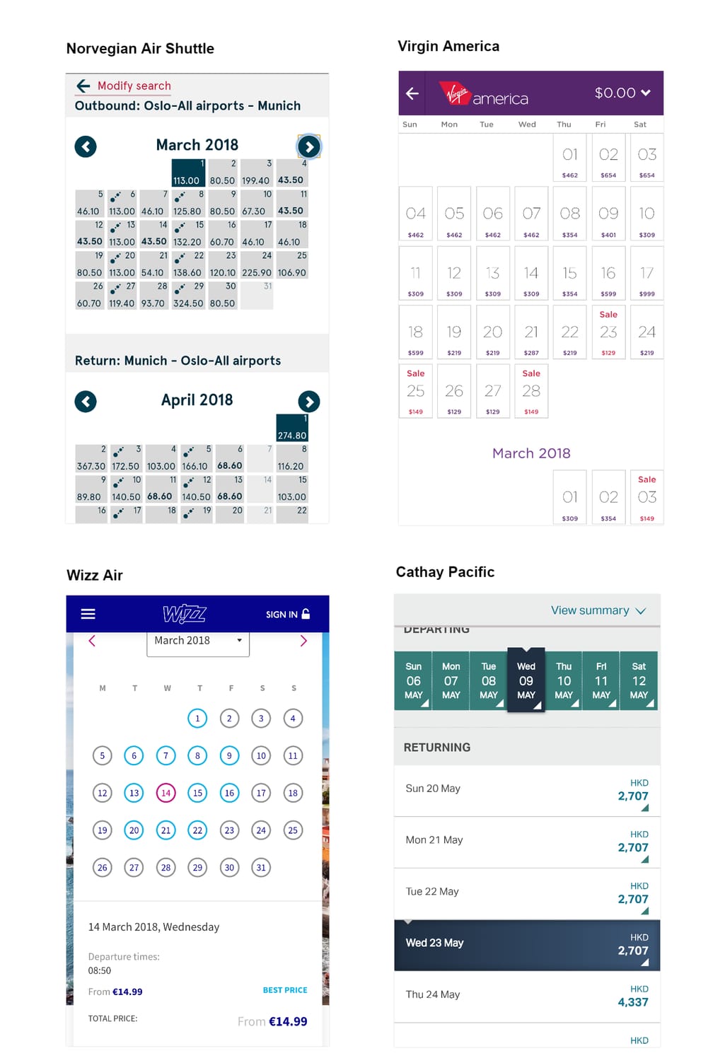
Those airline websites who had decent desktop experience keep their results in mobile
Best practice:- Don’t force users to install an app
- Provide holistic mobile experience.
5. Accessibility
We’ve already covered the main accessibility UX aspects in a dedicated article. This time, we’ll use the method suggested by Smashing Magazine in a similar airline UX research conducted back in 2015. A simple way to assess accessibility is to verify how friendly websites are to keyboard-only users. These may be people with eyesight impairments or motor disabilities. We’ve measured how many <tab> taps it takes to set a departure location, a destination, and dates. This simple approach allows for assuming the following issues with accessibility.The most important parameters are a total number of <tab> clicks and the presence of accessibility modes along with navigation support (e.g. contrasted frames around selected elements and additional menus and navigation buttons that appear once you press <tab>).
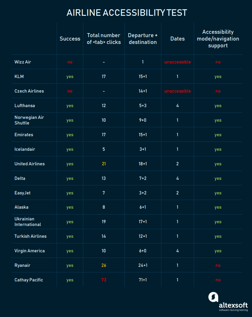
In a departure and destination clicks column, the first number represents how many taps it takes to reach a departure location interface, the second number shows how many additional clicks are required to set a departure, the dates column represents how many clicks it takes after setting departure and destination to start setting dates
Most airlines that we’ve checked have passed the accessibility test. Actually, most of them even have additional navigation support:- ‘Skip to main content/booking’ buttons
- Contrasted frames around selected elements
- Accessibility tips and additional navigation elements
However, there also were really poor results. Although we’ve managed to set destinations and dates at Cathay Pacific, it took 71 clicks to reach the flight origin field. For some reason, keyboard users have to first click through the entire news section. Fully unsuccessful results were at low-cost carriers Wizz Air and Czech Airlines. For some reason, we couldn’t manipulate their calendars using the keyboard.
Best practice:
- Run the accessibility mode after the first <tab> click
- Provide tips and use recommendations on how to use it
- Make the flight search and check-in buttons reachable within 20 <tab> clicks
Final thoughts and takeaways
Although we’ve heaped a lot of criticism on airlines in this research, their UX is far from disastrous. Both traditional and low-cost carriers make tangible investments in their websites to drive travelers there. Airlines have already outnumbered OTAs in terms of direct bookings, but they still lack user experience friendliness to make them the main sources of low-fare flight browsing and shopping. So, let’s discuss the main takeaways from this research.Make consistent localization. One of the first impressions that you get on an OTA website is flexible and full localization. Travelers visit the websites translated into their native tongue and see prices in the currencies they can relate to. Even top airlines have drawbacks either in language localization or in currency conversion. For instance, Lufthansa generally provides decent user experience but still fails at showcasing prices at local currencies.
Provide cost perspective. A cost perspective can be achieved in two ways: showing all flights per destination and dates for all carriers and providing a flex search feature. OTAs are doing both. Airlines, on the other hand, have difficulties with either of these techniques. Sometimes, airlines can display the flights of their partners (KLM, Turkish Airlines, Virgin America) but this goes only so much. Flexible search is available for everyone, and yet even the largest players don’t leverage this tool to the full extent. British Airways, Icelandair, Lufthansa, and many others show +/-3 days per each given date, but this is not enough. Our favorite example of flex search, Norwegian Air Shuttle, shows the full calendar with prices allowing travelers to pick the best price-time match.
Enable full partnership purchases. To reach a broader price and flights perspective, some airlines display both their own flights and those of their partners. Unfortunately, it isn’t always done well. For instance, KLM allows booking partner flights through their interface but won’t allow travelers to customize extra baggage. This is more a back-end issue than pure UX. An even more annoying situation may transpire with Virgin America. The carrier belongs to Alaska Air Group and fully displays flights of both Virgin and Alaska. A user choosing an Alaska flight will inevitably be relocated to the Alaska website to complete a purchase.
Ensure maximum price transparency with minimal user effort. In most cases, travelers that don’t fit into standard ticket packages (e.g. 23 kg bag, 7 kg hand luggage, change date with penalty) will have a hard time understanding how much they must pay to add sports equipment or extra bags. We embrace the full transparency that allows travelers to assess all their spends prior to paying for their tickets.
Don’t make website sign-in mandatory but communicate why it may be beneficial. Mandatory registration on the modern Internet should remain in the realm of some social media. In the rest of the cases, most user actions on websites should be available without registration. Intrusive sign-in popups break user flow and are annoying.
Embrace mobile. The mobile experience is still difficult in terms of flight booking. All registration and booking procedures require a lot of space and smart placement of elements. However, the airlines that shine in desktop UX are generally successful in mobile. According to our subset of explored airlines, the main mistake is still mobile performance.
Embrace accessibility. Unlike the results of the Smashing Magazine research that was published in 2015, the state of 2018 airline websites UX looks much brighter. Only two out of 16 airlines that we checked for accessibility completely failed (as they had unaccessible calendar widgets). In most cases, accessibility measures end in providing contrasted frames around clickable elements and ensuring that users can reach the main content within 20 <tab> clicks. But some carriers like Lufthansa and Virgin went the extra mile to accommodate people with special needs providing additional navigation and support.
Work on copy and presentation. Booking tickets isn’t a form of amusement by any means. At least, that’s what we used to think. Virgin America is perhaps the only airline that almost turns booking into entertainment. And that’s not a gimmick or a brand voice decision only. By making booking entertaining, Virgin relieves stress that most people experience while spending a ton of money with filling many of important forms with a lot of personal information. We talked in depth about UX copywriting in an article about UX design trends for 2018. Making the interaction with airlines friendly and human presents a ripe opportunity to combat OTA dominance.
