Have you seen a video series on YouTube called Gourmet Makes? There professional chef Claire Saffitz tries to replicate popular snacks operating just by the taste and look of the product. So far, Claire has successfully baked gourmet Oreos, Twinkies, and even Cheetos. Go have a look, it’s really fascinating.
When she takes out a baking sheet full of cookies and compares them to original Oreos, one question pops up in your head: How does she do this? How does she manage to operate without a recipe? How is she to clone the crunchiness, the color intensity, and the familiar design on top?
We can argue that a very similar process materializes when a web designer operates without a style book. They, of course, can look up the ingredients by using special software to identify the exact color palette or font used on the website. But it is expected that all these activities slow down and frustrate a newly employed designer who starts creating a new web page.
A style guide is a document gathering all elements of your brand’s visual style. As Susan Robertson from the popular design blog A List Apart notes, a style guide is a “one-stop place for the entire team—from product owners and producers to designers and developers—to reference when discussing site changes and iterations.”
Generally, the style guide is useful for the following functions:
Consistency. A unified visual experience is one of the main qualities of brand identity that help you create a trustful relationship with your audience.
Shared vocabulary. When all your team members have one document they can refer to, the work really becomes collaborative.
Onboarding. New designers can be involved in making design decisions from the very first day and don’t have to constantly bug older employees.
Code standardization. UI style guides help create consistent HTML, CSS, and JavaScript code so front-end developers can follow the same standards designers do.
Important: Don’t confuse a style guide with a brand guide. A brand style, AKA brand guidelines, is a document listing correct usage of a brand’s logos, icons, names, and sometimes even sounds. Most companies post their brand styles for marketing and PR purposes.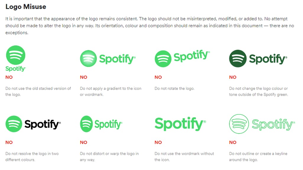
Brands often illustrate both correct and incorrect use of branding materials Source: Spotify branding guidelines
While this document can also be used by internal designers, it’s almost no help in creating actual interfaces. In this article, we’ll give recommendations on writing a style guide that designers will find helpful and enjoy using.
What to include in a digital style guide
Grid system
Let’s start with one of the most important and yet underrepresented web design elements - grids. Just like a photographer would often apply the rule of thirds to create a balanced shot composition, UI designers use lines, columns, and margins to create the backbone of a web page. Every web page designing process starts with a grid. So, setting a grid policy will ensure that all pages have the same proportions and component alignment.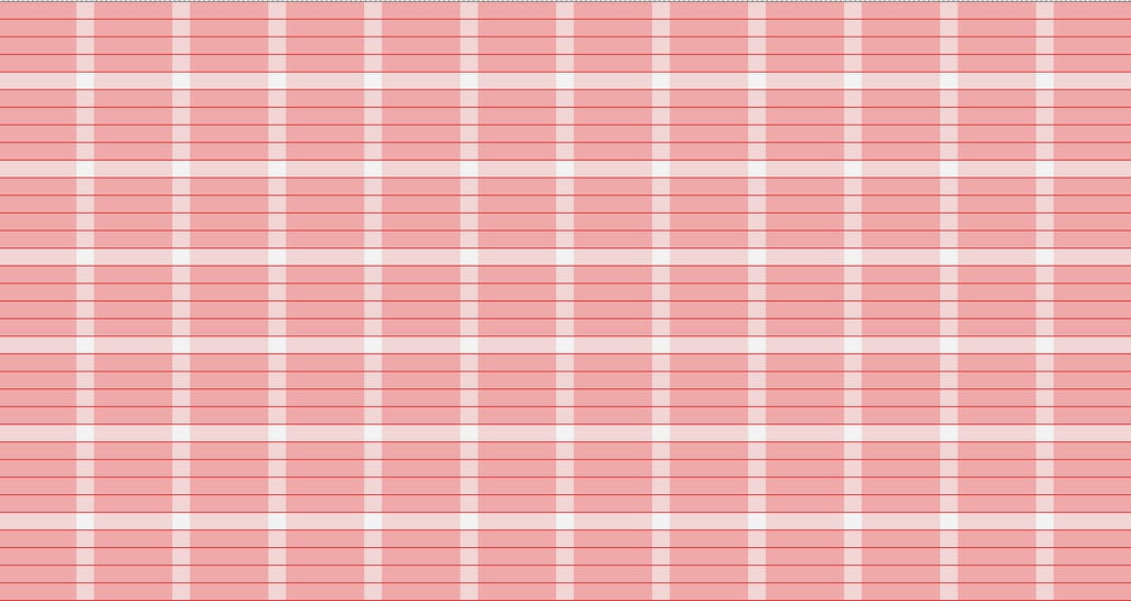
A simple 12-unit grid generated by ModularGrid.org
A basic grid system consists of:
Units. Building blocks of a grid. Search for thick pink vertical lines on the image above.
Gutter. Whitespace that separates units. These are thin white vertical lines.
Column or container. Blocks of interface comprised of several units and gutters.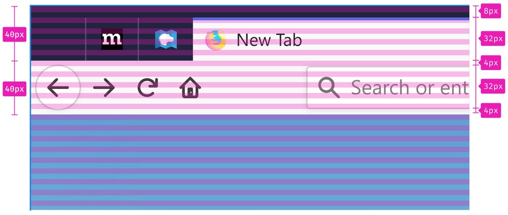
Grid guidelines by Mozilla
Your style guide’s information about the grid system would look something like this:
12 units with 50px width, 18px gutter, 900px total width
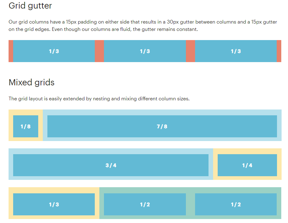
Grid layout specifications from MailChimp’s style guide
Hopefully, your grid is already responsive, meaning that it changes depending on the screen size. Mobile interfaces have different layouts and you need to clearly indicate and standardize them so designers and web developers work on different screens seamlessly.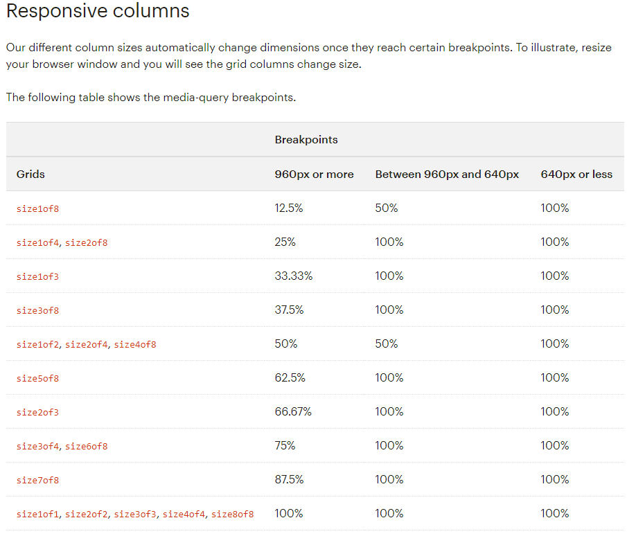
Mailchimp gives clear instructions on how grid columns should change sizes depending on the browser screen
Layout
There are not many types of layouts found on the web. Typical web pages consist of such elements as header, footer, sidebar, and the main area. They are built using a grid, and the width, height, and purpose of each section are determined by you.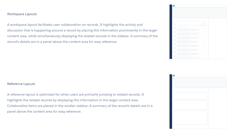
Layout guidelines from Salesforce style guide
What kind of information about a page layout to include in a style guide?
- Size of each layout element for every type of screen
- A use case for each layout you have
- Minimum width of the main area for best readability
- What layout blocks can be omitted for the mobile interface
- Element behavior during scrolling
Color palette
In their case study for creating a style guide, FamilySearch’s designer Steven Lambert shared a picture of all the colors they’ve been using on the website before the audit. Notice how many unnecessary hues of grey there are.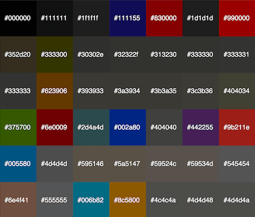
Source: SmashingMagazine
Now, look at your web interface. What do you see? Perhaps, you need some time to click through many pages, take screenshots, and document patterns, but soon you may end up with your own cacophony of colors - a palette that honestly doesn’t make sense. Unless your website has been designed recently, it’s probably overgrown with inconsistencies.
We won’t be telling you how to come up with a new palette - there’s a section about it in our article on creating effective landing pages. Instead, here are a few tips about color organization in a style guide:
- Provide color instructions in different codes: Hex, RGB, CMYK
- Specify different levels of opacity for each color
- Don’t forget about background colors
- Include text and link colors with clear use cases for each hue (e.g. light blue for links, burgundy for alerts)
- Separately create a grey palette so that you don’t end up with different shades of grey
Typography
Your product’s typography is one of the most important yet unnoticed features that represent your brand. Main typography characteristics you want to include in a style guide are font, hierarchy, size, weight, line height, letter-spacing, color. By ignoring these specs, you encourage designers to follow their intuition or spend extra time trying to replicate past designs. This is what essentially leads to typographic inconsistencies.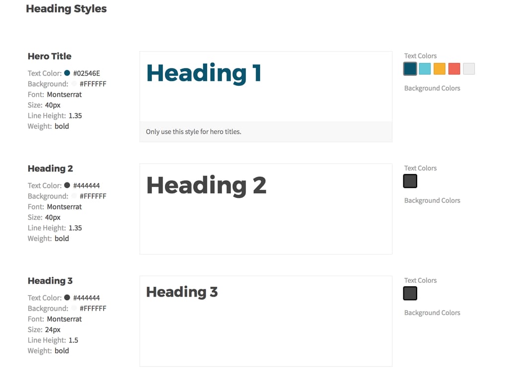
Frontify gives direct guidelines to different headings including text color, font, size, weight, and line height
Here are some recommendations that will make your typography guide useful and pleasing:
- Provide links to download fonts directly from the guide
- Specify the use of bold and italics
- Explain in what context each typeface should be used. For instance, red and bold text style indicates system errors or alerts
- Provide a fallback font if your main font is custom
- Provide similar font choices for different operating systems
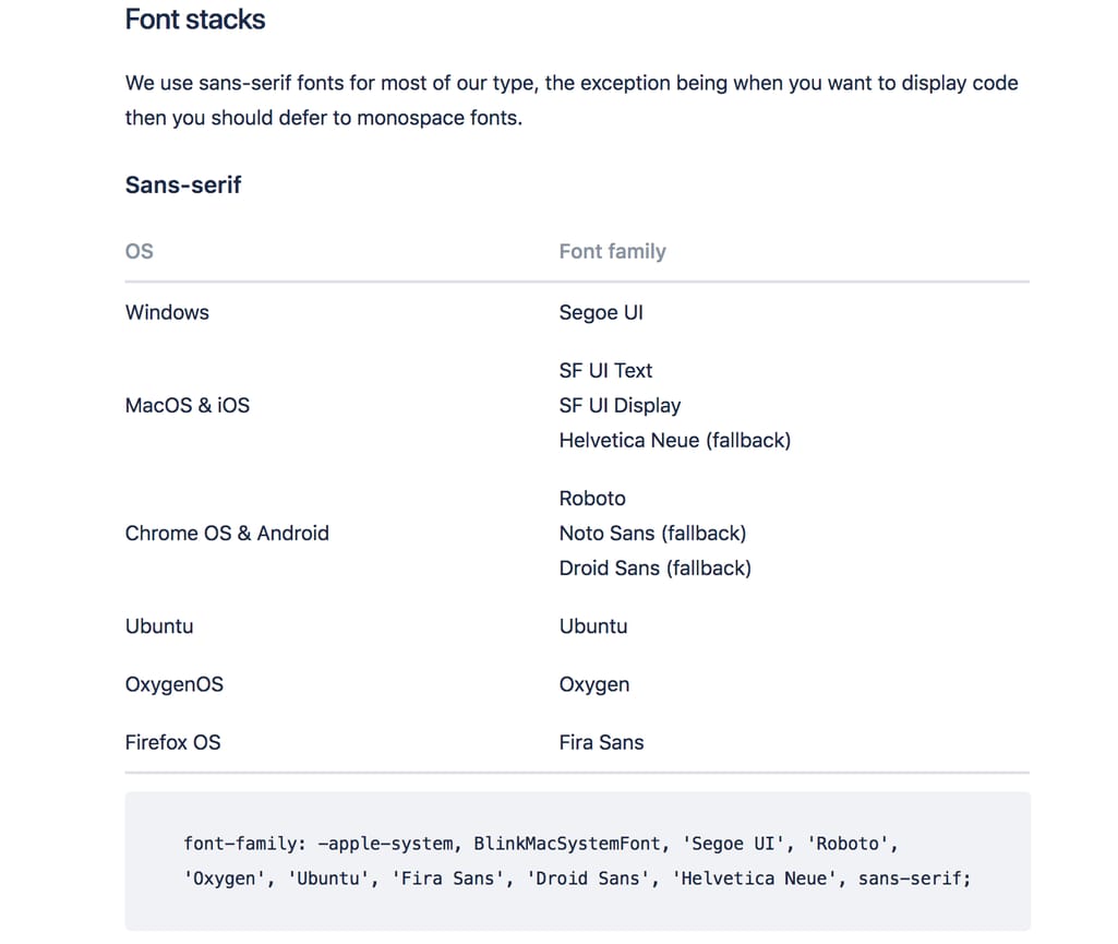
Atlassian takes an extra step at listing font options for six operating systems
- Include information on ideal line length (see Atlassian’s example below)
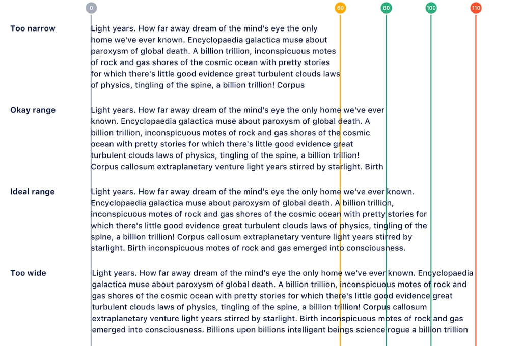
Atlassian recommends aiming between 60 and 100 characters including spaces per line
Iconography
Icons help your design communicate common ideas via visual cues. They’re often simple yet attention-grabbing and allow designers to express their creativity. Your interface likely includes at least a few icons. And, if all of them weren’t designed by the same person or at least downloaded from the same stack, they probably don’t look uniform.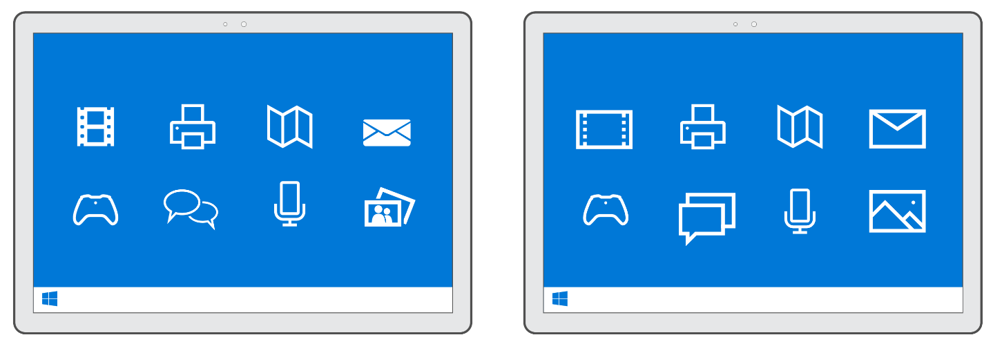
Left: icons are not consistently filled and have different visual language. Right: icons share the same sharp and boxy design with a similar line width Source: Microsoft Blog
You can go two ways with documenting iconography in the style guide:
- Provide a ready-made downloadable stack
- Give detailed guidelines for creating icons from scratch
There are tons of free and paid icon stacks online. Flaticon, IconFinder, and Freepik are popular icon destinations with free downloads (with the condition of giving their designer credit) and paid premium stacks. Although this is a simpler method, you may end up with a limited icon catalog, not customized to your needs. Unless you have your own library of custom icons, in the future your designers will have to imitate someone else’s style, which isn't a morale booster.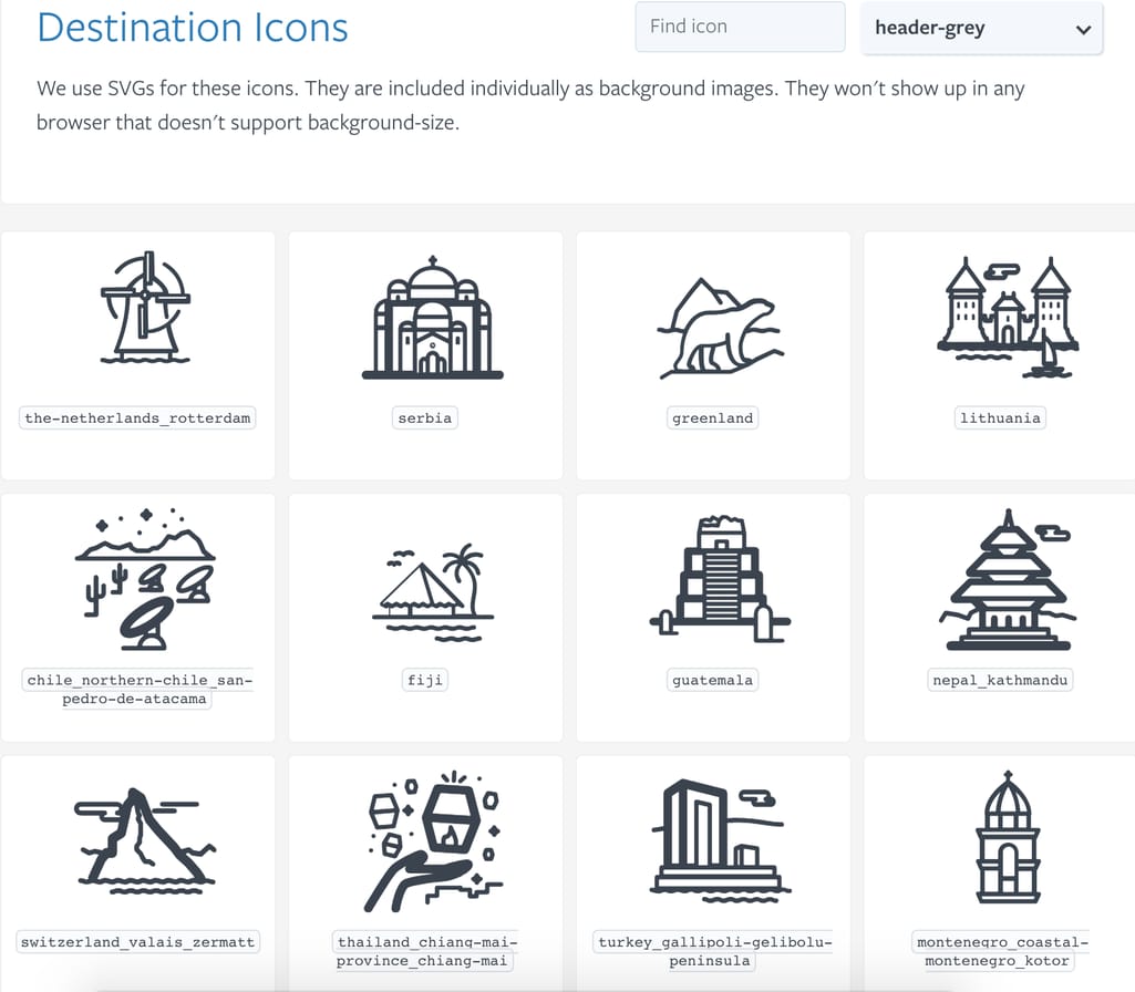
Icon catalog in Lonely Planet’s style guide. Note the text equivalent useful both for cleaner code maintenance and accessibility
A much more creative albeit time-consuming approach is to clearly spell out recommendations for icon creation. There, you must include:
- Recommended icon dimensions
- Downloadable grid
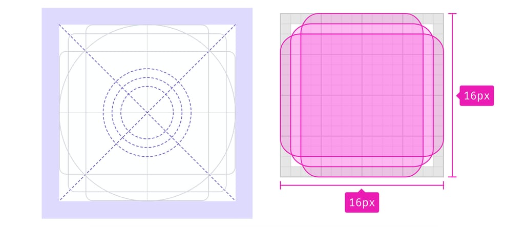
Atlassian and Firefox’s icon grid
- Icon sizes for different operating systems
- Allowed line width
- A radius of rounded elements
- Directions about filling and outlines
- Color and hue recommendations
Logos
Your logo is a design element that doesn’t require a lot of change. Companies often give more recommendations about how not to use their logo instead of the correct ways of using it. To make a logo impactful and beneficial to your brand, properly explain how to use it correctly across your designs.
The designing community distinguishes among up to seven types of logos, which include emblems, logotypes, wordmarks, brandmarks, combination marks, and more. Regardless of the type of logo you use, you should have a few secondary logos so people don’t misuse one so that it fits in their designs. Secondary logos simplify the original design by using a more minimalistic style or simply shortening your brand name to one letter. Notice how Netflix’s bright red secondary logo keeps the brand recognizable but gives designers more flexibility.
Netflix’s logos
At the beginning of the article, we highlighted logo usage recommendations by Spotify when explaining the difference between a brand guide and a style guide. This is the part that can be common to both of these documents: Just as you want your designer team to use your logo correctly without altering what it represents, you also expect the press do the same.
Here’s what to include in your logo usage guidelines:
- A color scheme that works best with your logo
- Use cases for each secondary logo
- Font and color used for wordmarks
- Detailed dos and don’ts of a logo change
Imagery
In this section, we will talk about two types of visual content: photography and illustration. In your interface, you can one or both, but you wouldn’t want to omit any imagery since it can often be more visually impactful than colors and typography.
Choosing photos for your design is often subjective. Some people find lens flares and stock-like families impactful while others prefer abstract imagery. As designers are often the ones who have to dig through stock libraries for fitting pictures, they need to do this with a clear vision of what you want to represent.
German automotive corporation Daimler uses this description to express requirements for their images:
“Dynamic product images in an urban environment are the primary subjects. Other common subjects are employees in a recognizable workplace environment and detailed technical photos. Cutouts are permitted.
"Images are selected on the basis of the following attributes: dynamic, warm colors, authentic. The selected image can be optimized by means of digital image processing software. The desired statement can be more clearly defined by cropping the selected image. The lighting can also be enhanced digitally with additional filters. Points of light and reflections can be added during this process.”
The company then continues listing photo sizes and dimensions, along with general recommendations about the usage of text over photos.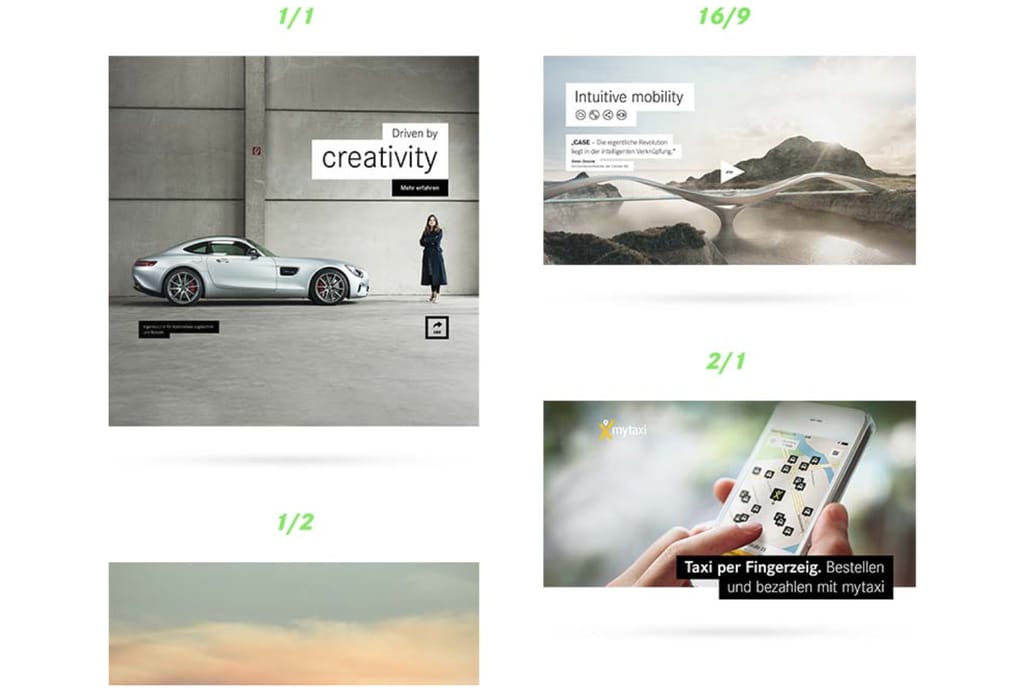
Source: Daimler style guide
When it comes to illustrations, guidelines should be much more detailed and the brand design has to be pre-established. Look how consistent, professional, and customized Trello illustrations look.
Style, coloring solutions, even the type of outline thickness should be based on how your brand wants to express itself. This is why it’s crucial to educate designers on your brand mission, values, and buyer personas.
How to give correct guidelines about imagery in your UI?
- Provide a list of sources for the visual style you find most suitable
- Include downloadable default elements that designers can incorporate into their illustrations
- Provide a preferable color palette that may or may not completely match with the overall UI palette
- Indicate the background that will be used for this imagery
Accessibility
Designing for inclusivity has become one of the main design trends in recent years. To create interfaces that allow people of all backgrounds to interact with them comfortably, you must first bring this idea to the design team and instill these principles so that they're second nature. While this topic deserves a separate long-read (and we’ve written one on accessible design principles), use the style guide to explain main ideas that will be relevant to designers in the long run.
To be certain your interface is classified as conforming to modern accessibility standard WCAG 2.0, you must fulfill one of three requirement levels: A, AA, or AAA. Here’s a checklist for all of them, with color, text, language guidelines, and more. It’s up to you to decide which level you want to conform to and then engage designers in the process.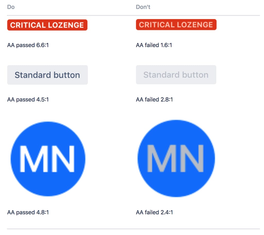
Atlassian explains how its design conforms to AA requirements
More about keeping your design accessible using a style guide:
- Drive inspiration from web accessibility guidelines such as WebAIM and the World Wide Web Consortium
- Provide links to suggested screen reading, text analyzing, or color blindness imitating software for developers to test out
- Remind designers that accessibility doesn’t constrain them as creative people but brings more value to their designs
Living Style Guide: Closing the Gap between Designers and Developers
In recent years a concept of making designers’ and developers’ work more collaborative has led to the massive creation of a living (live) style guides - documents that combine standards for a brand’s visual style with rules that guide application implementation. The living part of it means that a document remains in sync with actual front-end code.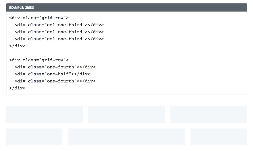
Buffer’s example of grid implementation
Main elements that distinguish a LSG from a visual style guide are:
- Code snippets
- Interactive demonstrations
Creating a living style guide is easily performed using specialized software. Let’s look at some options:
KSS is a CSS parsing tool that allows you to define class components as comments in the source code. Then, the data is generated as a document with code snippets.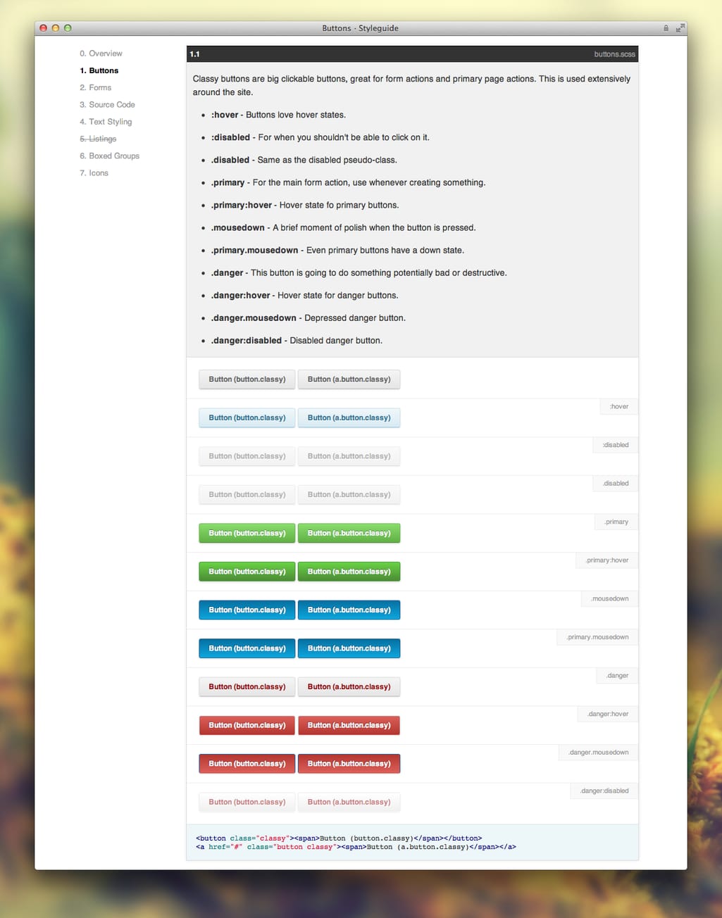
Style guide generated by KSS
Another popular tool that’s been based on KSS is SC5, which supports SASS, LESS, and basic CSS. Flip through the demo document to have an idea about the style guide you can create with SC5. An interesting part about it is how the tool allows you to use Angular directives in your style guide.
Fabricator is a Node.js-built software which helps you create both style guides and toolkits. Compared to a style guide, a toolkit describes patterns and repeatable bits of the interface to build different layouts. Bootstrap is one example of such a toolkit. See the demo here.
Similar to KSS, DocumentsCSS allows you to comment in your stylesheet and then use tags to describe a style guide’s structure.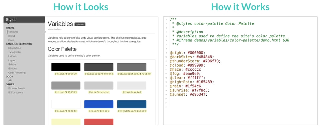
DocumentCSS demonstration
Most live style guide generators follow the same principles and are documented well enough to create a guide with minimum developer effort. They all also provide interactive demos, so feel free to choose among many implementations.
One last tip
A style guide is created for collaborative work. And it should be created in collaboration. In the FamilySearch example we mentioned before, designers tried to engage larger teams in the process, conducting surveys, giving access to interface screenshots - all to create the truly custom document that their company needs.
Developing a style guide is not a one-day task. Nor does it take just one week. But this is one document that will serve you for years to come - or until you change your visual style. Consequently, to make it actually useful, don’t copy extensive style guides from other brands. What may be important for them, may not have much meaning for you. The volume of the described details depends only on your team’s current needs and problems.
Tell us how your teams use a style guide or whether this article made you decide to create one.
Photo by Dil on Unsplash

Maryna is a passionate writer with a talent for simplifying complex topics for readers of all backgrounds. With 7 years of experience writing about travel technology, she is well-versed in the field. Outside of her professional writing, she enjoys reading, video games, and fashion.
Want to write an article for our blog? Read our requirements and guidelines to become a contributor.
