"The blood tests now all live in a drop-down menu, and ordering one involves scrolling down an alphabetical list of every test any doctor has ever ordered in the history of humanity. To get down to vitamin B 12 takes three minutes and seventeen seconds. Ninety-nine percent of the time we order the same dozen tests, and yet, rather than being prioritized at the top of the list (even the Southwest Airlines website knows to put the UK and US above Albania and Azerbaijan), they’re scattered throughout a billion tests I’ve never heard of or requested. Who knew there were three different lab tests for serum selenium?"
This is Going to Hurt, Adam Kay
The last decade marked the massive digitization of hospitals in the US. Today, 96 percent of US hospitals use an Electronic Health Record system -- EHR. But what was a great effort at automation, unfortunately, resulted in a ton of clerical burden laid on healthcare professionals. Now, for every hour spent in personal contact with patients, physicians spend another hour at a desk, operating an EHR, and often on their personal time.
There’s strong evidence that low usability of EHR systems leads to physician burnout. Which, of course, leads to poorer care. As a writer and former junior doctor, Adam Kay puts it in his rant on hospital technology, “If you’re only mildly anemic I’m not wasting the day with my finger pressing on the down arrow for three minutes. And if you’re severely anemic, I won’t order it because you’ll probably be dead by the time I’ve done so.”
There’s no doubt this trend needs attention from all members of the healthcare system: EHR vendors, healthcare technology regulators, an IT department in your clinic, and of course end users. Here we will discuss what makes EHR usability great and how to improve it.
Understanding and evaluating EHR usability
Usability is a quality attribute of a system’s User Experience (UX) design, a discipline that aims at making it effective and satisfying for users to achieve their goals with the software. All usability issues in EHRs can be divided into two groups:
- Basic design and interface problems -- how information is displayed
- Information support problems -- how access to this information is provided
If it sounds vague and subjective, know that usability can be measured. One popular method is the System Usability Scale (SUS) -- a questionnaire consisting of ten items with five response options from Strongly Agree to Strongly Disagree. Questions range from how confident one feels when using a system to whether they’d like to use it time and again.
The SUS gives a basic but fairly true indication of a particular system's usability when compared to benchmarks of other products. Below is a SUS score of an EHR along with Google Search, Microsoft Excel, and even a microwave. The average usability score according to the SUS is 68.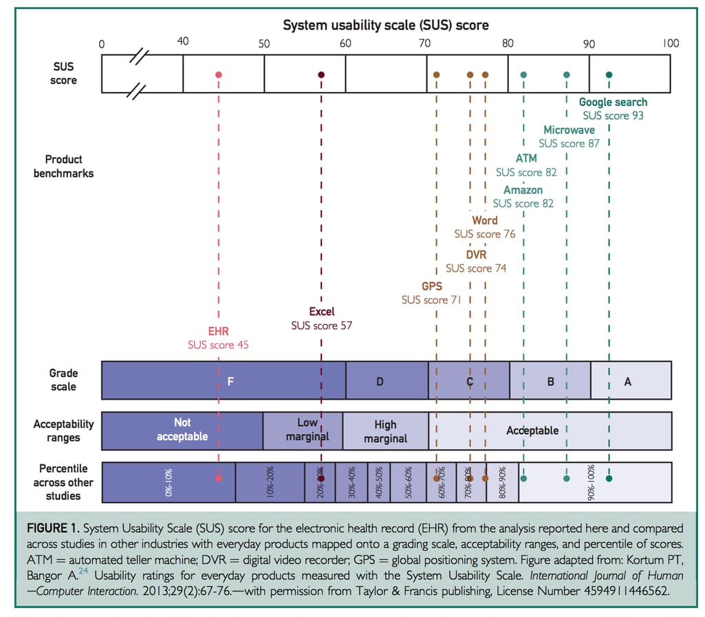
The study by Mayo Clinic surveyed 5197 physicians across all specialty disciplines Source: The Association Between Perceived Electronic Health Record Usability and Professional Burnout Among US Physicians
Such a score is even more alarming considering that most EHR systems go through formal certification. Design is one of the certification criteria that actually checks EHRs for adherence to user-centered design processes. To get approved, a vendor must provide test results with the evidence that the software follows user-centered design principles described in such industry standards as ISO 9241-11, ISO 13407, ISO 16982, and NISTIR 7741. The SUS score is included in the report too.
However, a recent report by JAMA Network shows that despite certification, SUS scores remain below average or even decrease as the system updates. This means that certification alone is not a good indicator of tremendous usability in EHR. Developers must put in greater effort than that required for certification and end users should have a better understanding of what makes great usability in EHRs. Let’s cover that now.
EHR usability best practices
In 2010, the Office of the National Coordinator for Health Information Technology (ONC) established the Strategic Health IT Advanced Research Projects (SHARP) program and issued grants to four institutions to help address the problems with EHRs. The program was a success, resulting in big shifts towards interoperability adoption, clinical decision support rules, clinical data sharing, and, of course, creating a knowledge base for EHR vendors on improving usability.
The program culminated in an abundance of resources from usability assessment protocols and frameworks to design guidelines. These resources are free to use and specifically designed for those who create and implement EHR systems to help them better understand the needs of end-users -- physicians, nurses, and other hospital staff.
To know what needs to be improved, we should first understand how physicians interact with EHRs. The EHR certification requires checking how well participants perform tasks in the following areas:
- Computerized Provider Order Entry (CPOE)
- Drug-drug and drug allergy interactions
- Demographics
- Problem List
- Medication List
- Medication Allergy List
- Clinical Decision Support
- Implantable Device List
- Clinical Information Reconciliation
- Electronic Prescribing
But most of the routine tasks physicians perform in EHRs come down to the three below:
- accessing patients’ medication and allergy lists
- entering and sending medication orders and treatment instructions (ePrescribing)
- receiving drug alerts
Let’s look at the best practices for EHR usability success in those tasks.
Medication and allergy lists
Reviewing a patient’s medication list is an important part of providing care. In case of low patient engagement, a medication list tells a patient’s whole story and fills in the gaps.
Both generic and brand names. Patients prefer using brand names of drugs they’re taking, so physicians should be able to quickly switch between generic and brand names to stay on the same page with patients.
Simple but effective formatting. Since discovering the medication in a list is initially more important to doctors than the dosage instructions, it makes sense to bold the name and mute the rest of the text. It’s also easier to navigate the list when it’s alphabetized.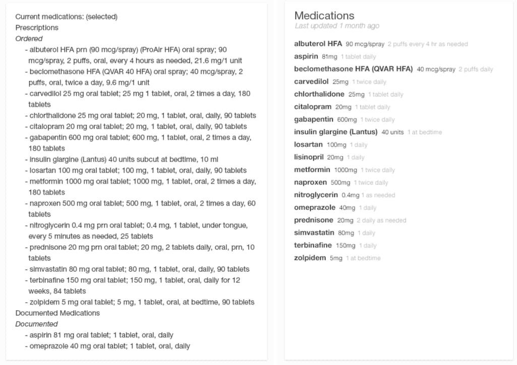
Left: an overwhelming and hard to read list of patient’s medications. Right: the list is clean-looking and easy to grasp Source here and further: Inspired EHRs: Designing for Clinicians
Medication sorting and filtering. When a patient’s condition changes and it’s not apparent why, sometimes looking at the medication they’re taking is enough to find a solution. That’s why interactive lists are so valuable. For example, a physician may filter by diagnosis and adjust dosage without making complex calculations in their heads.
Maximum dose icon. Another feature that should help with calculations is the color-coded daily dosage icon that indicates whether the patient reached their maximum for that drug.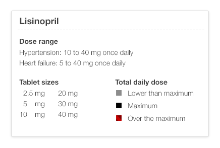
Colors display information about dosage limits
Allergy list prompt. The list of medication allergies should be available at a glance for when the user adds a new order or reads a lab report. It helps if allergies are shown in the order of severity and are color-coded.
Order entry and prescribing
Remember the quote at the beginning? There, Adam Kay lamented about the need to press the down button for three minutes straight to order a blood test for B 12. The part of an EHR responsible for this task -- Computerized Physician Order Entry (CPOE) -- enables:
Pre-populated prescription fields. True automation comes when the system offers suggestions as a user types them in, which makes order entry quicker and more accurate. If a physician has preferred drugs, they can pop up at the top of the list. Besides, the system can pull out the dosage and take options, filling out several fields in one click.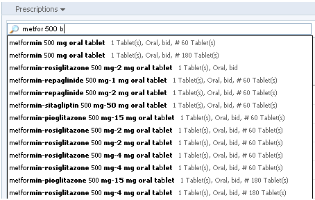
Users can skip to needed details without typing the whole prescription
Dose limit calculations. It’s common for patients to take several meds that contain the same drug, and the system can catch and prevent that. A physician can add a warning to not exceed the dosage of a particular drug, so the EHR can flag this issue if it happens during the order.
Order review. A physician should be able to have a final review of the order before sending it to make last-minute changes or discuss the prescriptions with the patient. If there are drug alerts or missing elements, they should be highlighted here.
Easy order change. When a physician needs to correct a dose, frequency, or quantity, they should be able to do this easily, without having to create a completely different order and delete the old one.
Medication timeline. Keeping the history of the patient’s medications and the reasons why they stopped taking them allows physicians to select a new medication and dosage without going through old records all the time.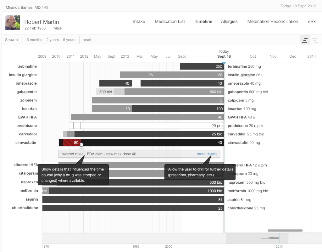
Information visualization is helpful both to physicians and patients
Visualized renewal due dates. Physicians should be able to quickly recognize what medications are close to renewal during the patient’s visit. It can be done by using color-coded bars.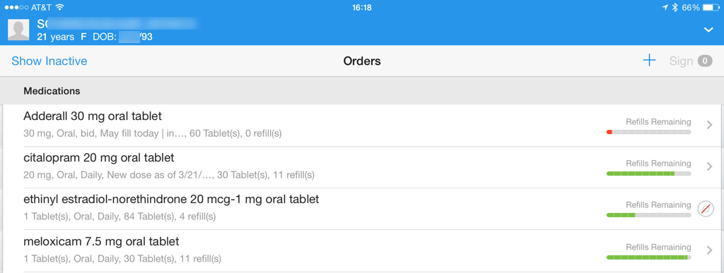
Colors and icons are used to reduce the cognitive load when reviewing medication renewals
Search via all names. One of the common challenges physicians face is when searching for particular procedures in the system and not finding it simply because the system uses a different spelling for that word. For example, an EHR might have “chest x-ray” in a database but not “chest xray” or “x-ray chest.” So, it’s important to incorporate all common spellings so physicians can easily find them.
Drug alerts
Alerts about adverse drug effects are helpful as long as physicians notice, understand, and respond to them. For example, below is the typical interface of an alert that interrupts a doctor’s workflow.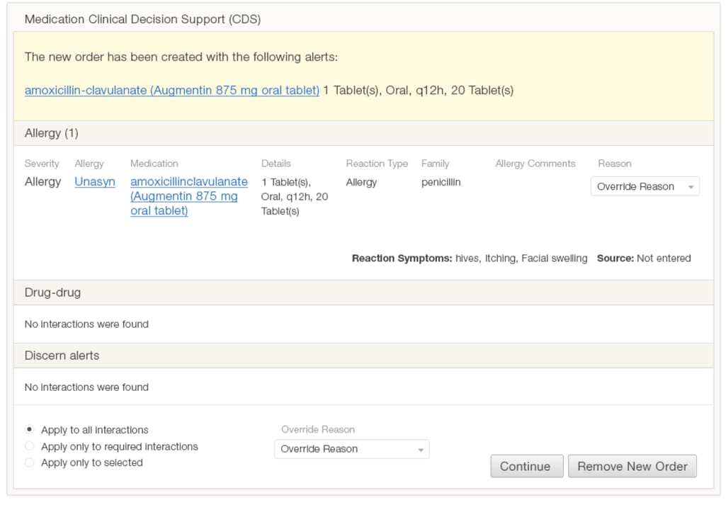
This alert uses a lot of text in the same format and contains irrelevant information. It also doesn’t look important, not using any visual cues that indicate the severity.
Here are some practices for making more actionable alerts.
Simple color-coded design. An alert should contain only information that’s important for making a decision. In the case below, it’s the names of contraindicated medications and the option to change one of them. The color red denotes the alert severity and informs the doctor.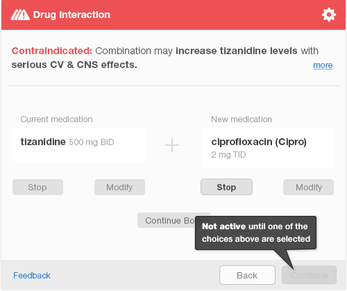
Although this alert interrupts the workflow, it’s easy to read and apply changes
Use of passive alerts. Unlike interruptive alerts, passive alerts appear in the corner of the screen allowing users to detect them with peripheral vision and acknowledge the severity. Truly severe alerts will interrupt the flow after the physician completes the order. This distinction allows the system to make sure that users don’t skip all alerts as annoying and miss an important one.
Customizable alerts. The “don’t warn me again” option helps reduce alert fatigue. For example, when a patient is known to have minor side effects, the physician doesn't want to be reminded about the allergy every time a dosage adjustment is made.
It’s important to find a balance so that the healthcare providers don’t get so overwhelmed with alerts that they start subconsciously ignoring them.
How to approach EHR usability design: three scenarios
Now, it’s clear that the problem is dire and there are recommendations for improvement. What matters now is how a specific clinic can go from bad to good usability. We can distinguish three common scenarios and give recommendations for each of them.
Scenario 1: Choosing an EHR with great usability
There are tons of EHRs on the market and we previously reviewed the most popular EHR vendors. But when you’re making a choice, is it actually possible to determine how smoothly and effectively physicians will be able to interact with the system? We have a few tips.
First, review the usability report the EHR vendors provide for certification. These are usually available for the public by one of the labs authorized to perform certification. A simple Google search should be enough. For example, the report for smartEMR gives it an SUS scale of 86 -- above average.
Read about the testing procedure, environment, and participants. Note participants’ age, education, computer experience, and role. There should be a mix of admin staff and physicians, people with different tech backgrounds and level of EHR experience.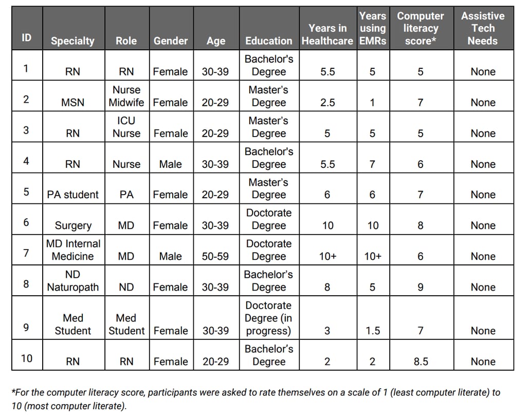 Demographic data of participants in the usability study for Elation EMR Source: DrummondGroup
Make sure to review the section about issues and areas for improvement. If the report was made in 2018 and the EHR hasn’t provided an upgraded version for certification since, this means that those issues haven’t been fixed.
Finally, request a demo and perform your own usability testing. You can use the official procedure. Gather participants from your clinic (the more the better) and ask them to perform regular tasks like creating a new prescription, accessing a medication list, or find and update the settings. Note any issues that arise and if the product satisfies you in all other areas, consider how those issues can be improved. Which brings us to the next scenario.
Scenario 2: Upgrading usability in your EHR
Thankfully, either the IT staff at your practice or your healthcare IT consultant can improve the EHR you already have.
Start with evaluating your EHR’s usability. We talked about the SUS before, but for the redesign goals, one questionnaire won’t be enough. There are two methods we can recommend:
- Rapid Usability Assessment -- it consists of two processes: calculating the time required to complete the task and expert assessment. The former uses a computer program that simulates the physical and mental actions it takes to complete a task. The latter approach involves usability experts that assess the system using established usability principles.
- TURF (Task, User, Representation, Function) framework -- this is designed specifically for EHR usability assessment and improvement. Use a software toolset provided with the framework to collect data from EHR interactions and generate reports.
Then, prioritize your issues. The matrix below might help. As the redesign process usually spans across many months, you need to identify your priorities. The most efficient way would be dealing with design problems that may result in patient harm first (primary prevention) and follow with providing support to physicians themselves (information support issues).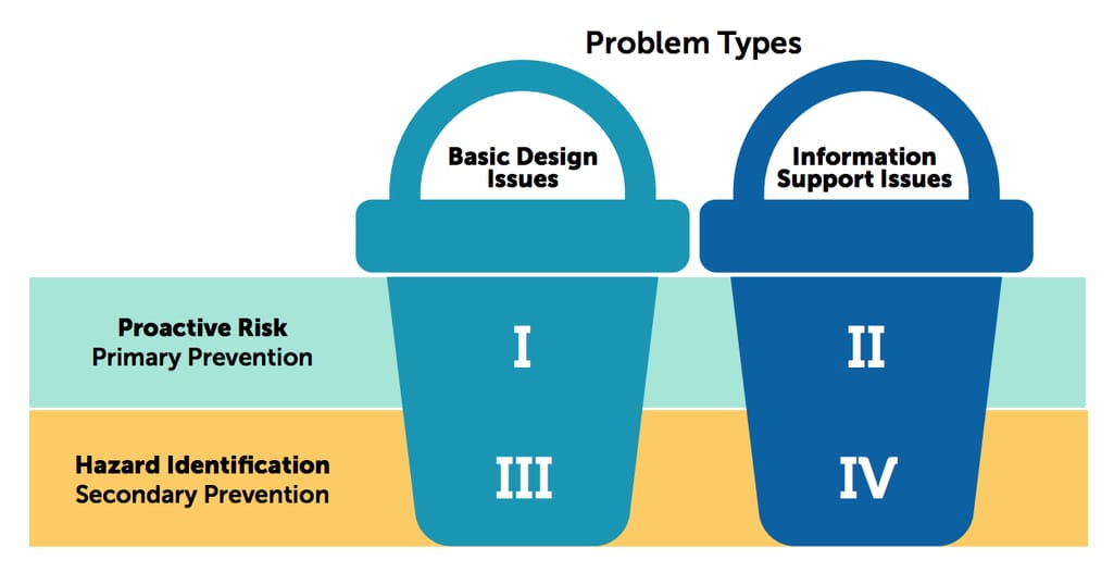
There are two goals of usability improvement: fixing basic design issues and fixing information support issues Source: ONC Usability Change Plan
Lastly, invest in EHR training. Although this step doesn’t impact the usability of the EHR, it can significantly improve user satisfaction. Multiple studies show that users of the same system can have very different experiences just because some are more familiar with such software. And no vendor shows the same level of satisfaction among users with high and low experience. That means that EHR education might be the cheapest and the least effort-intensive method to improve your EHR interactions or prepare for EHR implementation, at least for the time being, before the upgrade or redesign.
Scenario 3: Design a custom EHR from scratch
Custom EHR development has tons of benefits and one of them is the total control of user experience and interface. This will allow a clinic to match the digital and real-life workflows, making sure that the software works for the staff rather than overworks the staff.
The aforementioned TURF framework can be applied for the initial design of EHR as well. The steps are the same as with redesign: evaluation using different types of analyses, identifying problems, developing design mockups, etc. Instead, the informational structure of the whole solution will be based on this design.
Here, the process will likely follow the standard steps for enterprise product development and will require the help of professional product and project managers.
Usability upgrades never stop
Spoiler alert: Almost all out-of-the-box EHRs need usability improvement. That’s because the usability requirements for certification are fairly low. For example, the minimum number of participants is five, which is clearly not enough to gather sufficient data for any conclusion. And also because end users -- physicians and nurses -- rarely take part in choosing or designing a product they will have to operate (or avoid if it’s that bad) half of the time.
In recent years, ONC introduced the Usability Change Package -- an educational resource for EHR end users for identifying usability challenges and learning to address them. This document and the accompanying webinar can be helpful for less tech-savvy EHR users embarking on the road of continuous improvement.
The document also lists tons of useful resources on EHR usability: eBooks, studies, playbooks, websites, and even online courses that we highly recommend everyone to review.
Let us know directly about your journey to usability improvement (or lack of thereof).

Maryna is a passionate writer with a talent for simplifying complex topics for readers of all backgrounds. With 7 years of experience writing about travel technology, she is well-versed in the field. Outside of her professional writing, she enjoys reading, video games, and fashion.
Want to write an article for our blog? Read our requirements and guidelines to become a contributor.

