Check out this homepage. What do you notice here first? Is it the wording “fashion advice” in bold that grabs your attention, making you read the whole sentence? What about a logo in a rich coral at the top left? Or is it a model who seems to be looking straight into your eyes that steals the show?
The Adictic homepage. Source: Adictic
Adictic is a platform where you can ask other members for clothing advice “to clear away your fashion concerns down to the last detail” or help others choose between outfits. Buttons “Help me choose” and “Need advice” allow visitors to clearly understand what they can get from joining the community.
Designers used size, typography, and color to emphasize some elements over others to guide your glance while you learn about the project. In contemplating the dominance of certain visual components, we deal with visual hierarchy.
What is a visual hierarchy in design?
When you emphasize everything, you emphasize nothing. This saying describes the key idea behind visual hierarchy in design: to organize and prioritize page elements by their importance. If visual design is a way to communicate information, visual hierarchy is about communicating this information effectively. Content delivered with visual hierarchy in mind is easy to consume and understand.
Visual hierarchy is one of the approaches to control user attention. By making one component more dominant than the others, designers can influence how people navigate on the page or hint what actions they want users to take and in what order.
Numerous techniques and rules are used for achieving powerful visual hierarchy. And most of the basic visual hierarchy rules originate from Gestalt principles.
Gestalt psychology, founded in the 20th century in Austria and Germany, provided the foundation for the modern study of perception. In short, Gestaltists studied how humans recognize and interpret sensory information. They discovered that our brain tends to simplify sophisticated images or designs by defining patterns, grouping similar elements, considering them a part of an organized system.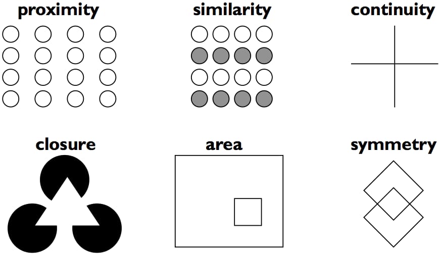
Gestalt principles indicate how humans perceive information
Just as the human brain finds structure and order in chaotic visuals, principles of visual hierarchy, when applied correctly, allow for creating design that ensures seamless interaction with your product. No matter what it is, website or application.
We assume that you have a vision about a product you want to introduce, understanding what user problems it would solve and how. We discussed these and other stages of UX and UI design development, their goals and deliverables in a dedicated article. Now, we want to focus on how to use visual hierarchy techniques when shaping user experience and interface design during different design stages. We’ll also explore how to test the visual hierarchy of applications or sites.
Developing a wireframe: How to organize page elements across the interface
Understanding how people perceive visual information, particularly how they view and explore pages, allows designers to develop solutions with intuitive interfaces that also bring aesthetic pleasure. It’s also crucial to keep in mind a goal a user must achieve on the page.
Digital product design starts with wireframing – representing design at a structural level. A wireframe is usually a static visualization of a web page that shows the location and basic appearance of interface components – buttons, text and image blocks, a logo, a menu panel, etc. As interface elements provide certain functionality, the wireframe also depicts interface features.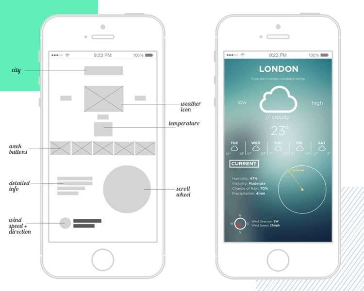
The wireframe for a weather app concept and visualization of a final app look. Source: Justinmind. Author: Matt Sclanrandis
Now let’s talk about several techniques and perception tricks to consider and use to define a page layout.
Choose a focal point and differentiate it
According to the model of visual hierarchy proposed by Microsoft’s Pete Faraday in Visually Critiquing Web Pages, a research paper, gaze patterns are guided by two cognitive processes: initial searching and subsequent scanning. During the search, a person tries to find an entry point to the page – a focal point/point of interest. The largest objects would seem the most important for users, and they would look at them first. So, one can change the size of a design component to turn it into a focal point.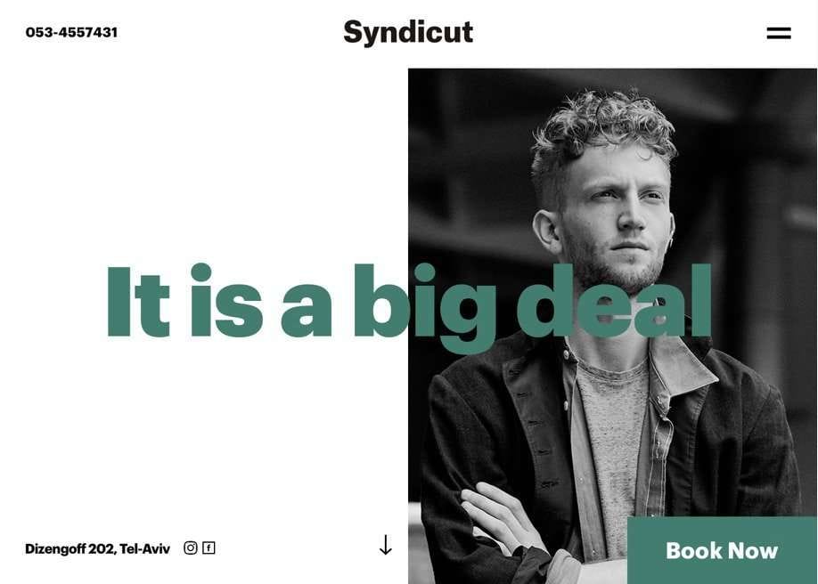
“It is a big deal” as a focal point on the homepage of the barbershop website. Source: Syndicut
During subsequent scanning, the user extracts information around the entry point. That’s why you can place a text block with important information near the focal point (which can be a key phrase in a sentence) to be sure visitors read the text, too.
Place important information “above the fold”
The concept of above the fold or upper fold has been around since print publishing times. Since newspapers had to be folded in half when sold on newsstands, publishers used large headlines with the hottest news and pictures on the top half of the page to draw people’s attention.
In a digital world, above the fold content is the content that’s visible without scrolling. “Believe in the fold,” say the experts from the Nielsen Norman Group because content above the fold has an average 84 percent more viewability than the below the fond one.
Consider how people view pages and adjust page layout accordingly
Keep in mind gaze patterns to place interface components to your advantage.
F-pattern. People who read left to right scan pages in the same way. In 2006, Jakob Nielsen and his colleagues at the Nielsen Norman Group carried out an eye-tracking study, during which they recorded how 232 people were looking at website pages. They discovered a reading pattern that resembles the F shape and is characterized by many fixations concentrated at the top and left side of the page:
- First, users read horizontally the upper part of a content area.
- Then they move down the page and read another line the same way. The second line is shorter than the first one.
- At last, users vertically scan the content’s left side.
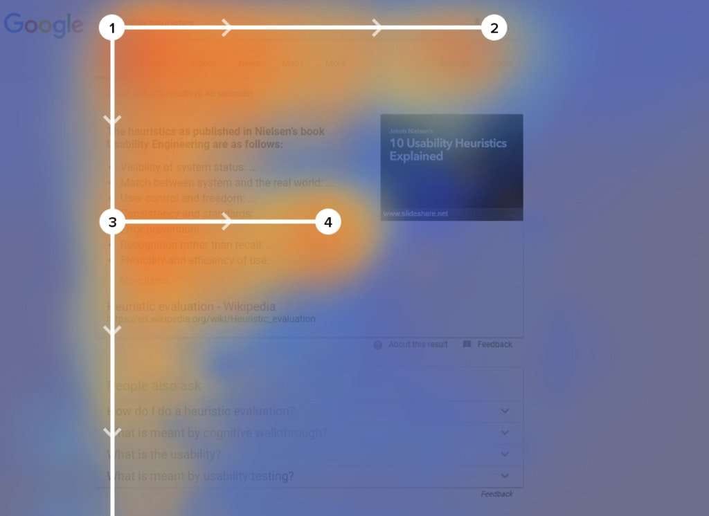
An example of the F-shaped pattern
The finding suggests that people would read first lines of text on a page more carefully than the rest. Also, readers will fixate on the first few words of each line more than subsequent words on the same line.
However, it’s possible to change the F-shaped viewing pattern by creating a more complex visual hierarchy. One of the ways is to add images of faces (that serve as entry points) to the right side of the page above the fold. This experiment, among the others, was described in the research paper Visual Hierarchy and Viewing Behavior: an Eye Tracking study.
The specialists gave participants two tasks – browsing and information retrieval – to determine whether these tasks influence viewing pattern. “In the browsing condition, the fixations appear more in the central part of the page, as opposed to the left or right sections,” the authors noted. They concluded that placing information important for retaining new visitors in the center of the page is likely to help attract those who browse a homepage.
Those study participants that had to retrieve information concentrated with navigational links. So, users who retrieve information would be glad if you locate useful links on the left side of a page.
Z-pattern. Contrary to the F-pattern that you can break to aid your business goals, it’s better to adjust your page layout to Z-pattern. This gaze pattern applies to pages with minimum text, such as landing pages.
Users explore simply designed pages this way:
- The user scans the top of the page horizontally.
- Then the user moves their sight diagonally to the page’s opposite corner.
- Finally, a person’s eyes move horizontally to the lower part of the page.
So, to follow the Z-pattern, align important components like a logo across the top horizontal line, place information leading to call-to-action on a diagonal line, and spice up the bottom horizontal line with a call-to-action button. It’s worth mentioning that important information must be located in the corners.
Check out how Facebook designed its landing page with the Z-pattern in mind: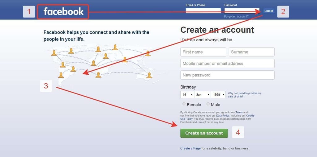
Facebook landing page follows Z-pattern. Source: UX Planet
Incorporate the golden ratio for design composition
Balance the location and size of interface components using the golden ratio. The golden ratio is a mathematical proportion between differently sized elements, and it’s considered to bring the greatest aesthetic pleasure.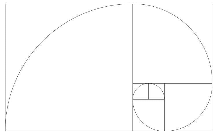
The golden ratio. Source: SketchAppSources. Author: Thomas Veit
How to follow this proportion in design composition? To calculate the length of the bigger design component, choose the length of the smaller one and multiply it by 1.618.
With the golden ratio, designers can define how much area they should leave between design elements to ensure the design is both functional and harmonized. In other words, using these proportions can help make the right amount of whitespace.
Whitespace is an effective technique to create a visual hierarchy: A standalone object catches the viewer’s attention. And the more whitespace around it, the more noticeable the object is.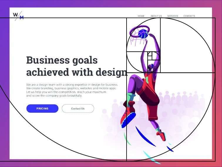
The golden ratio is applied to define the right amount of whitespace around a figure. Source: Tubik blog
The whitespace rule is connected with the Gestalt principle of proximity. According to the principle, similar objects would seem unrelated to each other if separated with whitespace. On the contrary, elements that are close to each other would appear as a group even if their shapes and sizes are different.
The image to the right is perceived as three groups of circles because of the proximity of the lines. Source: Toptal
Once the wireframe is developed and approved, the team can focus on its visual part.
Creating a mockup: How to incorporate colors and text formats
When a painter creates a landscape, they first sketch with a pencil: set the horizon between the sky and the ground, place tree shapes, add a road on a field, a building, or other eye-catching objects. In web design terms, an artist first draws a wireframe, and then breathes life into the outline with painted color and detail. The more detailed illustration of a product with color and images is called a mockup. The goal of creating a mockup is to make design choices that would differentiate the product from other products, highlight its features and value, as well as reflect a brand’s philosophy.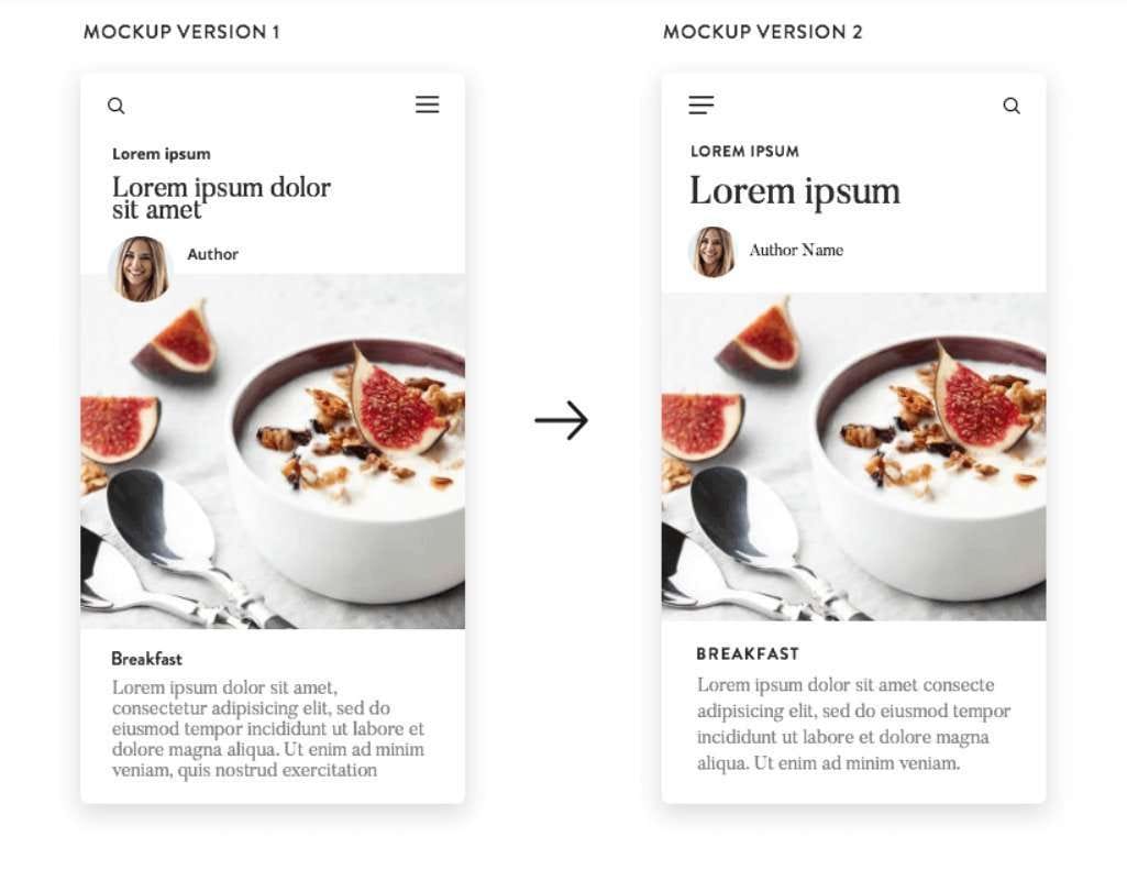
Two versions of mockups for a blog. Source: Justinmind
Use saturated colors for interactive elements
Color is a powerful tool for emphasizing lesser/greater importance of interface components. Using saturated colors within a selected color theme, you can draw user attention to interactive elements, such as call-to-action buttons, links, notifications, or introductory text. Saturation is determined by the amount of gray. More saturated colors have less gray and are richer or brighter and vice versa.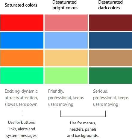
Saturated and desaturated colors and their usage. Source: UX Movement
Designers of the site for Jackie personal styling service made headings, call-to-action-buttons, a logo, and navigation elements very visible on a pale background: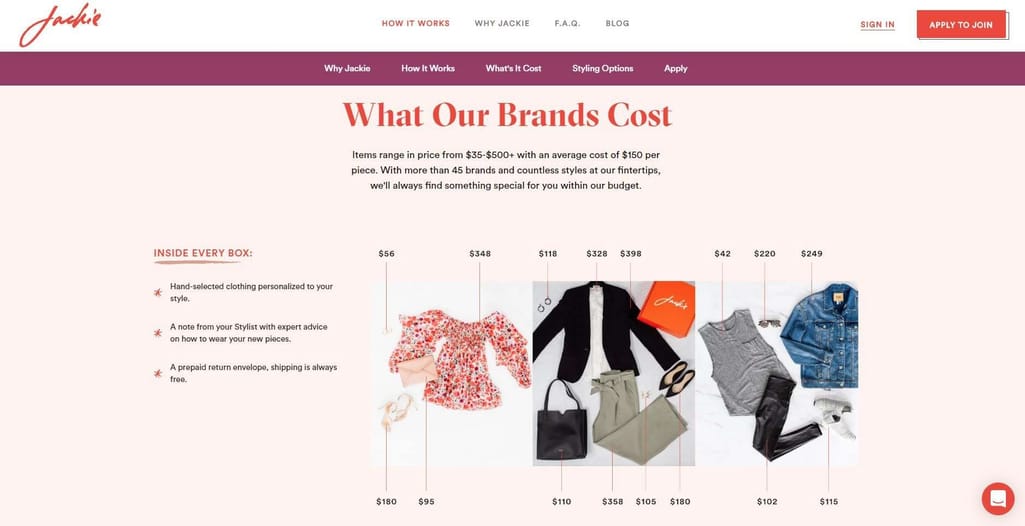
Rich red for important interface components. Source: Jackie
Apply typographic hierarchy
Text formatting is another brick in the wall of visual hierarchy. Typographic hierarchy allows for separating the content you want users to lock on immediately and prior to the rest of the information. The common approach to distinguish text content is to group it according to three levels of importance:
- Level one is for the most important content and applies to headings.
- Level two usually applies to subheadings that help users navigate to different parts of design, grouping related information together.
- Level three is used for body text – article, description, or note.
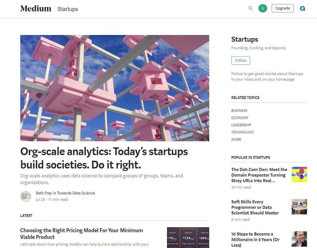
Medium uses different text sizes for headlines, subheadings, and body text
Choose typeface styles and categories and combine them to achieve contrast
Once you've decided on text sizing, think how to support visual hierarchy with typeface styles and categories. The typeface is a family of one or more fonts with common visual features, but with different attributes which make categories (serif, sans-serif, decorative, etc.) and styles (italic, bold, etc.).
With different typefaces, you can make certain words, phrases, or digits more or less recognizable, and express the overall design mood in another way. One of the ways to achieve typographic hierarchy is to combine text in a sans-serif font with one in a serif font. For instance, using a serif font for headlines in the center and sans-serif for headlines located at the sidebar. Fast Company followed this approach on their website: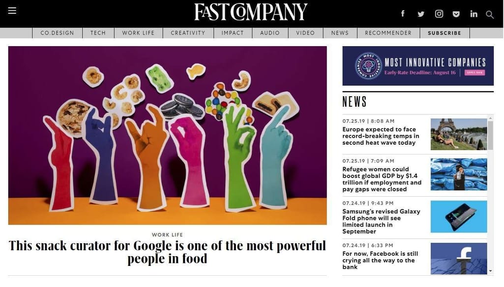
Fast Company’s choice on typeface styles and categories
Designers also suggest pairing typefaces that look thick and bold with thin typefaces that appear to be smaller. At the same time, these typefaces must have a similar tone or feel to keep the design consistent. “If you are using rounded typefaces, stick to letterforms with similar shapes in the o’s, for example. Opt for typefaces with similar x-heights if the styles will be used in line with one another throughout the project,” advises Design Shack. The x-height is the distance between the baseline and the mean line of lower-case letters in a typeface. Usually, x-height is the height of the letter x in the font, hence the term.
How to test a visual hierarchy
Once you have a mockup, you test it to learn about its strong and weak sides. There are various means to test whether the visual hierarchy of your design serves its purpose. Some of them require more equipment and cost, some are easier to carry out.
User testing
This testing approach is about giving a person a task to perform (i.e., find a given item in an eCommerce website, add it to a cart, and go to checkout; define a restaurant with the highest rating on a page, etc.) and see how they proceed. Then evaluate the time it took for the user to complete this action. If you see that the person stumbles at a certain step or task, reconsider how an element/content is presented. How can you help the user solve a problem faster? You can also ask people what interface components they noticed first, second, etc., and what elements drew the least attention.
Blurring technique
It’s probably the simplest and fastest way to find out whether you emphasized the right interface elements or not. Take a screenshot of a needed page, open it in Photoshop, and apply a 5-10 px Gaussian blur. Or simply take off your contacts or glasses and take several steps back from the screen. If you can recognize buttons, a logo, sections, and other visual elements in a page’s blurred version, the visual hierarchy is done correctly.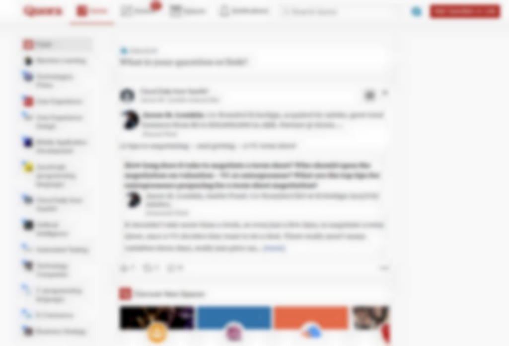
You can still see text blocks, different tabs, and buttons after blurring Quora’s homepage
A/B testing
A/B testing entails showing an original page (control) version to half of the traffic, while another visitor group is presented with the modified page called the variation. Pages with minor changes in saturation of a call-to-action button or location of a focal point as well as fully redesigned pages can be used for experiments. Collected feedback data is then analyzed to define which version works better.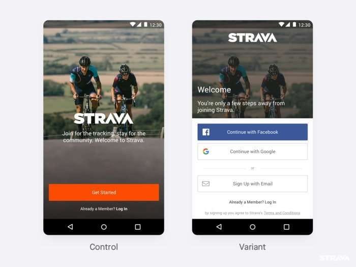
Control and variant versions for a sign up/ login page. Source: Strava
Eye-tracking
Eye-tracking – measurement and recording of points of gaze – demonstrates what areas and page elements draw viewer attention and vice versa, as well as why users exhibit specific gaze patterns. This research is carried out in labs using screen-based eye trackers or eye-tracking glasses.
The eye-tracking study adds another dimension to traditional usability testing that includes evaluating metrics, mouse movements and clicks, or even participants’ comments. “Following the eye at work makes you feel as though you are in the user’s head, thinking with him,” note Kara Pernice and Jakob Nielsen in the How to Conduct Eyetracking Studies report.
Visual hierarchy, as one of the design components, can be tested with eye-tracking research. For instance, you can change the color of an element and see how this change affects a gaze pattern.
In 2012, researchers studied how the changes in bricklet design can influence their noticeability. A bricklet is an area containing some useful information or shortcuts (i.e., via links), to allow website visitors to access this information easier and faster. Experiments took place in a laboratory and focused on financial sites.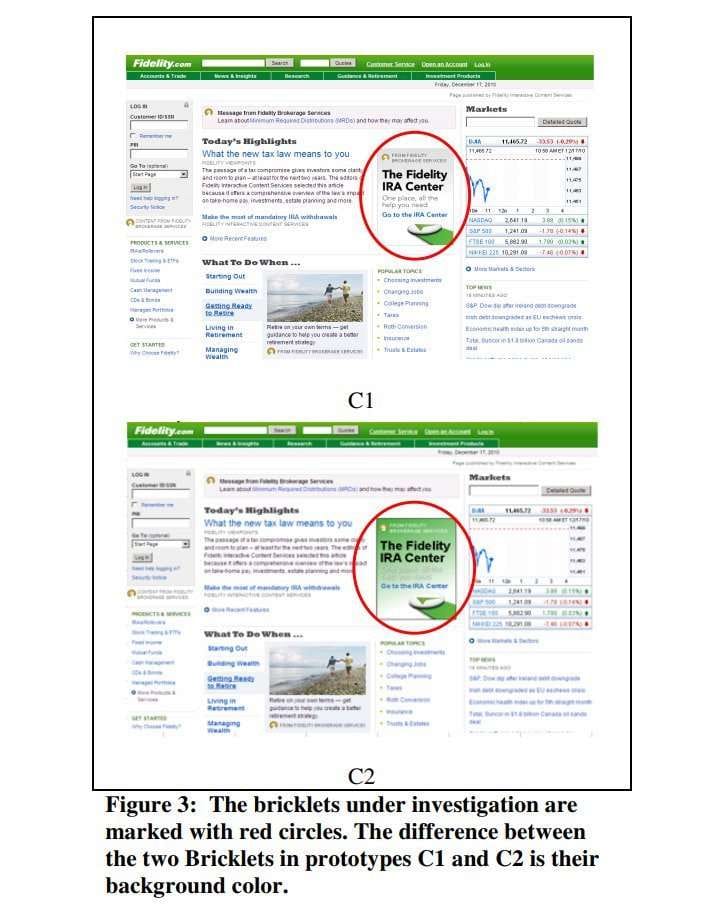
Page prototypes containing bricklets with different background color. Source: Designing Noticeable Bricklets by Tracking Users’ Eye Movements
The hypothesis that was proven suggested that contrast of a background color influences the degree of attention: “The bricklet without the contrasting background was noticed significantly faster than the bricklet with the contrasting background. This is consistent with the phenomenon of banner blindness...Furthermore, it is interesting that this effect manifested even when the color of the background matched the color scheme of the website,” the researchers concluded. Banner blindness describes a tendency of users to ignore graphic elements of garish colors, mostly banners.
It’s wise to use eye-tracking study only if you need to dig deeper and after you’ve tested your design with simpler techniques.
Final word
Let’s quickly sum up.
Visual hierarchy is about prioritizing design elements to effectively communicate information to users. What makes effective communication? It’s when a business delivers the right message about product purpose and philosophy, ensuring that people can easily explore and use a product. So, it’s crucial to align visual emphasis with the goal of a specific page or content.
Visual hierarchy techniques consider peculiarities of human perception and are based on Gestalt principles. In other words, the visual hierarchy takes a cognitive approach to UX and UI design.
Visual hierarchy rules and gaze patterns are considered to create page compositions when developing wireframes. Techniques related to mockup development target mainly color, image, and text perception.

