PERT charts can be a handy tool for organizing and managing projects. When should you use them and what’s the right way to make them? Let’s find out.
What is a PERT chart?
A PERT chart, also known as a PERT diagram, is a project management tool that helps plan and visualize the tasks involved in a project. It’s used to better understand and schedule the sequence of tasks, especially in projects with uncertain timelines.
PERT charts, developed by the US Navy in the 1950s to support the Polaris submarine missile project, were made public in 1958. Initially, PERT stood for Program Evaluation Research Task, but by 1959, it was renamed. Today, PERT stands for Program Evaluation and Review Technique.
Who makes PERT charts and when? Project managers develop PERT charts at the planning phase of a project.
Why make a PERT chart? PERT charts help schedule project activities and estimate the overall project timeline. They give a clear view of dependencies so you can plan overlapping activities and tasks. This allows you to optimize the work process and minimize project duration.
What are the use cases for developing PERT charts? PERT charts work best for projects with complex dependencies and unclear timelines (such as R&D or new product development) since they primarily focus on the relationships between tasks instead of deadlines.
How a PERT chart works: key components
Essentially, a PERT chart is a diagram that shows project tasks, their sequence, and the time it takes to complete each task. So let’s look closer at its main concepts.
Tasks/Activities/Events – the specific actions or steps that must be completed for the project. Each task is usually represented by a rectangle or a circle.
Dependencies – the relationships between tasks, showing which task requires completion before another can begin. These are represented by arrows connecting the nodes.
Lead time – the time needed to complete the task. PERT charts use three time estimates to calculate how long a task will take: the best case (optimistic), the worst case (pessimistic), and the most likely case. This way, they account for the uncertainty and risks.
Critical path – the longest sequence of dependent tasks that determines the overall duration of the project. If one task in the critical path is delayed, the entire project will be delayed.
There are other terms you might see in PERT chart descriptions.
- Predecessor event – a task or activity that needs to be completed before another task can start.
- Successor event – a task or activity that follows another task. It can't start until its predecessor event is finished.
- Critical activity – tasks that are part of the critical path, which means they must be completed on time because any delay in these tasks will make the entire project longer.
- Slack (or float) – the time a task can be delayed without affecting the overall project deadline. If there's slack, it means the task has some flexibility in its timing. Ideally, only noncritical activities can have slack.
- Dummy activity – a way to show that one task depends on another, but it doesn’t have any actual work associated with it. It’s only there to represent logical relationships.
Now, let’s look at what your PERT chart can look like.
PERT chart example
Let’s say you're planning a project to build a website. Here’s a hypothetical list of tasks.
- Design the layout (estimated time: 2 days)
- Make the wireframe (estimated time: 1 day)
- Develop the homepage (estimated time: 3 days)
- Develop the contact page (estimated time: 2 days)
- Develop the About page (estimated time: 2 days)
- Test the website (estimated time: 1 day)
- Launch the website (estimated time: 1 day)
Now, the dependencies. For example, you know you can only start developing your web pages after your layout and wireframe are ready. So tasks 3, 4, and 5 depend on task 2, which, in turn, depends on task 1.
You also know that tasks 3, 4, and 5 don’t depend on each other and can be worked on simultaneously – or in any order.
Then, task 6 (testing) depends on tasks 3, 4, and 5 being finished.
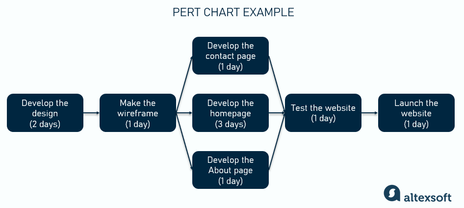
A simple example of a PERT chart for a website development project
Looking at a PERT chart, you can clearly see your critical path – and estimate the time to complete a project (8 days in our case).
Of course, PERT charts are usually way more complex, with a large number of tasks and intricate dependencies. So let’s dive deeper and talk about how to make them right – step by step.
How to make a PERT chart
Here are the main steps in creating a PERT chart.
1. List tasks
Start by making a work breakdown structure (WBS): Break the project scope down and list all the tasks or activities that must be completed. Each task should represent a single action or step in the project.
Important: Consider making a table with a list of tasks that you’ll further supplement with information about dependencies and time estimates.
2. Define dependencies
Next, figure out which tasks depend on others. Some tasks cannot begin until other tasks are completed. And some tasks can be done simultaneously – those are called parallel or concurrent tasks.
To record dependencies, make a column in your task table where you put a predecessor for each task – if there’s any. In our example above,
- task 1 doesn't have a predecessor,
- task 2 has task 1 as a predecessor,
- task 3 has task 2 as a predecessor,
- task 4 also has task 2 as a predecessor, and so on.
If a certain activity requires several tasks to be completed before it starts, it will have several predecessors. In our example, task 6 will have tasks 3, 4, and 5 as predecessors.
Important: These dependencies are the core of the PERT chart, so they must be clearly identified to show the order of work. It makes sense to involve stakeholders (team members in the first place) and work on determining dependencies collaboratively.
3. Estimate the time
For each task, estimate how long it will take to complete (yeah, that's not the case for story points). Try to be consistent with your units (minutes, hours, days, weeks), so that it’s easier to calculate the critical path.
As we mentioned, the three-point estimation technique is used with these 3 elements:
- optimistic time – the best-case scenario (how quickly you expect to finish if everything goes smoothly);
- pessimistic time – the worst-case scenario (how long it will take if there are delays); and
- most likely time – the realistic estimate based on experience.
Having these three values, use the weighted average formula:
(Optimistic Time (O) + 4 x Most Likely Time (M) + Pessimistic Time (P)) / 6
For example, you think that the optimistic time for developing a certain feature is 3 days, the pessimistic estimate is 5 days, and the most likely time is 4 days. So the weighted average will then be (3+4*4+5)/6 = 4 days.
Important: To come up with the estimates, involve your team members. You can also use prior experience in similar projects – but still validate your estimates with experts.


Check out some useful estimation tips
4. Create the chart
Okay, now the fun part – constructing the diagram itself.
Start with the first task and add arrows showing the order in which tasks must be completed. Typically, the first task is pictured on the left and the arrows go right, so the entire chart should be read from left to right.
There are two main approaches to adding textual details to the chart.
In activity-on-arrow diagrams, the task name and duration are indicated next to the arrows, while nodes represent milestones. On the contrary, the activity-on-node approach has all the important information on the nodes, while arrows only show dependencies.
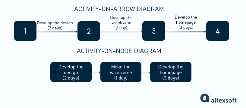
Activity-on-arrow vs activity-on-node
Important: As you build the chart, make sure that you accurately represent all the dependencies between tasks.
5. Identify the critical path
Sum up how long it takes to complete different sequences of dependent tasks, from the first activity to the last.
The sequence that takes the longest is your critical path – which determines the minimum project duration. Note that all the tasks along this path will have no slack time, meaning they can’t be delayed (otherwise the entire project will be delayed).
Important: If you have several task sequences with the same timeline, then there are several critical paths in the project. To meet the project deadline, you must manage all of them closely. Also, having a contingency plan in place and maybe some wiggle room for unforeseen delays is always a good idea.
6. Review and update
Revisit your PERT chart regularly and adjust it for any changes in the project – as we all know, they happen all the time. New tasks or dependencies may arise, or some activities may take longer to complete than initially planned.
Important: Be sure to monitor critical activities and recalculate the critical path if needed.
PERT chart templates and tools
Depending on the complexity of your project, you have several options for where to create your PERT charts.
Arguably, the easiest thing to do is draw the PERT diagram on paper or a whiteboard. It might work fine for small, straightforward projects. But still, in this case, it’s hard to maintain and adjust.
You can also draw the charts manually using any diagramming tool you like, i.e., PowerPoint, Adobe Express, Lucidchart, ClickUp, etc. Many tools have free editable templates that you can customize (such as Miro or SmartDraw).
You can also use the good old Excel – here are a downloadable ProjectManager template and a Hubspot template for Excel.
PERT chart disadvantages and alternatives: CPM, Gantt chart, Kanban boards, and WBS
PERT charts seem to be a handy tool, don’t they? Well, in reality, they have several major disadvantages.
They are hard to create and manage. For large projects with numerous tasks and dependencies, creating and managing PERT charts becomes too complex and time-consuming.
They don’t work well in Agile. Despite their complexity, PERT is considered an efficient scheduling technique in such industries as construction or engineering. But they mostly rely on the Waterfall project management approach with its rigid, upfront planning. On the contrary, in Agile software development, PERT isn’t effective because, again, it’s too hard to update, accounting for constant changes in requirements, tasks, etc.
They don’t account for resources. PERT charts focus on task duration and dependencies but don't handle resource allocation or capacity (e.g., budget, manpower, equipment, etc.). These limitations (also called resource constraints) are hard to visualize with PERT.
They are hard to interpret. Complex, intertwined PERT charts with thousands of tasks become totally unreadable for stakeholders, including team members and project managers themselves.
All these drawbacks make PERT charts less efficient – and less frequently used – than other techniques. So let’s look at what else is out there.
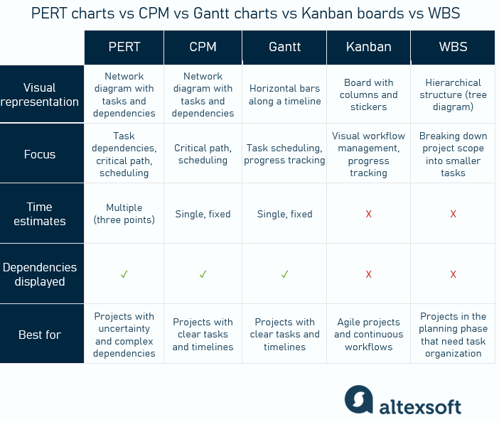
PERT charts vs CPM vs Gantt charts vs Kanban boards vs WBS
As Eugene Ovdiyuk, a PM at AltexSoft, shared, “A critical path is something that a project manager always calculates at the beginning of the project since it’s crucial to determine the project duration”. That said, we’ll start with a CPM.
PERT chart vs CPM (Critical Path Method)
PERT and CPM are actually very similar, so they’re often mentioned together as one approach. Both use network diagrams of activities, and both identify the critical path.
The key difference is in time estimates: Unlike PERT, which uses three-point estimates and incorporates risks, CPM relies on a single, fixed time estimate for each task. So it’s considered to be best suited for projects with predictable timelines.
PERT chart vs Gantt chart
A Gantt chart is a visual timeline that shows tasks as horizontal bars along a time axis. It helps to track task durations, deadlines, and progress in a linear format.
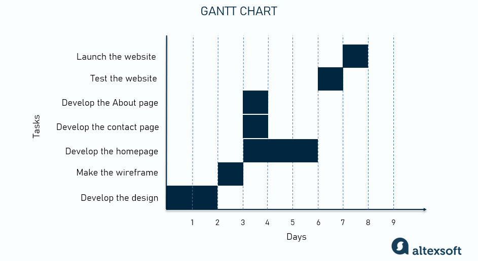
Gantt chart example
Gantt charts with their calendar-based view are simpler and more intuitive than PERT charts for visualizing the overall project schedule. Unlike PERT, which only includes the activity’s duration, Gantt charts clearly show the start and end dates. Dependencies can also be displayed on Gantt charts with arrows from one task to another.
Gantt charts are easier to create, update, and maintain, especially with today’s software tools.
As Sviatoslav Laha, a PM at AltexSoft, explained, “Gantt charts are the most popular tool as they provide a clear view of the project timeline and are easy to interpret for all stakeholders.”
Gantt charts are ideal for projects with clear task dependencies and schedules, where monitoring progress is key. But it’s also a good idea to use PERT and Gantt charts at the same time to have a fuller picture and visualize both dependencies and activity timelines.
PERT chart vs Kanban boards
Kanban is a visual workflow management method that uses boards and columns to track the status of tasks, such as "To Do," "In Progress," and "Done." It serves a different purpose than PERT, so they’re a bit hard to compare: Unlike PERT, which is mainly used for scheduling, Kanban doesn’t include any time estimates, but instead focuses on resource allocation.
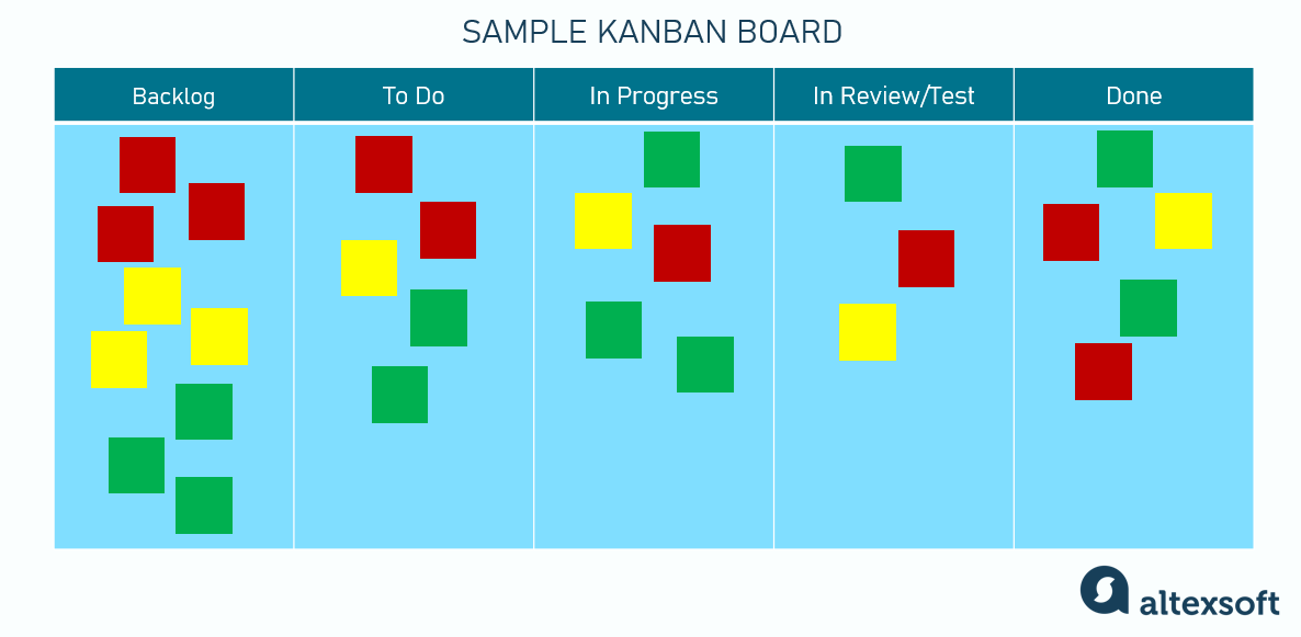
Kanban board example
Since it doesn’t use fixed timelines, Kanban is perfect for Agile projects and continuous workflows, allowing teams to focus on task efficiency and work in progress.
PERT chart vs WBS (Work Breakdown Structure)
WBS is a hierarchical approach to breaking down a project into smaller, more manageable tasks or components. It doesn’t show time or dependencies; instead, it’s used to organize the project by displaying manageable work units.
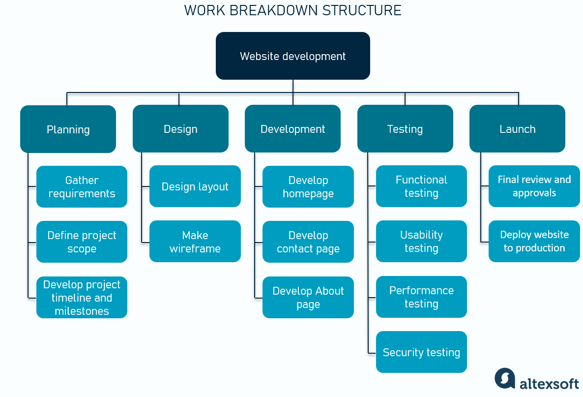
WBS example
WBS is essential in the planning phase as it provides a clear view of what needs to be done before project execution begins – and it’s actually a part of PERT that helps list all the project tasks.

Maria is a curious researcher, passionate about discovering how technologies change the world. She started her career in logistics but has dedicated the last five years to exploring travel tech, large travel businesses, and product management best practices.
Want to write an article for our blog? Read our requirements and guidelines to become a contributor.

