Three facts about today's tourism game you want to know:
- Despite worldwide app fatigue, 82 percent of travelers keep downloading travel apps. Why? Because they're irreplaceable across the border: offline content, handy smartphone functionality, and speed - compared to desktops or even mobile browsers.
- Experience reigns with 3 in 4 millennials preferring to spend money on a travel activity rather than a tangible item.
- Travelers book more often with apps that have good UX - just one unsatisfying experience will make 69 percent of travelers delete the app and never use it again.
Conclusion? Tourist activity apps that deliver intuitive, seamless and appealing UX convince travelers to book and do it repeatedly.
Previously, we explained how to connect T&A supplies to providers using different distribution models and even created a flowchart to help with provider choice. In this article, we’d like to give you a hand by gathering the best UX practices for T&A apps based on data about travelers’ habits and preferences.
How people travel using a T&A app
Google identifies the following stages in the travel customer journey:
- Dreaming: exploring destination options and ideas with no firm plans
- Planning: arranging the trip and things to do on the trip
- Booking: reserving a certain activity
- Experiencing: enjoying the booked activity and sharing it with others.
T&A apps support users through every stage of travel. The in-app journey starts with discovering places and activities in a foreign city. First thing, the app’s main screen shows them the most popular destinations and top-rated things to do there. A user can filter and categorize the search. Then, a user moves on to the planning stage clicking on activity pages and studying the specifics of the available options.
Once the decision is made, a user proceeds to booking and gets the ticket. Prior to the event, they are notified of the necessary details like the meeting point and time, etc. After experiencing the event, an app can send push notifications asking the traveler to spread the word and leave a review.
Speaking of app functionality, users would rather use one multifunctional app than several single-purpose apps. Supported by the findings of Moritz Christian’s survey, this argument dictates the need for a comprehensive T&A app covering all the necessary services.
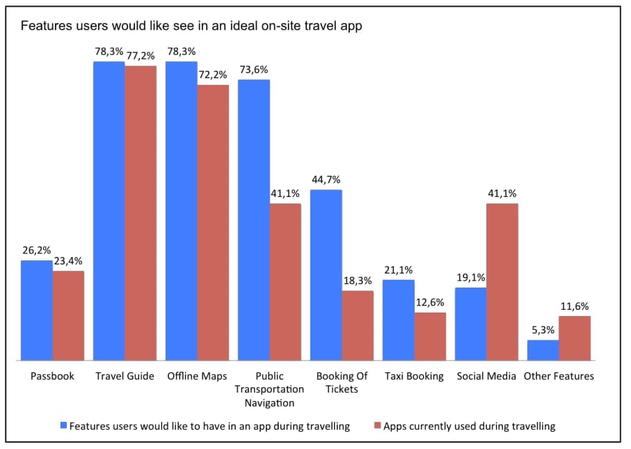
In-demand services in the travel industry, Source: Moritz Christian
According to the above research, users seek the following features in a travel app: offline maps, travel guides, and bookings. Interest in public transportation navigation features is arising. As the current state of these functions doesn’t seem to satisfy users much, it shows high potential for improving in-app UX.
Further, we’ll elaborate on the best UX practices for each stage of the T&A app journey minding user behavior patterns.
1. Discovery
Exploration options are among the first things a user bumps into when opening a T&A app. So, providing comprehensive search results can help win over users' hearts, encouraging them to browse the app more.
Give a city overview. Don’t you agree that providing local weather, time zone, currency, and a brief overview of the city is very welcoming? Having a so-called city profile, your app will retain customers more easily, as they won’t have to wander to other apps to check that info. A great idea would be to boost it with travel tips from locals that provide a view on the city from the inside - how to get around, where to save and where to spend, most atmospheric and hidden corners, etc. Show your users that you have their best interests in mind.
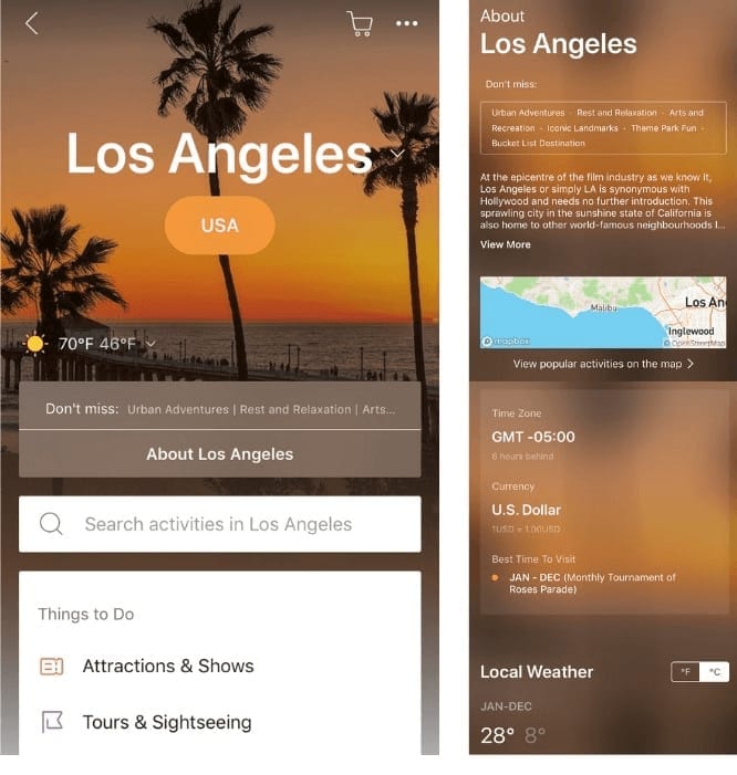
Klook app city profile
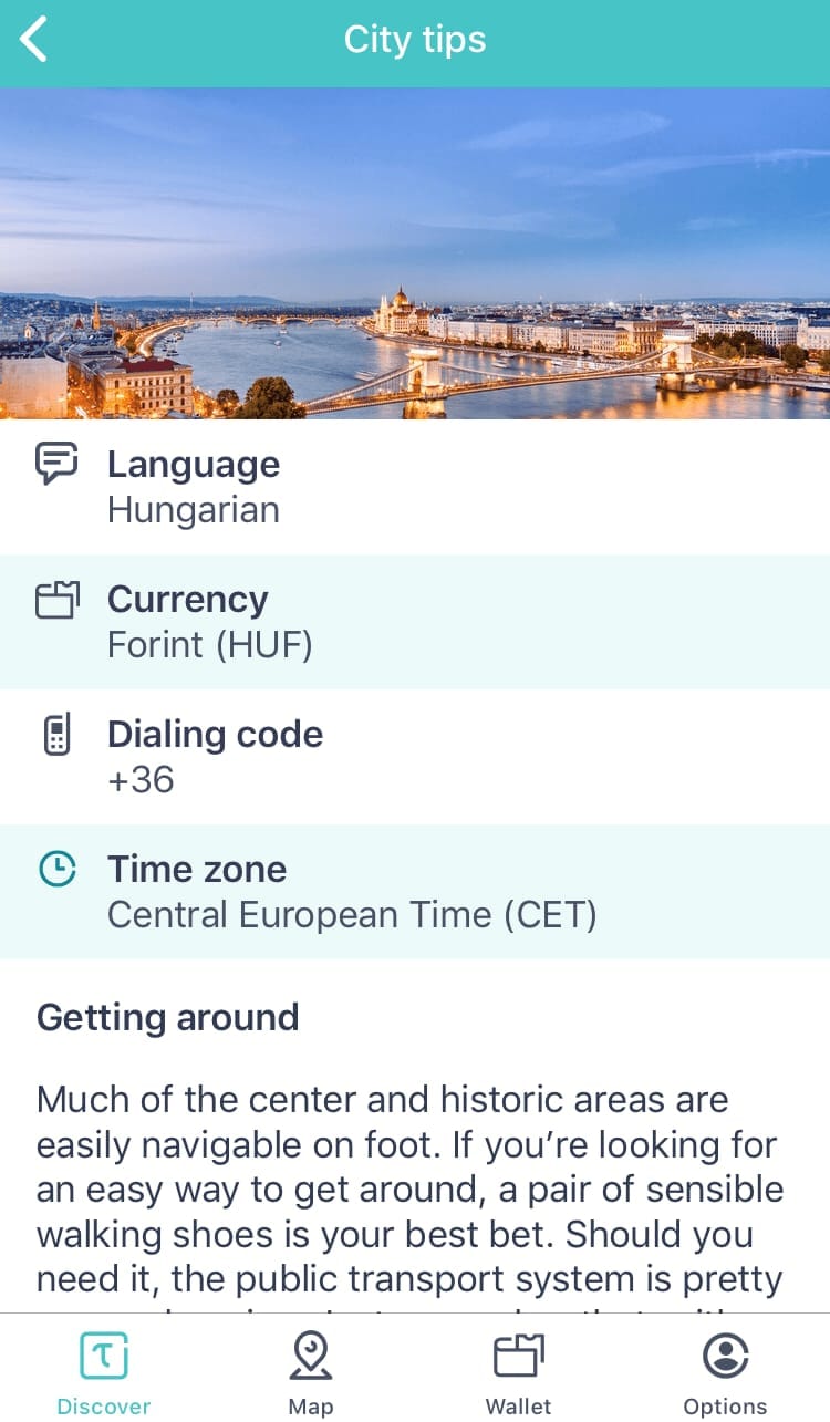
Tiqets city tips
Implement voice search. Voice-powered technology enables searching faster and hands-free. Around 40 percent of users utilize voice search once a day, which proves that travelers are now more comfortable taking advantage of bots and virtual assistants.

Mobile users of the future will make even more use of voice technology, so it’s worth equipping your T&A app with a bot or a digital assistant. As a time-saving option, you can integrate your app with existing voice assistant solutions like Google Assistant, Apple’s HomePod, and Alexa.
Add various filtering and sorting capabilities. Classifying tours and attractions in the app surely adds to its UX. Applying filters, categories, and criteria for sorting allows users to narrow down their search. Let’s consider each of these segmentation techniques in more detail.
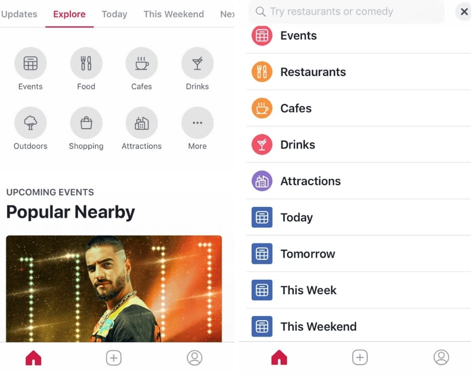
Facebook Local app filtering by time and event format
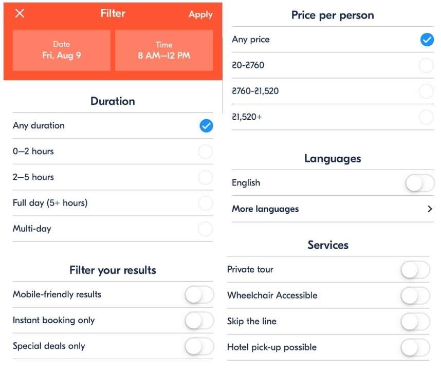
Various filters in GetYourGuide app
Filter variety isn’t the only thing that matters. It’s the way they are arranged and presented to the end user that allows for more intuitive usage. In their mobile UX case study, TripAdvisor shares their initial filtering design fails and how they were addressed:
- Intensifying the filter button coloring made it stand out from the background, and as a result, more users started applying it in their search.
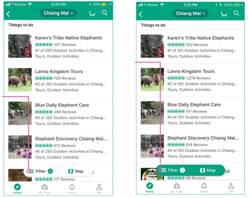
TripAdvisor UX improvements demonstration: Filter button
- Adding a feature that prioritizes results by ranking, reviews, and rating, or finds the one that best matches the picked criteria, enriched sorting capabilities.
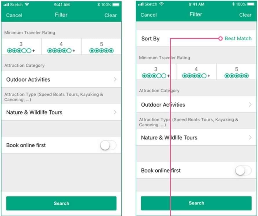
TripAdvisor UX improvements demonstration: adding a sorting feature
Switch buttons are not only easy to use but are also efficient in eliminating ill-fitting results.
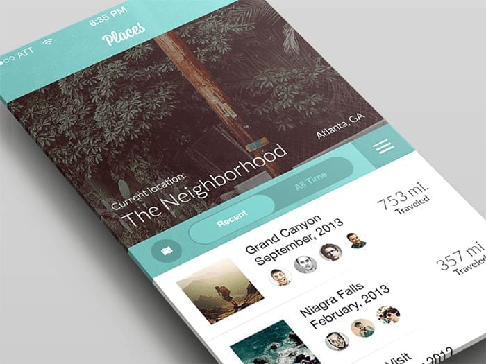
Recent and All Time switch button, Source: Regy Perlera
Mark skip-the-line options. TripAdvisor Travel Trend Report, 2018 lists skip-the-line tours among the fastest growing tours for US travelers in particular, allowing travelers to see more than just someone’s back. As skip-the-line tickets are in high demand, it’s reasonable to make it a stand-alone filter.
Segment tours into categories and collections. The focus of tours is changing, as they become more specialized and segmented. So while classifying the available adventures, it’s worth taking into account what users mostly look for. Cultural categories like food tours, cooking classes, historical and heritage experiences, and "off-the-beaten-path" tours are seeing bookings skyrocket.
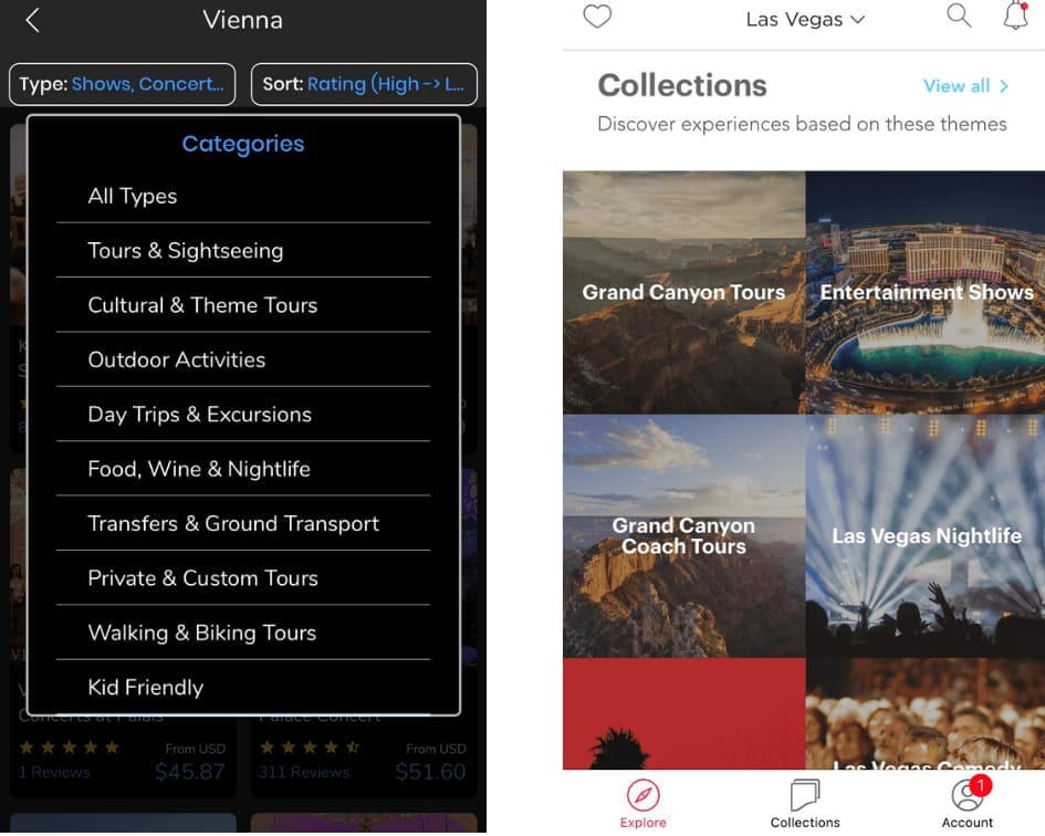
Tours & Travel activity types, Headout theme-based experience collections
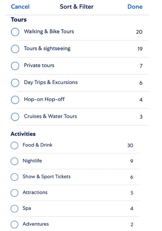
Expedia tours and activities categories
Personalize with interest-based offers. Over half of US travelers expect brands to provide them with information based on their personal preferences or past behaviors. A good personalization feature makes certain that search results specifically match traveler’ interests, budget, time, and companions if any. By asking who your users are and what they prefer, your app will be able to categorize the offerings in a more user-caring way. In our opinion, the following concept of a mobile app nicely visualizes this idea using glyphicons. In our dedicated article, you can learn how to customize travel experience using behavioral analytics and machine learning.
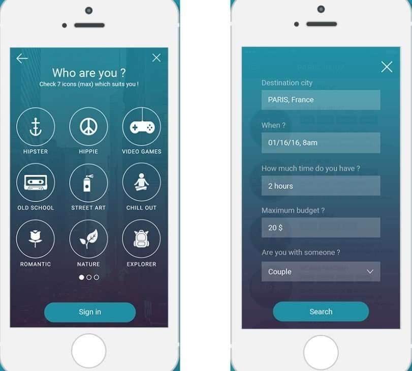
Examples of personalization filters, Source:Léo Sestier
Enable discovery through location. While deciding on a place to visit, a lot depends on its location. So exploring a city via a map can be very convenient. This allows users to efficiently plan their travel itinerary, as they can estimate distances between the tours and activities, and calculate how much time it’ll take them to get from one place to the other.
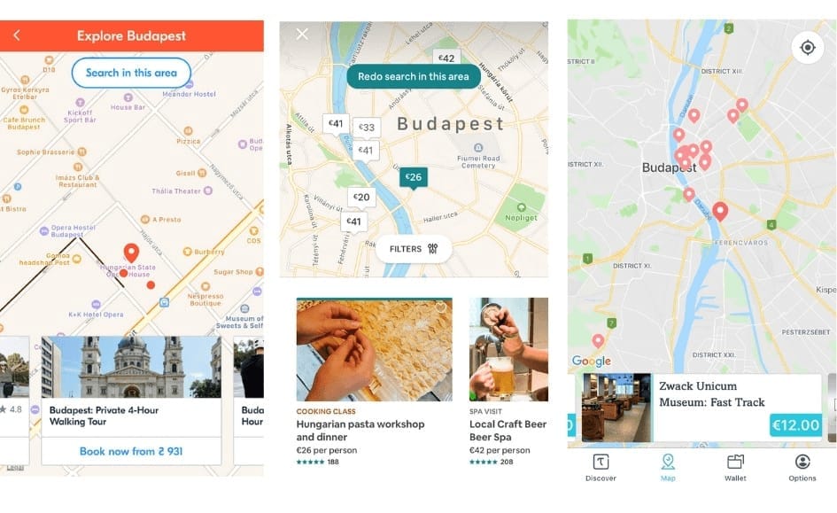
Search in the area by T&A apps
2. Activity page
Now, when a user goes to the activity page, the task is to get them to purchase a ticket. The related info needs to be clearly rendered. We’ll describe further how to design a tour page in a user-friendly way.
Provide a clear-cut tour description. Make sure you provide all the necessary info and more: like in this Tiqets Organ Concert description - it not only includes the starting time but also the time one should arrive there. Here’s a useful shortlist of the things to include:
- location and public transportation details
- whether cancelation is possible and if it’s free
- what kind of tickets are accepted: mobile or printed
- language of the event
- duration
It’s also important to mention any age restrictions or other requirements like a government ID, price inclusions and exclusions, any changes in the schedule, etc.
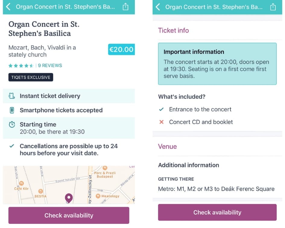
An example of a concise activity description by Tiqets app
Form the expectations. Tourists should know what to expect so that they're not disappointed if their expectations aren’t met. An activity description is a critical part of T&A app design. The best way is to keep it short and direct, using a personal, friendly tone and avoiding language complexity (as many tourists are non-natives). Having trouble with phrasing? Check out the Hemingway tool that rephrases sentences making them easy-to-follow.
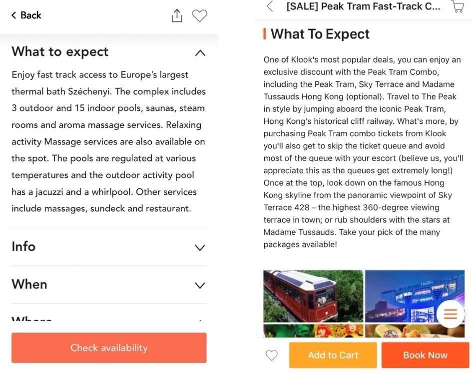
Activity description in the Musement and Klook apps
Provide insider tips. Locals won’t steer travelers wrong. So, including their pieces of advice in the experience description will help your app gain user trust.
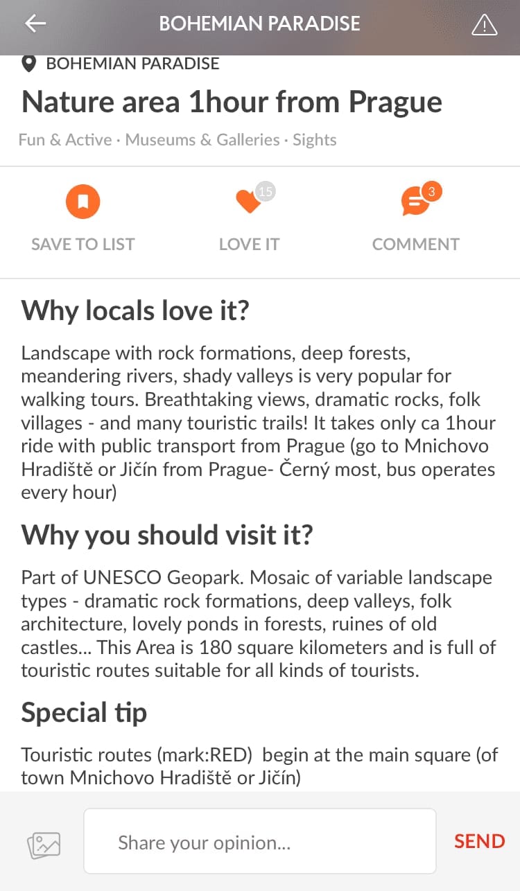
Source: Like a Local app
Provide an interactive presentation. A monolithic text can scare off potential customers. So, keep them entertained even while they’re studying the adventure details. A nice touch would be to present the adventure in the form of a timeline with images illustrating each stage.
The design below by Piotr Adam Kwiatkowski demonstrates a 45-day journey. But this approach can be easily applied to describe a one-day tour.
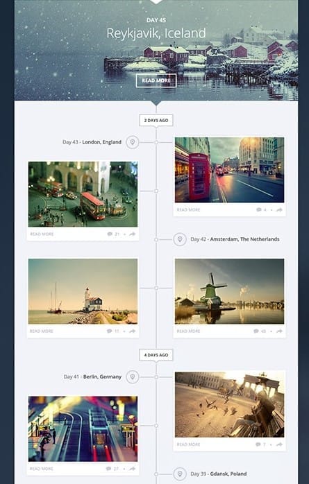
Timeline by Piotr Adam Kwiatkowski
Add guides profiles. As Airbnb keeps promoting activities hosted by locals, it’s becoming a trend. Tourists long for real, native experiences which only townspeople can offer. That’s why it makes sense to give them an opportunity of choosing among the guides the like-minded one.
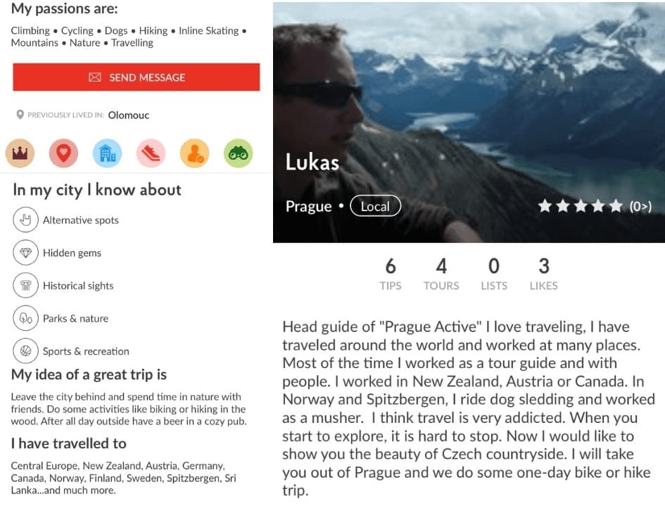
Source: Like a Local app
Allow users to leave feedback. Reviews are an important aspect that influences the booking decision. This feature will allow your app to inspire confidence in customers and build a loyal audience. So if you’d like to find out how to encourage customers to rate your services, leave reviews, and take surveys in your app, read our article on user-generated content in travel.
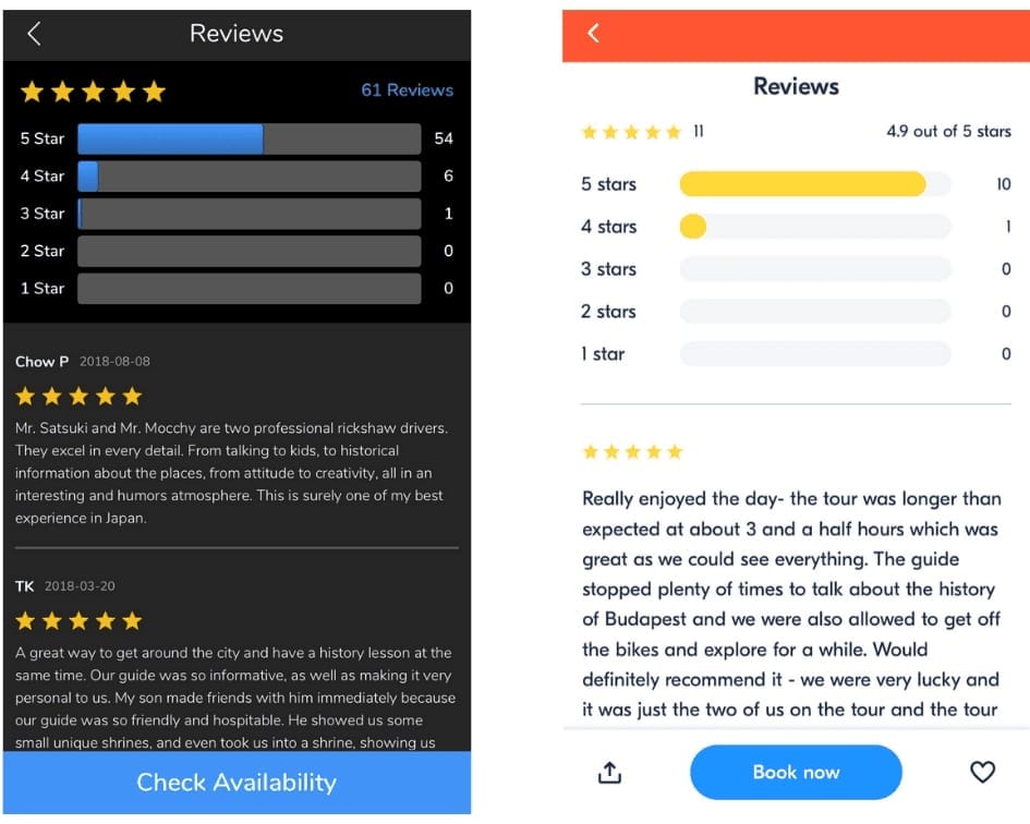
Reviews in Tours & Travel and GetYourGuide apps
Facilitate last-minute decisions. As travel excitement increases upon arrival at the destination, many T&A bookings take place last-minute. So your app needs to be ready for handling late bookings.
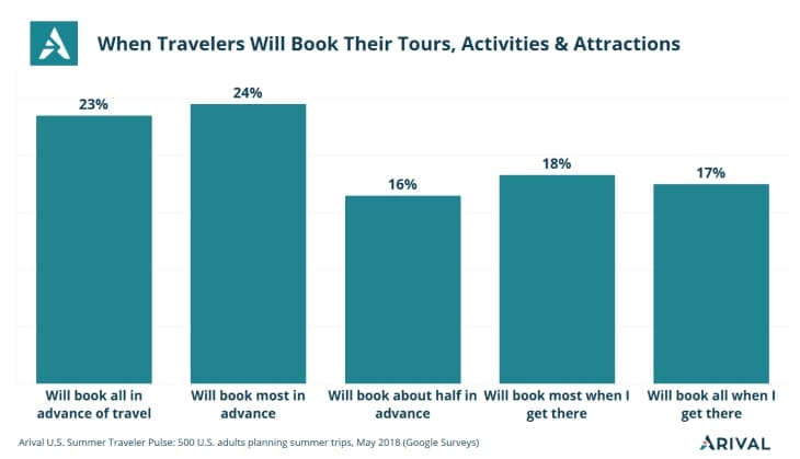
T&A booking statistics, Source: Arival
To optimize last-minute decisions - warn users of the upcoming dates and tickets left before they embark on the booking process. This way they won’t end up finding out that what they want is sold out or unavailable.
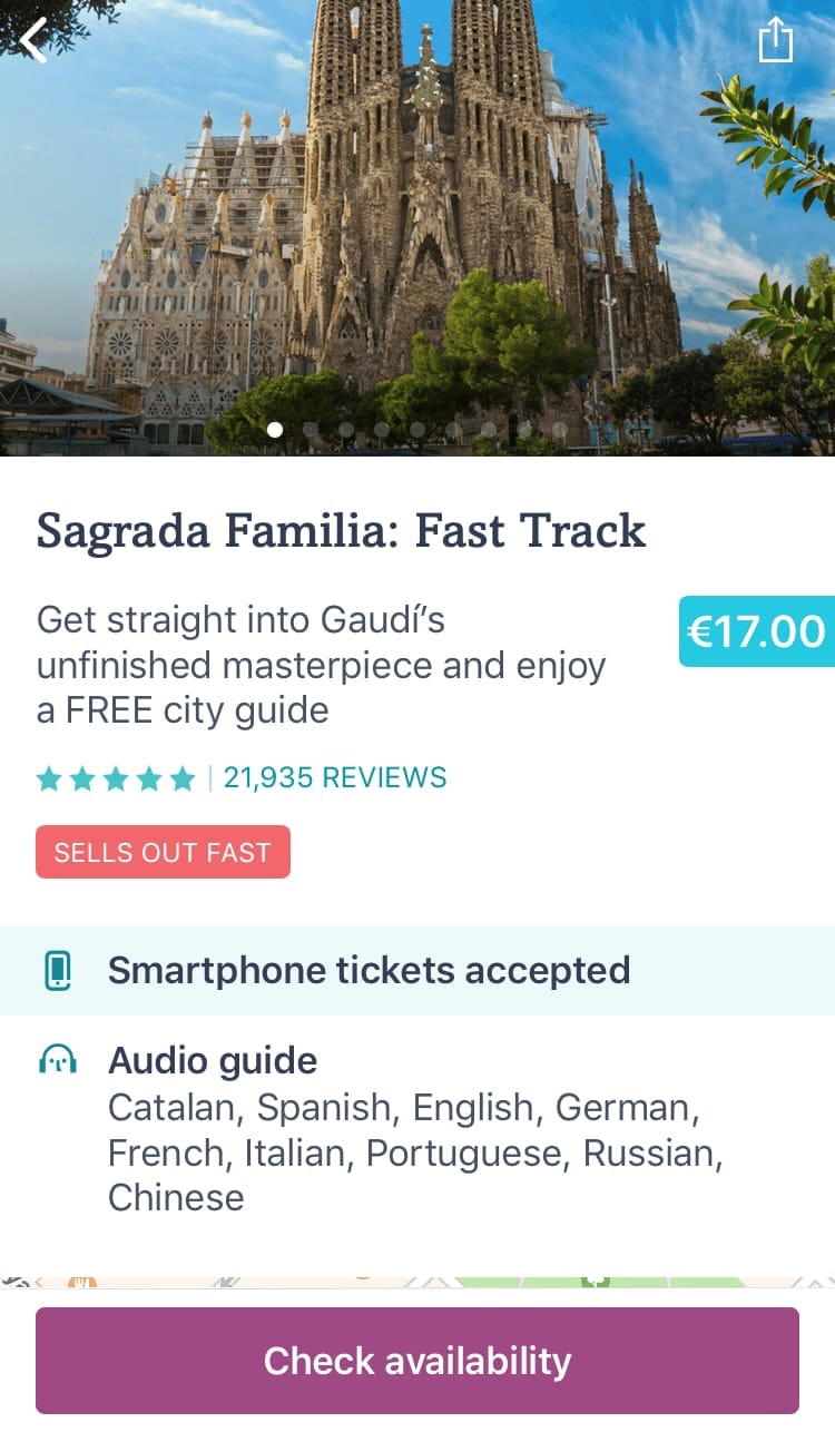
Tiqets app tour page with a “Sells out fast” note and a “Check availability” button
Another thing that matters here is the speed of booking. It can be improved by simplifying navigation (easy-to-use menus) and shortening the booking process to a few clicks.
3. Ticket reservation
Heading towards the finish line in the T&A app journey, users seem to be sure about their T&A selection. However, a confusing and unwelcoming booking process can turn away many potential ticket buyers at the point of purchase. To avert that, here are some handy UX booking practices for seamless booking.
Simplify the registration process. Given that mobile users are the most impatient ones, save their time on registration by allowing them to associate their app account with a phone number, or enable sign-in with email or a popular social network like Facebook.
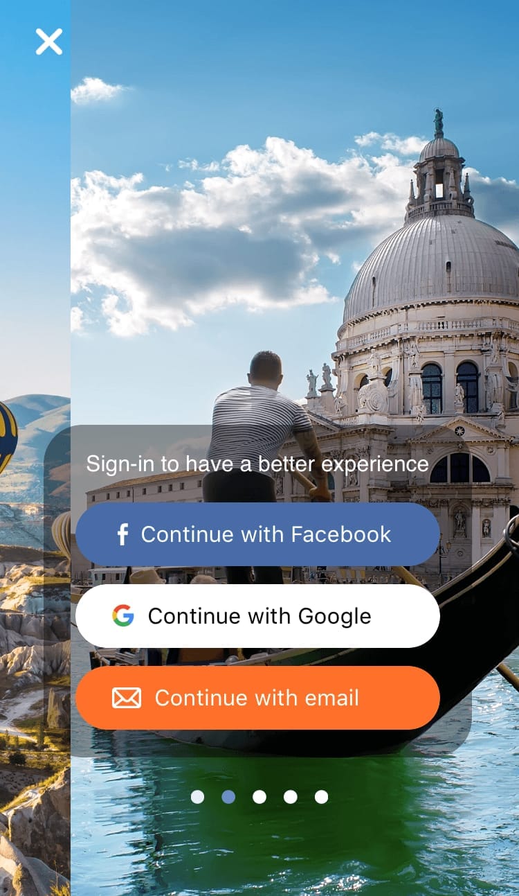
Sign-in page in Tous & Travel app
Provide several payment options. After going through the entire checkout process, the last thing a customer expects is not having their payment method supported. So, don’t let them down. Payment must be fast, seamless, secure, and in line with what was advertised elsewhere in the app.
Besides credit and debit card payment, mobile users are likely to use the following forms of digital wallet to complete their online transactions: PayPal, Google Wallet, Visa’s V.me, and Master Card’s Masterpass. For more info, check our article covering online payment gateway and ways to integrate it. Don’t limit your users in terms of payment options, because it’s easier to download a new app than to set up an entirely new payment method.
Shift to mobile tickets. Digital tickets, especially displayed in a mobile-friendly manner, free users from having to print out the ticket. Then, in museums and on tours with barcode scanning technology, they can just show a barcode on their smartphone that will be scanned for entrance.
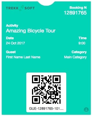
Mobile ticket template, Source: TrekkSoft
Include simple ticket management. Besides sending electronic tickets to user emails, allow them to store the tickets in Apple Wallet or Google Pay for easy access on the phone.
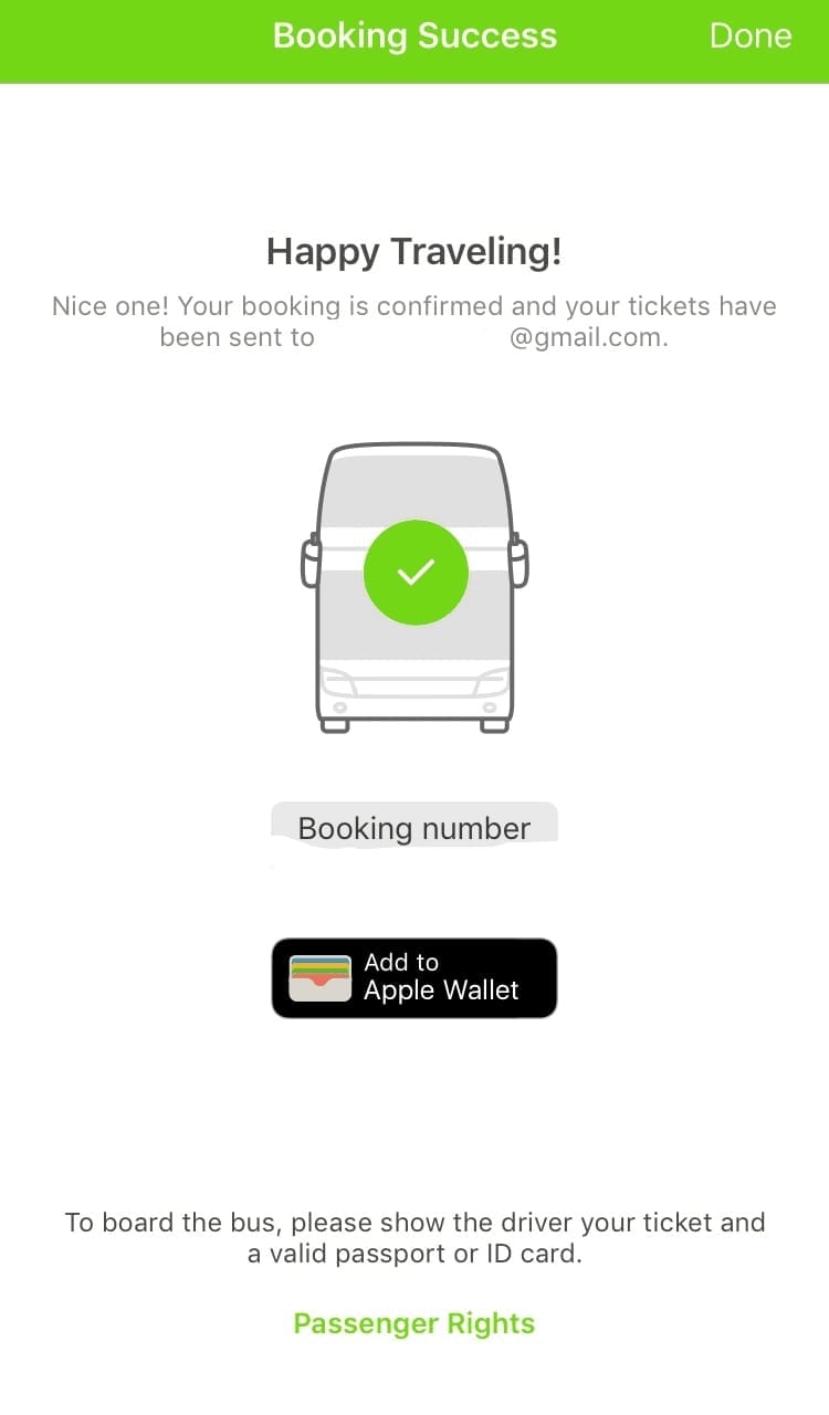
FlixBus booking confirmation
Alternatively, you can provide customers with e-tickets in PDF format. Then, after purchase, they can save PDFs on the phone and secure their entrance. So, in case, a physical ticket is still required, users will be able to print out the digital ticket.
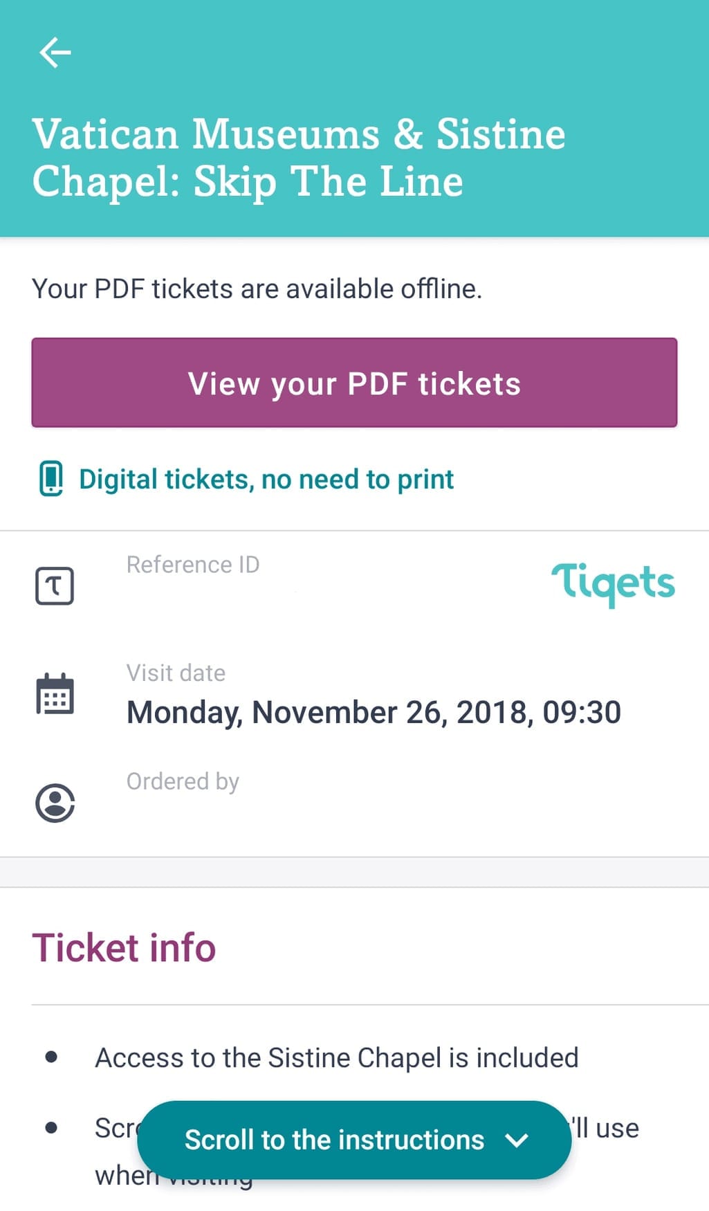
In Tiqets a ticket is available in the in-app wallet and can be opened in PDF
4. Navigation
On arriving in an unknown city, travelers need to find their way around somehow. Thus, having mapping features incorporated in your T&A app is a necessity. The goal is to make map orientation for users as handy as possible.
Make downloadable offline maps. People are often out of Internet reach while traveling. Don’t let your users get lost. Generate an itinerary with the ability of offline navigation. Go further and optimize your downloadable maps with efficient routes that have all the attractions mapped out for travelers convenience. This way they don’t have to do it manually.
Include public transportation navigation. As users name it among the most demanded functions, tapping into it will definitely benefit your app. To begin with, you can expand your T&A app with public transport tips. Look how Google Trips does it.
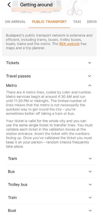
Google Trips s public transport description
Then you can take advantage of public transportation info. Go to our article to choose a transportation API for integration.
Get creative with maps. Experimenting with map design can help your app stand out in a crowd. A good design example are 3D maps. Being more illustrative, 3D map views improve user’ topographical orientation and ease locating places and sights on the map.
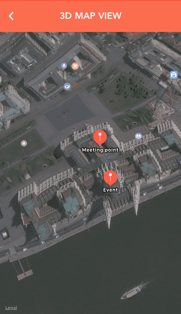
Location of the meeting point and the event in 3D, Source: Musement app
Urban Walks app is eye-catchy thanks to its hand-drawn maps for travel tours. This kind of map presentation creates a special atmosphere and stirs up interest in the tour. So this practice is definitely worth noting.
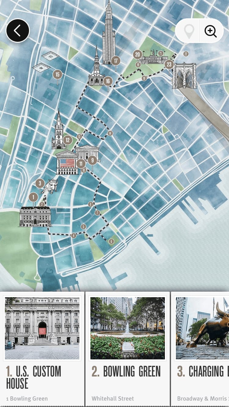
Manhattan downtown map, Source: Urban Walks
Implement tour tracking. Although tour guides still use flags or even umbrellas to identify themselves so that their tourists don’t get lost, being able to track the tour trail on your app’s map is way more productive. You can visually highlight meeting and drop-off points, stops along the way, etc., to make your visitors feel more comfortable.
5. Notifications
A good UX practice is to ask users for permission to send notifications at later stages of app use. Explain to a user the benefits they’ll receive by allowing notifications. Make sure your app pushes are friendly, personalized, and timely.
Make smart push notifications. Users will allow notifications more frequently when the pop-up appears after the discovery stage. While enabled, send the pushes in the local user time zone during the app usage peaks and don’t disturb during sleeping time. Personalize notifications by adding the recipient’s name or any kind of specific information like “Hey, you have something in your cart,” then go for it! Push notifications can serve as reminders when the booked event is approaching, or as a call to action notifying of upcoming discounts, for instance.
Incorporate email newsletters. Once users are signed up, you can segment them based on their behavioral data and further send them targeted emails that might inspire them for a new trip.
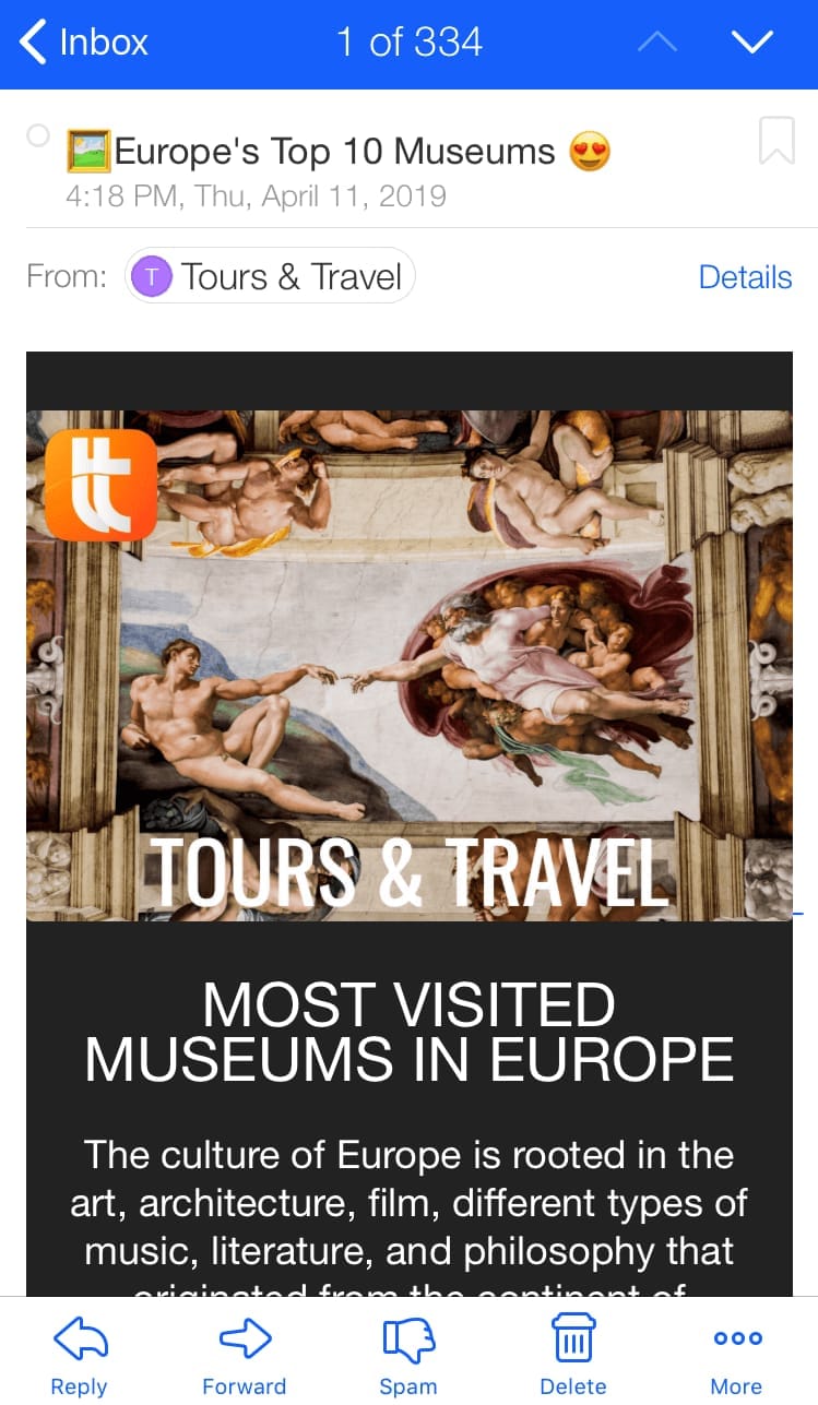
Tours & Travel newsletter
Allow for customer support access. Don’t ignore the importance of direct communication with customers, as it can significantly increase T&A bookings. Facebook’s 2018 survey shows that people feel more confident about the brand they can message directly.
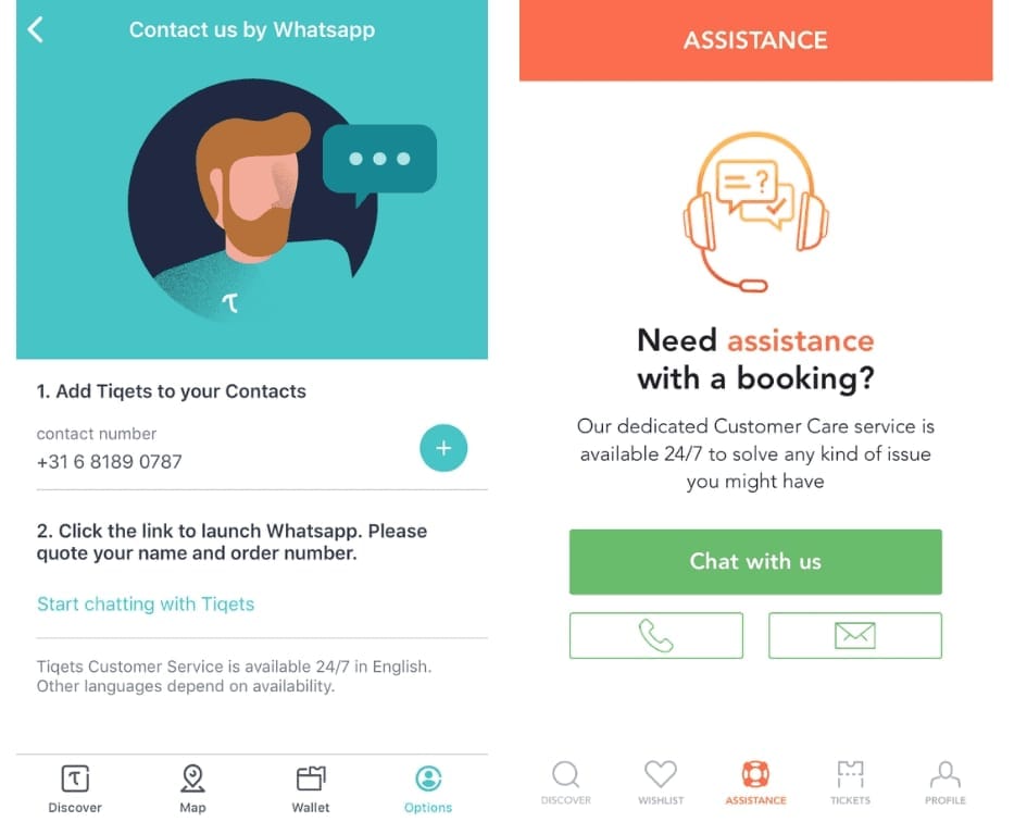
Tiqets customer service through WhatsApp Messenger and Musement in-app customer support chat
Final thoughts
In the end, we’d like to emphasize the importance of accurately defining your app’s target audience. Are they traveling on the cheap or do they have money to burn? Hungry for action? Not big fans of long walks? Families, solo travelers, or maybe LGBTQ tourists? Their preferences and interests differ, largely driving your app’s UX.
One more thing, don’t create a monster trying to be to everyone's liking. Too many options can be overwhelming, confusing, and negatively affect the whole experience of using the app. Define the target user, set the key components of your T&A app, and track its progress toward UX-related goals.
Read more about tour operator software and how travel companies benefit from automation in our dedicated post.

