This is a guest article by Jodi English, designer from Ampjar
As a SaaS company, every day at work poses a problem: How do we reconcile our vision for our product’s user experience with how our users actually interact with it? As much as we’d like to fully indulge in creativity and explore our wildest ideas about what a modern user experience should be, we always need to weigh that with what the data shows. As Donald Norman so eloquently said in his book, Living With Complexity: “We must design for the way people behave, not for how we would wish them to behave.”
And let me tell you right now: That’s no easy task. Thankfully, we have a great UX team that’s developed a highly-effective and efficient workflow to tackle this never-ending challenge. In this post, we’re going to give a bit of insight into our process, and more precisely, what tools we use to get the job done. We’ll follow the journey of a UX design from the ideation phase through to the wireframe, prototyping and design steps, before finally reaching the development stage.
About the data
We rely heavily on Heap and Google Analytics to provide the user data that informs our design decisions. While neither of them are UX tools in their own right, they do tell us things like how a user is interacting with a new feature, which landing page designs are converting the best, and whether or not a new menu item is being seen, all of which help us determine what’s working and what’s not.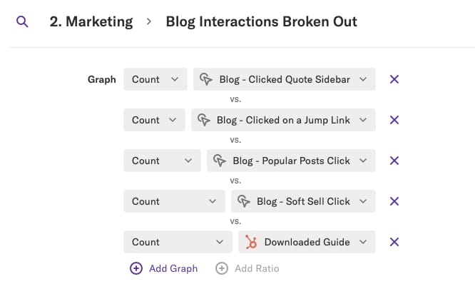
Heap interface
Ideation tools
Every UX idea we implement begins with two questions: What are our user’s goals and how can we make achieving them more streamlined? Once we’ve homed in on a part of our app that needs improvement or a new idea we want to implement, we begin with our first tool, Google Docs.
Google Docs
Google Docs is probably pretty familiar to anyone reading this article. In a nutshell, Google Docs is Google’s version of Microsoft Office with one big bonus: at its core, it’s built around collaboration. Unlike a traditional Word doc or PowerPoint slideshow, Google Docs and Slides are hosted online, and multiple users can edit the same doc in real-time, which makes it far easier to brainstorm and collaborate on new ideas.
Typically, we start with a general idea of the feature we want to implement and create a simple flowchart that elaborates on its functionality. Google makes it easy for multiple team members to make changes in real time and combined with Slack and Zoom (more on those later), it’s really a breeze to start hacking out ideas as if everyone’s in the same room.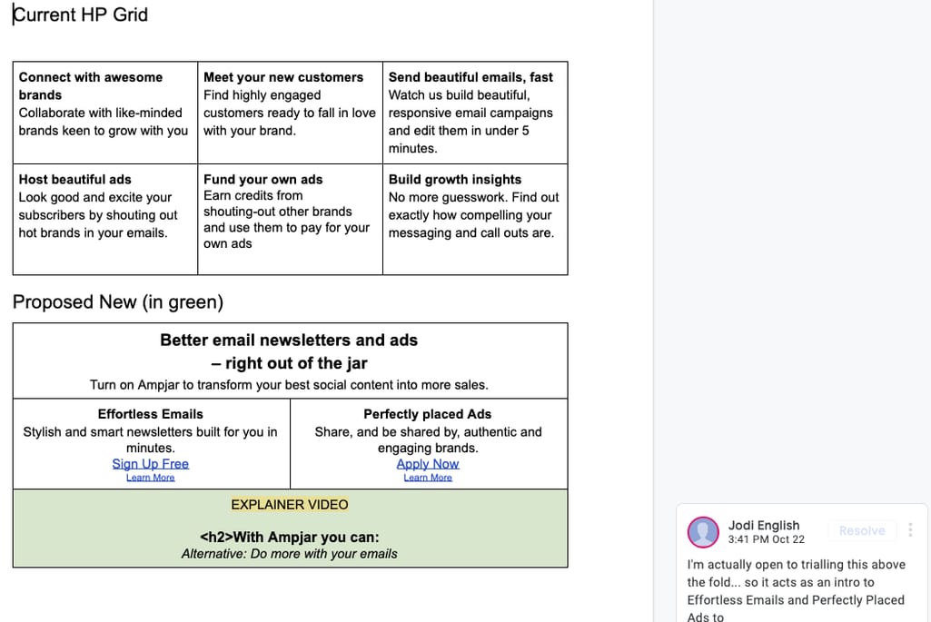
Brainstorming and collaborating in Google Docs
Miro
After getting our basic ideas down, we shift to a tool called Miro, basically an online whiteboard and post-it notes. While we don’t spend too much time on it, we use it to get a quick draft of the wire flow down and make notes of any points or questions we need to discuss. This way, when the team finally meets together in person, everyone will be going into the meeting with a solid idea of what the main objectives are and which points still need the most work. Although we typically use this before in-person meetings, there’s no reason you can’t use it afterward as well.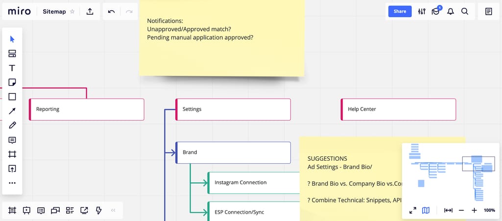
Using Miro for notes
Post-its
Yes, you read that right and no, that’s not the name of a new productivity app. When it comes time to meet face-to-face to discuss how to implement a new feature, we find it helpful to do things the old fashioned way: organize our UX flow with Post-it notes.
While there are a lot of digital tools that could help us achieve the same thing, there’s something about the tactile sensation of bringing our ideas into the real world that gives us a boost. In fact, there’s been some recent interest in the creativity boosts that tactility can provide, so it seems we’re not alone on that front. Plus, on a purely practical level, it’s quicker and easier for team members to get in a room together, write or draw ideas on some Post-it notes, pick them up, and move them around than it is to do the same thing in most software.
At this point in the process, we’re striving to map out the core user journey. Take a look at the picture below to see what we mean.
Post-its make a quick and easy way to collaborate on an idea with a very low barrier to entry
Once we’ve got the Post-its set, we take a picture and import it into a Google Doc, where we’ll all make comments about how our design could be improved.
Wireflows, design, and prototyping tools
Sketch
Once we’re past the initial planning and ideation phases, it’s time to start bringing our vision to reality. Our first stop on that journey is to use Sketch, a vector graphics application, to start coming up with wireframes, screen designs, and user flows.
Sketch is similar to other vector graphics programs like Adobe Illustrator, but we prefer Sketch because the entire program is focused on UI and UX design. For example: Sketch comes with a UI component library that includes all the most commonly used symbols like hamburger buttons, arrows, etc. Another huge benefit of Sketch for UI/UX design is that by using the Zeplin plugin, we can export the CSS code of any designs we make in the software to help expedite the development process.
When using Sketch, we’ll generally start by making a large wire flow that connects all the screens we’re adding and clearly shows how a user would navigate the whole experience. Then, we begin fleshing out each individual wireframe to come up with the elements we want to use.
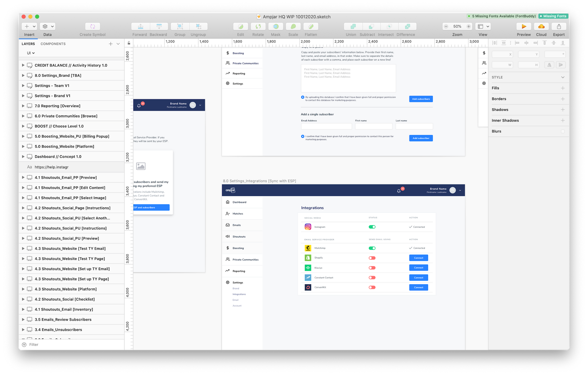 UI created in Sketch
InVision
InVision helps us take our wireframes to the next level. While Sketch only allows still and non-interactive mockups, InVision lets us add motion and minor functionality that simulates a real web page or application. InVision even lets you import Sketch files directly.
While the type of interactivity you can add with InVision is fairly minimal, it gives us a quick, functional demo that we can send around to different team members and start evaluating whether the UX will work in the end. Overall, it’s a useful way to begin prototyping and get a taste of how certain design ideas are likely to pan out once implemented.
Interactive prototype made in Invision
Development tools
Sketch and Zeplin
When we’ve fully worked through an idea, we return to Sketch to create the final iteration of the design. Because of Sketch’s focus on UI design, it’s easy to keep elements consistent using a component library.
Plus, with the ability to easily export the CSS of our designs via Zeplin, we find that Sketch is the most efficient way to kick off the development process. Zeplin allows our dev team to open up the designs and view the CSS of every element on the page, greatly easing the transition from design to technical implementation. The ability to grab code snippets from Sketch designs using Zeplin goes a long way towards ensuring consistency between the original design and the final implementation.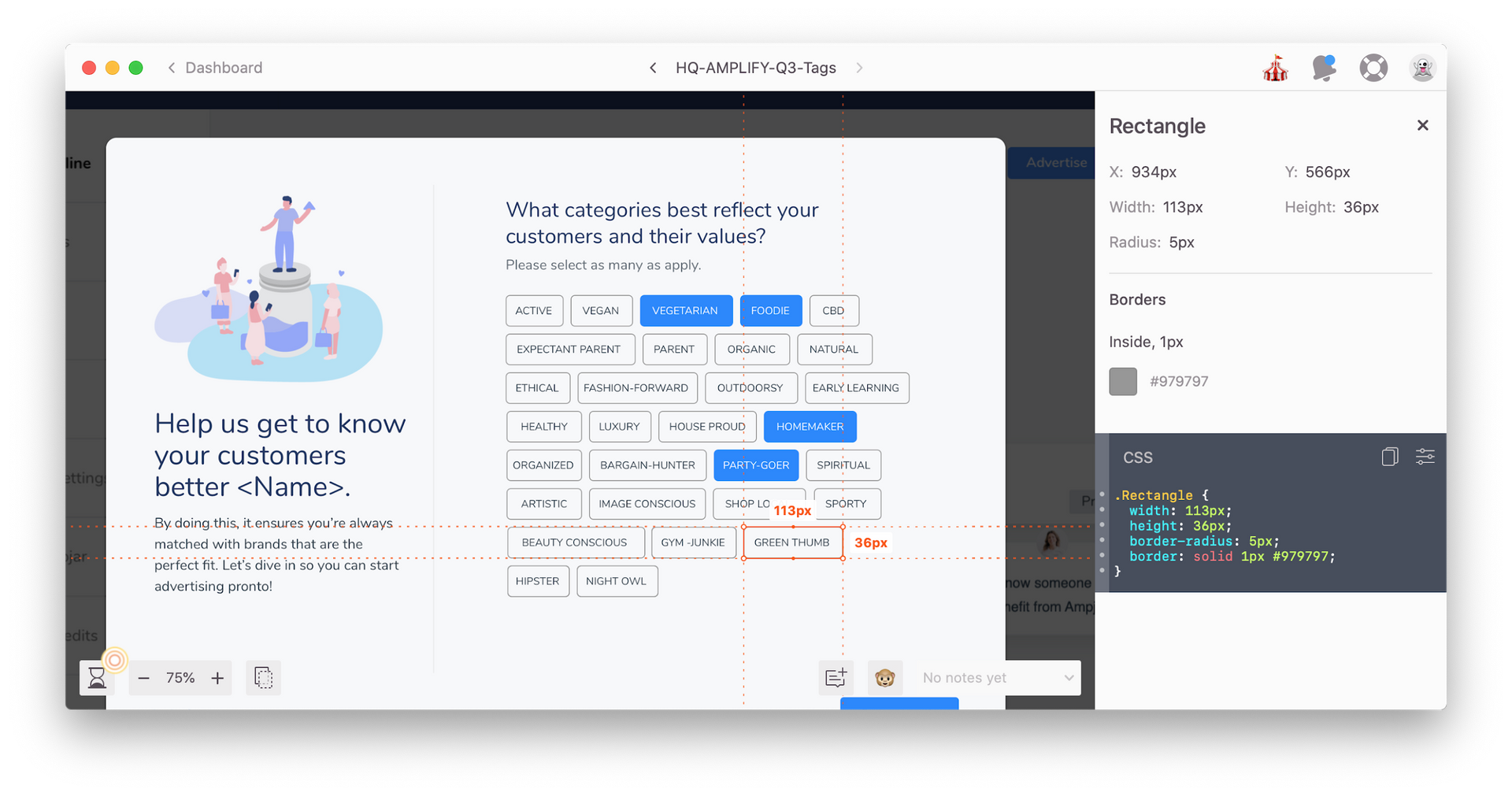
Copying CSS code directly from Sketch using Zeplin
Slack, Zoom
While these two tools might not have a direct impact on the construction or development of Ampjar’s UX, they aid our communication, which is a vital part of the process. Generally, we’ll use Slack, a popular chat app, for quick comments and feedback. Because of the program’s channel structure and real time chat, it’s easier to organize our discussions with Slack than it is with email.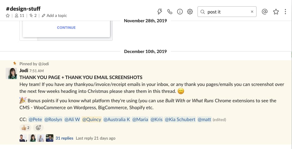
Slack chats are easy to use and navigate
When we need to get a bit more in-depth with our feedback or discuss a more complex issue, we use Zoom to set up a video call with team members, where we can really hash out our ideas as if we were in the same room.
Jira
To help keep things organized and to brief our dev team, we use Jira. Jira is pretty similar to Asana or Trello: There are a few different boards representing different phases in a project (like “to do,” “in progress,” or “done”), and users can move specific tasks through those boards to indicate the task’s progress. There’s a whole review of different project management tools like that if you’re interested. Such functions help all team members stay up to date about the current status of every piece of the UX puzzle.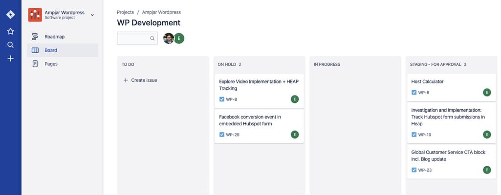
Using Jira for task management
While we made an effort to separate each of these tools into the phase we use them in for the sake of clarity, in reality there’s a lot of overlap. We use Slack and Zoom throughout the entire UX design process, for example, and Jira can be just as useful at the start of the design process as at the end.
Hopefully, this foray into our process helped to provide a bit of insight into how we get things done at Ampjar. And, hopefully, it’ll give you a boost of inspiration and some new tools that can help you conquer your own UX challenges.
 Jodi is a multi-disciplinary designer in Ampjar. She's passionate about strategic branding and web design for brands, startups and entrepreneurs who want to make a positive impact. She’s known for her love of colour, bingeing true crime and having far too many tabs open.
Want to write an article for our blog? Read our requirements and guidelines to become a contributor.
