An app that requires thousands of moves before you get what you need or a website with messy navigation are cut from the same cloth – the cloth of a bad user experience. Sure, we no longer need to use a command-line interface to interact with software. But it doesn’t mean that every modern digital product is the apex of user experience creation.
A website or an app, no matter how functional, must be understood by a user. If you want to create a digital product with great UX, you can’t skip thoroughly researched, in-depth learning to know your user, and the process of graphic interface design. And you definitely need designers to govern these processes. In this article, we will learn about the people who create a relevant encounter: user experience (UX) and user interface (UI) designers. Also, we will find out where each of them fits into the user experience design process.
Interface design: what to start with?
So, what is a good UX? Steve Krug, a famous UX designer, defines it succinctly, "Don't make me think!" This quote became his book’s title on user experience in web development. It means that the best UX is the most intuitive UX.
Trends in UX design are constantly changing – just check our article on UX design trends for 2018 – but the main principles remain. Information architect Peter Morville defined good user experience as useful, usable, desirable, findable, accessible, credible, and valuable. He illustrated it in a UX honeycomb.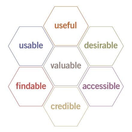
User Experience Honeycomb Source: Semantic Studios
When you start building a new digital product or plan a website redesign, you must understand your users first to fill all the сells of this honeycomb. Then, you need a plan.
UX design itself is the process of planning the future product, while UI puts these ideas into the user interface. UX design and UI design are often confused, or considered to be one and the same thing. But they are not. Let’s make it clear and define them.
What is UX design – The why of a product
UX design is the process of creating products that provide meaningful and relevant experiences to users. It entails research and analysis of all customer-related information, an organization of content, and sorting so a user can find what they’re looking for quickly and easily.
The goal of UX design is to create a digital product a user feels comfortable with. This embraces the way a product functions and a user operates it: content hierarchy, clear navigation, and functionality of the visual elements. But the most important is that all this helps solving user’s problem. Also, a design must be created in compliance with technical and business specifications.
What is UI design – The how of a product
UI design is the process of making software or computerized device interfaces with a focus on looks and style. UI design makes achieving user goals aesthetically pleasing because of a UX designer’s creativity. So, we can consider UI an integral part of UX. But user interface design is mostly oriented on the how of user experience design.
Peter Morville states, “… why and how are inseparable,” so we have two bounded processes, oriented towards the same goal: bring the content to a user in the most comfortable and pleasant way.
On the job market, we often see ads with the title “UX/UI designer.” Companies prefer hiring professionals who can complete the whole design of a product, making it responsive and visually appealing. This happens partly because the owners want all for the same price, and partly because some just don’t understand which stages and tasks UX design embraces. In fact, UX design embraces UI design as one of the stages. We’ll examine this process as well as the functions and deliverables of both types of designers.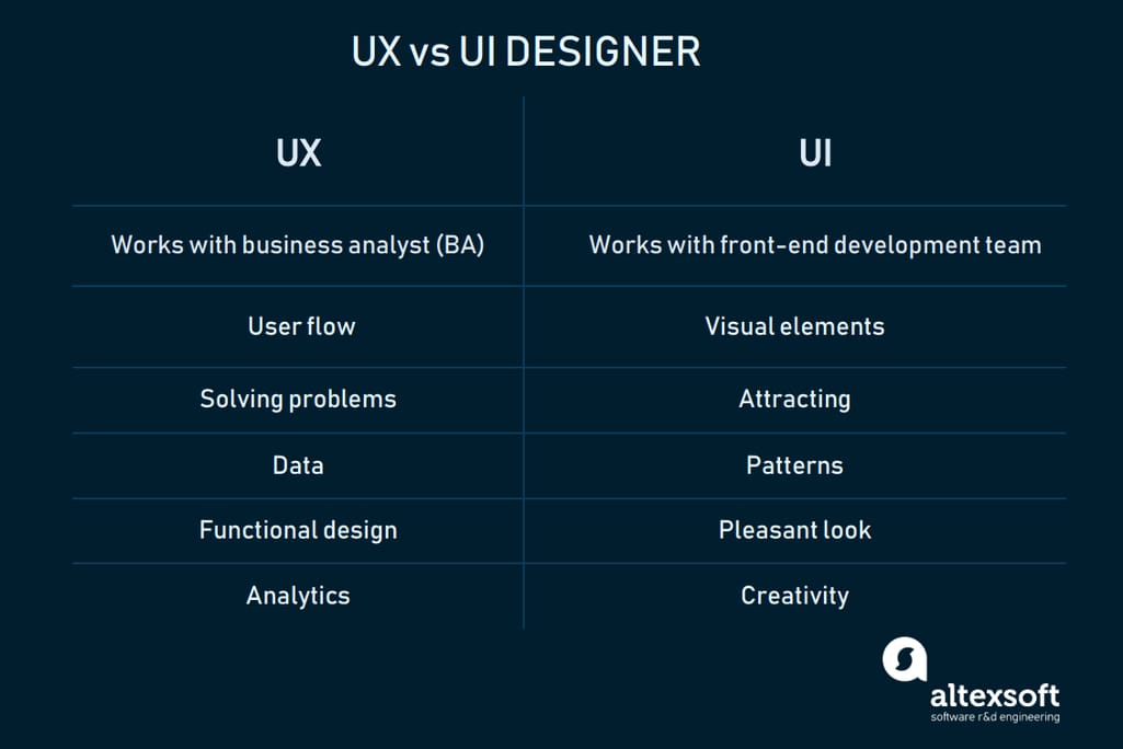
UX design specifics and deliverables
The whole process of UX design is oriented towards creating the best user experience by eliminating the information load. It consists of two parts:
1) Define a user’s problem, and
2) Find the ways and means to solve it.
The first part is a UX designer’s responsibility, understanding the user and his/her needs considering how to steer someone to achieve particular goals. A UX designer serves as a guide for a user. A UI designer, on the other hand, is someone who paves this path with visual elements and is largely responsible for the second part. You can see a basic sequence of stages in UX/UI design flow with its participants and the deliverables below. Nevertheless, it can be different depending on a project.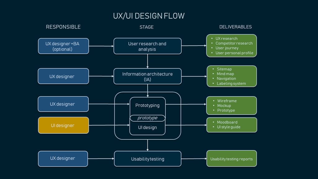
UX/UI design flow
When designing for web, desktop, or mobile products, a UX-oriented team must always keep in mind why the user needs this or that exact element. The user is the main character of this story, so a good UX design must be user-oriented and emotional: a large part of the first stage of a UX design is devoted to exploring a user.
User research and analysis
Key roles: Business analyst, UX specialist
Everyone’s goal at this stage is to understand the user and his/her pain points. This is when a UX designer works along with a business analyst to do market research, create a competitive analysis, conduct user and stakeholder interviews, record user observations, and define the user journey.
Main deliverables: UX research, competitor research, user journey, and user personal profile.
A UX designer is the person who may work in cooperation with a business analyst (BA) if needed. As a business analyst gathers requirements from stakeholders and potential users and frames them into software documentation, a UX specialist translates it into the product's information architecture. In many cases, the role of BA is taken by a UX specialist or they collaborate on the same deliverables. The UX designer starts with competitor research to define general features of a future product.
Competitor research. This process allows a UX designer to analyze the best and worst examples of competing products, as well as common patterns used in similar products. Based on this, a team can implement the best features of a competitor’s app or website in their own, enhance those features, and find out the issues users have with similar products with an eye to eliminating them. The next stage is UX research, which aims at closer user analysis.
UX research aims at gathering information from users applying a variety of qualitative and quantitative methods, including interviews, contextual inquiries, diary studies, personas, card sorting, and usability testing. UX research helps the team to understand the user and the way to improve his/her experience.
One of the most popular and important UX techniques is card sorting. The information – names of items or features – is written on the cards and given to a group of users to assign categories to them. The card-sorting results will be used in a sitemap or application map later. It’s a fast and effective research method because it helps understand the general logic of the target audience and then categorize information and features accordingly.
Based on the UX research data, a designer can create information architecture – which we’ll address later – the user persona profile and journey.
The user persona profile is a document that illustrates an archetypical model of a person who will interact with the product. This concept is similar to the concept of a buyer persona, which we described in our article on starting a SaaS business, but represents a larger group of users. Usually, this person is given a fake name, but the information from a profile is generalized information, based on customer interviews. It includes the following basic information:
- Demographics
- Goals and needs
- Pain points
- Behaviors
- Quotes (usually by real users)
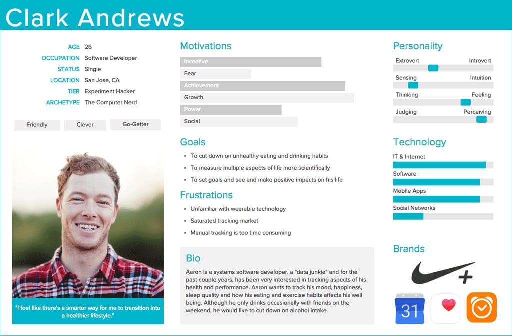 User persona profile example Source: Keep it usable
The user journey or user flow is a powerful UX tool that visually illustrates the whole step-by-step user experience with a product. It’s drawn by a UX designer and depicts the sequence of actions that a new or experienced user performs before starting and during use of a product. User journey can be illustrated with text and arrows or in storyboard form. Below you can see a user flow that we created for Niftie, the Australian ride-sharing company.
 Niftie user flow
These deliverables shape the UX, because they define user wants, needs, and behavior, so a team can build a product with satisfactory functionality. Data, gathered at this stage, becomes the groundwork for the next stages of UX design.
Information architecture (IA)
Key roles: UX designer
As a result of UX research, a designer can create the full structure of a digital product. Information architecture is everything for UX. The main goal of IA is to classify the content in a way that a user can understand, enabling the user to easily find what he/she needs. As a result of card sorting, a UX designer can structure the content of a website or application. There are some patterns for information classification:
- Hierarchical – from the most important to the least important items,
- Sequential – step-by-step, where all the items are interdependent,
- Matrix – a way of content organization empowering the user to decide how to arrange the content,
- Alphabetical – in alphabetical order,
- By relation - based on roles and relations between the items.
Main deliverables: sitemap, mind map, navigation, labeling system
The basic outline of a product structure is represented in the form of a sitemap or a mind map.
Sitemap. This artifact displays the relationship between pages and content hierarchically.
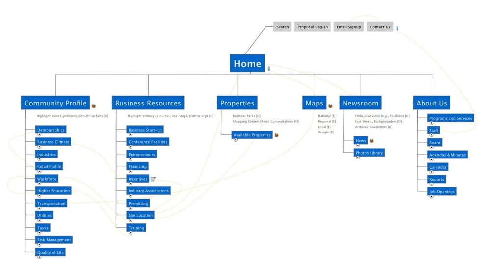 A high level sitemap Source: UX.Stackexchange
Mind map is a tool for building IA based on relations between different entities of a digital product with a detailed description of functionality. Below you can see an example of a mind map that we created while helping to build a corporate travel management solution for Cornerstone Information Systems.
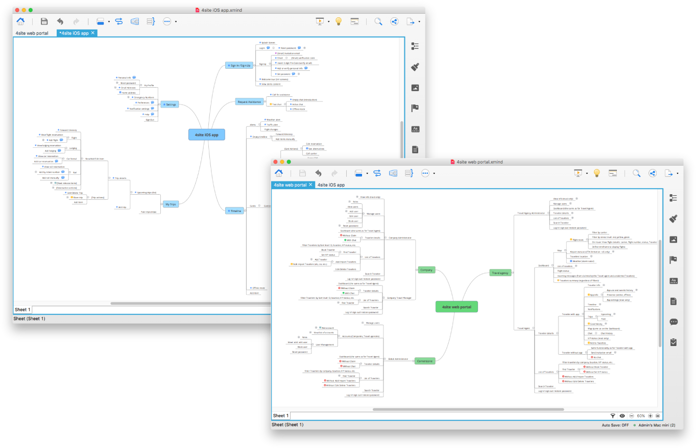 Mind map for Cornerstone information systems website and iOS app
After the structure is ready, a designer can also label the categories and develop interface navigation.
Labeling system. Labels are the short names of the larger categories displayed on the interface.
Navigation is an interface element of a product that guides a user through the content. It is defined by a sitemap and consists of main navigation, service navigation, and footer or universe navigation.
As a result, a UX designer has a basic content structure that serves as groundwork for the next stages. With this structure, a UX designer can develop the skeleton of a product.
Prototyping
This part of UX design plays a significant role in development because the deliverables are tested by the users and are shown to stakeholders. A designer creates wireframes, mockups, and prototypes. Those artifacts represent a page layout and look similar but perform different functions: They represent a product at different stages of development of UX/UI design.
Main deliverables: wireframe, mockup, and clickable prototype
- Wireframing is an initial process of design layout creation. It’s an outline that represents the main groups of content and shows the general features of an interface. It contains gray boxes, lines, buttons, and sample text. The purpose of a wireframe is to outline how the interface works without getting into graphic details, allowing the team to assess the basics of user interaction early. Also, the simplicity of a wireframe allows a designer to rework some features of a layout. Wireframe can be static or interactive. Static wireframe can be sketched, even on a paper, while interactive wireframe allows a person to click through it and test the functionality.
 Foursquare static wireframe Source: Namika Hamasaki
For mobile devices, designers may use a UI skeleton. It refers to mobile app UX design. UI skeleton is a visual representation of a mobile graphics interface, where the loaded content is represented in form of bare spaces. Basically, it’s a wireframe for mobile devices. The goal of a UI skeleton is to understand that UI is functional and user-friendly.
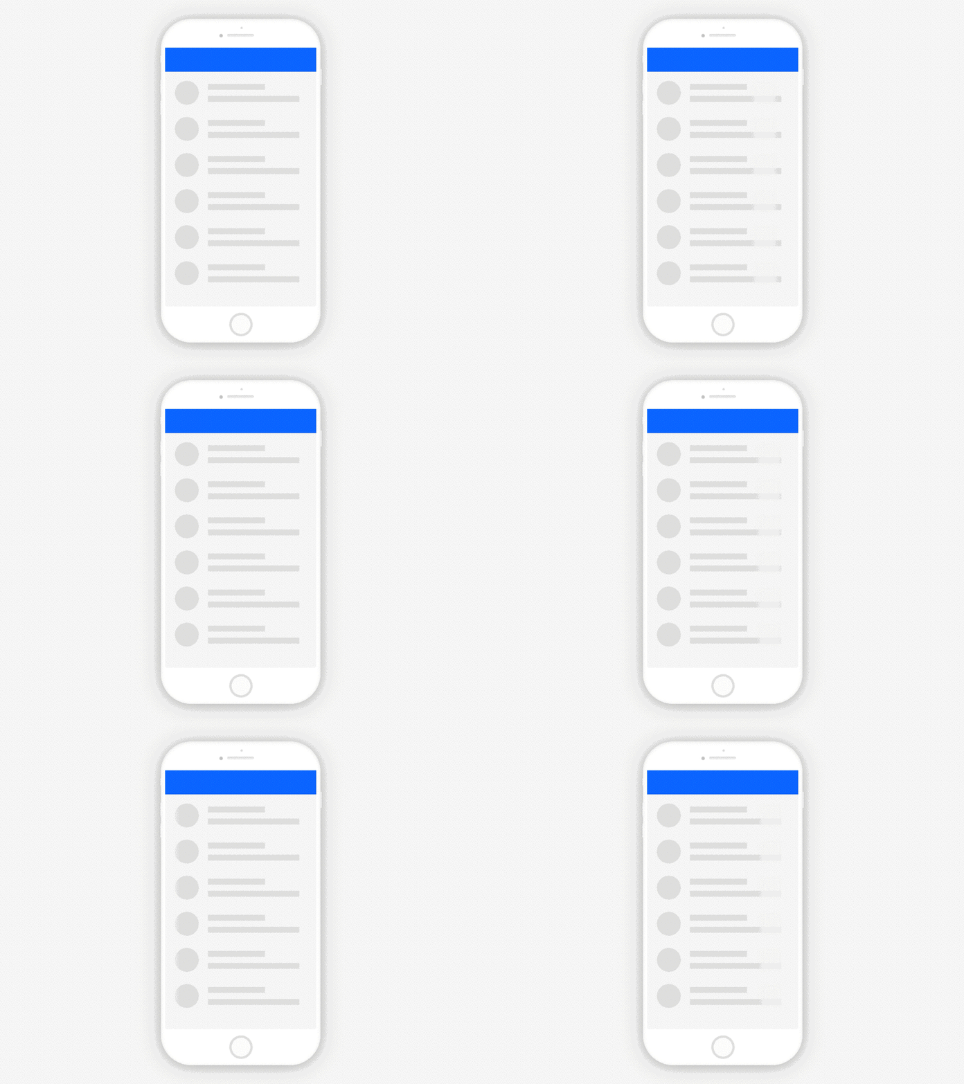 UI skeleton Source: Scribble by Qianxu Zeng
Usually, as soon as a wireframe is ready, a UI designer starts working on a graphic interface design, basically signifying entrance into the UI design process. This is where the UI design stage proceeds parallel with the prototyping stage that we describe below. The next element of a UX design is a mockup, which already has the look of the final product.
Key role: UX specialist
- Mockup – This represents the design in more detail, an illustration of how the product screens will look. It’s a midpoint between a wireframe and a prototype, having colors, logos, pictures, and usually UX writing instead of the real content. The purpose of a mockup is to show the product’s look. Mockups can be low- and high-fidelity, static or clickable, single or multi-page. Low- and high-fidelity prototypes differ by the level of detail of an interface.
 Foursquare high-fidelity mockup Source: Namika Hamasaki
Key role: UI specialist
- Clickable prototype – This is a final model of the future product. Unlike a mockup, it has all visual and functional elements, content, and may work like the final product, e.g. you can click on buttons, input values into fields, etc. So, designers, stakeholders, and users can test it, simulating real interactions.
Wireframes, mockups, and prototypes can be created via open-source or paid prototyping tools. Here are some of them:
- Sketch – a vector-based design and prototyping tool for Mac users.
- InVision Studio – a free prototyping tool with animation, compatible with all types of devices.
- Figma – a tool for online UI design, prototyping and testing.
- MockFlow – a platform for UX design that allows a UX designer to create wireframes, style guides, and sitemaps.
- Moqups – an online tool for UI prototyping, wireframes, mockups, and diagrams.
- Lucidchart – a tool for diagrams and wireframes.
- Balsamiq – a web app with a desktop version for wireframes and mockups
- Wireframe – an online tool for wireframing and mockups
For those who prefer paper wireframes and mockups, there are paper templates.
Prototyping is the stage of UX design that is shared between UI and UX designers. Some claim that creation of wireframes and mockups is the responsibility of a UX designer, while a UI designer works on a prototype. Still, a UI designer works on the visual part of an interface and implements it in a prototype. Let’s look at what this stage consists of.
Key role: UX specialist
UI design system
Key roles: UI designer, front-end development team
When a final layout is ready, a designer can work on graphics. Wireframes and mockups are the skeleton, while graphics is the flesh of a digital product. At this stage, a UI designer starts developing the graphical interface of a digital product. It entails drawing icons, choosing typography and color palette, as well as setting UI guidelines.
Deliverables: Moodboard, UI style guide
Before a designer starts to actually design the interface, he/she needs some inspiration. Moodboard is a great tool for this purpose. It allows a designer to find the ideas for visual design. It consists of different images that inspire the final color palette and overall style of an interface.
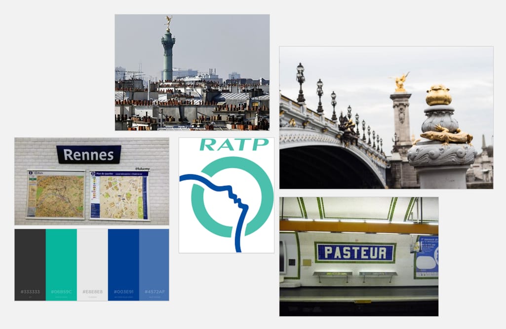 Moodboard for interface of a Paris metro ticket box
Here’s an example. If you have ever been to Paris, you probably know that buying a metro ticket is no pleasure. Greg Jeanneau, a UX designer, created a Paris metro ticket box interface to simplify users’ lives. Greg used views of Paris and logo of RATP, Parisian public transport operator, as an inspiration for the color palette, and the typography of Parisian metro stations for user interface elements.
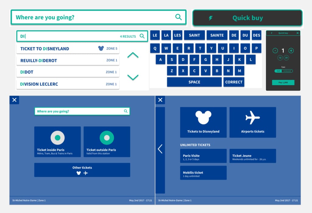 User interface of Paris metro ticket box Source: Greg Jeanneau
All the decisions on visual design are documented in a UI style guide.
UI style guide. It’s is a document gathering all elements of your brand’s visual style. The main aim of this document is to maintain consistent design and facilitate the work of designers and front-end developers. A style guide standardizes the grid system, layout, color palette, typography, iconography, logos, imagery, and considers accessibility requirements.
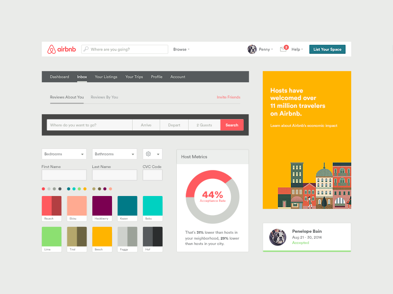 Airbnb UI toolkit Source: Derek Bradley
When all these deliverables are ready, a front-end development team can implement the results in a prototype of a graphic interface and finally test it. While developers implement design features, a UI designer tracks this process.
Usability testing
Key roles: UX designer, front-end development team, UI designer
As soon as the first prototype is ready, a team can test its usability. Usability testing is different from QA testing or A/B testing. Its main goal is to get feedback from real users of a product to understand how intuitive the interface is, and whether the user can achieve their goal with the product.
At this stage, the UX designer records and analyzes the results of testing. There are a few different types of usability testing:
Comparative usability testing is used to compare one product to another, for example, a competitor’s, or it can be similar to A/B testing when two versions of a design are compared and the best one is chosen.
Explorative usability testing is usually conducted before the release. It’s focused on finding the blind spots and gaps in a product design that were not seen before, but are observed by the users. This testing facilitates improvement of the product before it reaches the market.
Usability evaluation occurs after the product is launched and all necessary improvements are made. That’s when the product is tested again to make sure that the changes accommodate a positive and intuitive user experience.
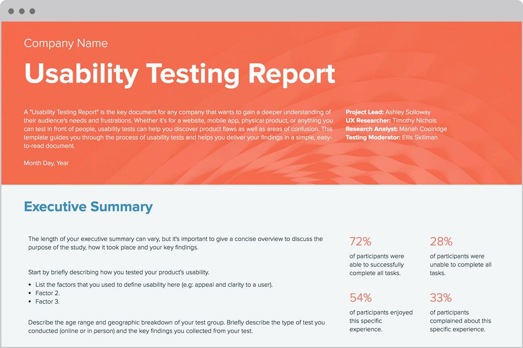 Usability testing report template Source: tensio
After user testing, designers can add necessary changes in UI or UX design, and then assign a product’s design to the developers’ team for implementation. But the work of UI and UX professionals doesn’t stop after the release. They keep their eyes on the product.
Support and further development
So, a product is released, and the users find it suitable. That doesn’t mean that UI and UX designers are no longer needed. They remain working on UX/UI design, constantly updating the product according to set design system and UI style guide.
Further testing and evaluation. New content and functionality usually require changes in an interface to improve key performance indicators. This means that the team may reiterate usability evaluation, suggest additional implementations of certain screens, and run A/B tests to define the best performing version.
Improvements and new features. A UX designer must learn which new features the users need and decide how to place them within an existing design. A UI designer changes the design according to the new requirements, and supervises A/B or multivariate testing.
Redesign. In case a product needs redesigning, the team repeats the whole process from the very beginning: conducting new UX research, creating a new sitemap and wireframe while the UI designer contributes a mockup and invents prototypes, etc.
While the stages and deliverables that we’ve described are the most common ones, the approaches to UX/UI creation differ. For instance, we recently discussed the Design Sprint approach by Google Ventures, which is a timeboxed process of making initial assumptions, creating a prototype, and testing with real users. And sometimes, various deliverables are omitted to make the design stage shorter.
Final word: Can one person be a UX/UI designer?
UI and UX are inseparable. But does that mean that you can hire a UX/UI designer, a single person who can complete the whole process of UX design from A to Z? UX and UI design are parts of a whole, and it may seem reasonable to assign the whole process to one person. But the problem is that UX design requires a wider skillset and more experience than just graphic design. While a UX designer might be able to create prototypes and work with the UI team, a UI designer must have the skills to perform thorough user behavior and marketing research, and have user empathy to create a product with an intuitive interface that the users will love and use.
Photo by Harpal Singh on Unsplash
