Imagine this situation: You visit a website and spend time looking for the information you need. You click one link, then another, and again, and again… But you come up empty – you can’t find anything useful. Whether you’re a product owner or designer, you don’t want your website to be a maze with nothing but frustrating blind alleys.
Information architecture helps to avoid this. It handles the chaos, creating a clear structure for a website, an app, or a program. In this article, we’ll explain how you can build superb information architecture.


Information Architecture: From Chaos to Clarity
What is information architecture?
When you arrive at a new place, you need something to guide you. If you’re spending a weekend in an unfamiliar city, you have to consult a map. Then you use street signs and addresses on buildings to reach your destination. It’s the same with any unfamiliar location: You don’t want to waste time and get lost, so you need guidance.
Information architecture (IA) is the science of structuring content as it is applied to news websites or blogs, online stores, booking apps, downloadable software, etc. The goal of information architecture is to classify the content in a clear and understandable way and arrange it according to relations between the content pieces, allowing users to find what they need with less effort. Not applied solely when creating a product from scratch, IA is used in redesign.
Information architecture is a part of interaction design that considers content, context, and users. This means that user needs, business goals, and different types of content must be taken into account while structuring a product’s information.
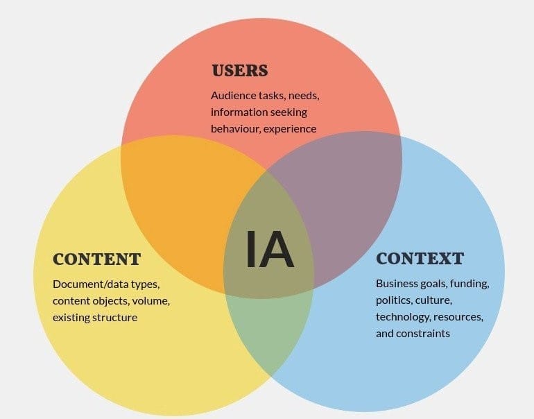
Main components of information architecture. Source: Lucia Wang
Usually, information architecture design falls under the care of UX and UI designers or an information architect. To avoid confusion, let’s briefly go over the differences between these similar terms.
Information architecture vs UX vs UI
IA, UX, and UI are closely related and sit under the umbrella of product design concepts, but they are not the same. Check the definitions.
UX or user experience is what users feel when they interact with the product. So, the aim of UX design is to make a product practical, useful, attractive, and so on — in other words, to create a positive experience from using it.
UI or user interface is an important part of UX since it deals with the visual aspect of the product and the interactivity behind it. So, UI design directly impacts UX since appealing graphics and easy, intuitive interaction are integral parts of a smooth user experience.
IA or information architecture refers to organizing and labeling content to make the product usable and understandable, while enhancing user experience. So, in a way, IA design is a foundation of UX.
To make it clearer, here’s an analogy. You can compare IA with the skeleton of the product that supports and holds all parts in the right place. Then, UI is the skin or appearance that other people see as they interact with the product. And UX is the emotion that is created as a result of such interaction.
Here’s an excellent visualization of the interrelation of these terms.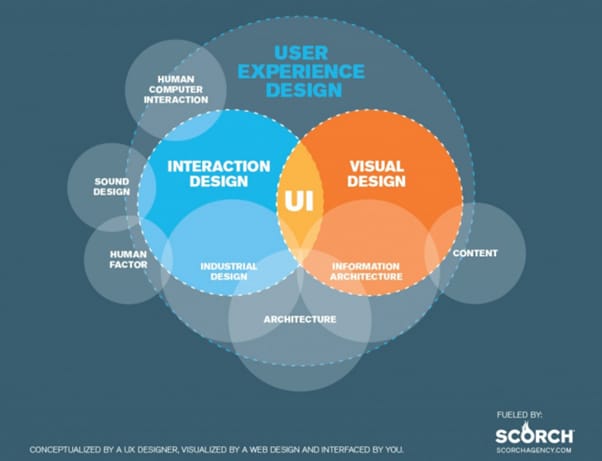
How IA, UX, and UI are related, image credit. Source: Scorch
Information architect role
An information architect is a professional responsible for organizing, structuring, and labeling content in a way that will make it easy for users to find the necessary information and navigate through a website or applications.
Peter Morville, the co-author of Information Architecture for the World Wide Web, explains the role of an information architect as a person who bridges users and content by designing search and navigation, embodying the abstract ideas into prototypes, units, and disciplines to turn the concepts into something understandable. An information architect who works along with a UX designer can concentrate solely on information architecture design, while a UX designer devotes more time to research. In this case, an architect creates a number of deliverables, which we will describe in the section on the steps of IA development.
Regardless of the title, a person who works on information architecture must start with the rules that help to achieve the goal of IA. In the next part of the article we will look closer at the activities of IA design and its deliverables. To create a strong information architecture, you must start with thorough research, so it all begins with learning your users’ needs and behaviors.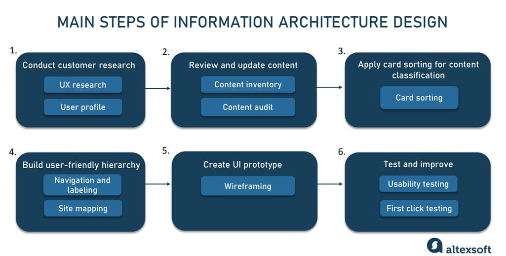
The key steps of information architecture development
Conduct customer research
The aim of this stage is to learn about a user’s needs. You must work with a customer profile and the results of customer and stakeholder interviews. The data revealed at this stage will allow you to create a user persona profile, list business requirements, and get an idea of what a user wants. Since these tasks belong to a UX designer or business analyst, you need the results of their activities.
At the end of this stage, you’ll end up with a user profile and user flow that illustrate the way a user thinks and interacts with a product. When you have all the necessary information about the product and the people who use/will use it, you can go to the next step.
Review and update the content
Once you know what a user wants, you can update the content of an existing website and list it. The main activities to perform at this stage are content inventory and content audit. Let’s look closer at each of them.
Content inventory
The goal of this activity is to create a list of information elements on all the pages of a website and classify them by topic and sub-topic. This includes the following items:
- Headings and subheadings
- Texts
- Media files (images, video, audio)
- Documents (doc, pdf, ppt)
- URL-links of the pages
These elements are listed in a content template with their characteristics included.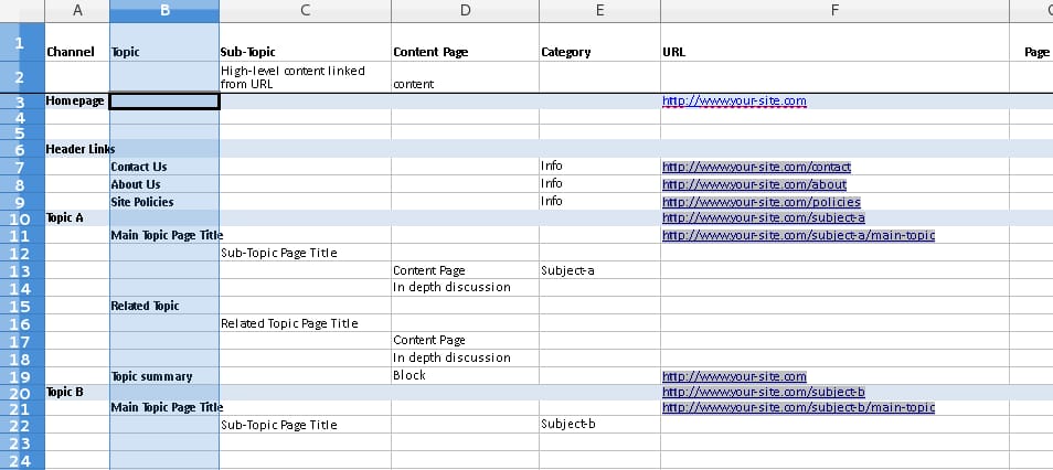
Content inventory template. Source: Eckford
Content audit
Well, you have the content list. Now, assess its accuracy, style of presentation, and usefulness. Then, scrap the least important items, refresh outdated pieces of content, and rearrange them for the next steps. This activity is applicable both to new products and to app or website redesigns.
The next step involves grouping content into different categories. Here, you’ll need the help of potential users.
Apply card sorting for content classification
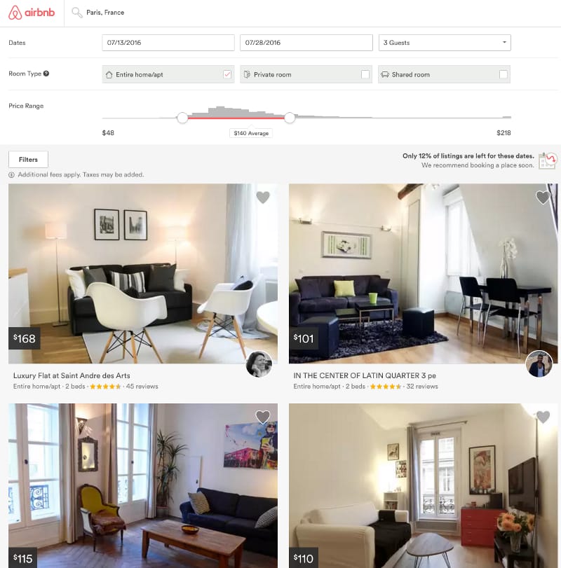
All types of content must be classified and have proper names that won’t confuse a user. You need a taxonomy to do it. Taxonomy is another word for classification. In the case of IA, it’s an attempt to group different unstructured pieces of information and give them descriptions.
 T
Taxonomizing on the Airbnb website. Source: Stanford K. Kekauoha
The most popular and the most important technique that allows taxonomizing the content is card sorting.
As soon as you have the content, arrange it. The point of the activity is to see directly how users perceive the product’s content pieces. Card sorting is usually conducted in small groups of 15-20 participants, where they have to describe and sort 30-60 cards with pieces of information into different classes. The cards contain topics that must be categorized, or pieces of content that must be described.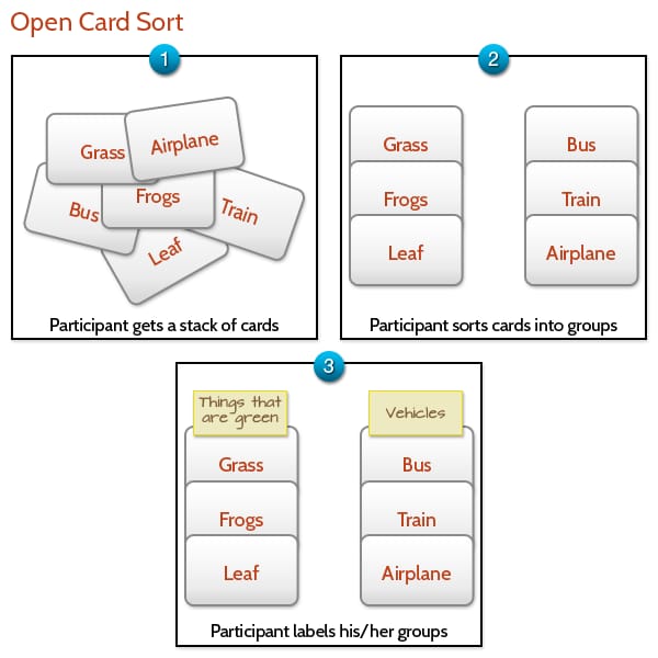
How card sorting works.Source: Interaction design
There are three types of card sorting:
Open – for free labeling. The participants categorize topics however they like and in the order that makes sense to them. This approach allows you to understand how the users think in terms of classification. Open type is used to design new products.
Closed – with pre-designed categories. This method of card sorting is usually applied in redesign. The participants are given predefined categories from a content inventory list, and they sort the content according to them.
Hybrid – unites elements of both types, or starts with an open type, moving to the closed type to follow user logic.
You can conduct card sorting in groups, as a personal interview, or remotely via IA tools like UserZoom or Optimal Sort.
The cards can be digital or physical, i.e. written on pieces of paper. When creating cards, use the results of content inventory. Separate topics have to be on separate index cards. They should have numbers and some should have blank spaces, so the participants can create their own names for categories. As a result, you’ll see the approximate structure of a product and proceed with the first prototypes. But first, the categories must be labeled and defined in a navigation system.
Build a website hierarchy for user-friendly navigation
Every website or app needs a solid navigation system that helps users find what they need. As soon as you have the results of card sorting activities, you will understand how to embody and classify the content in reality. This step embraces navigation design, labeling, and site mapping. Let’s define them one by one.
Navigation
When working on navigation, remember that no matter which pages the visitors come from, they must be able to easily locate what they are looking for. The terms IA and navigation are sometimes used interchangeably. However, they are not the same since navigation is just a part of IA. As you design your website or application, it’s important not to focus on navigation only as you risk finding out eventually that it doesn’t accommodate the full scope of your site content and functionality.
A navigation system consists of many elements – buttons, menus, and tables of content. There are four main types of navigation:
Hierarchical – shows the information hierarchy from main elements to their sub-categories. An example is drop-down menus for large websites.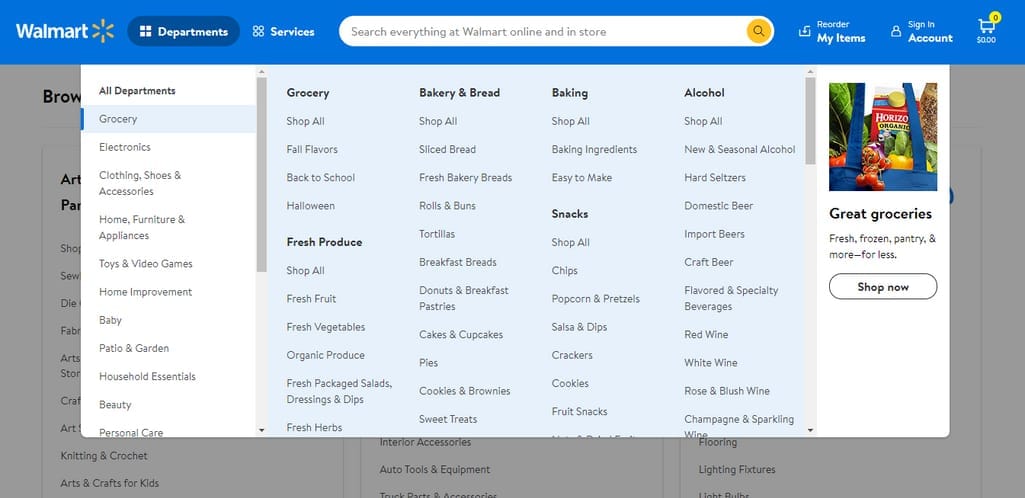
A drop-down menu on Walmart website homepage. Source: Walmart
Global or site-wide – present across all the pages, this navigation enables the users to get to the main page from every location, for example, left- or right-sided, top-centered, sticky menus, footers, or hamburger menus.
Left-sided menu on Wikipedia. Source: Wikipedia
Local – shows the navigation of a specific area: a page or a part of a site and its content. It can be present in the form of lists.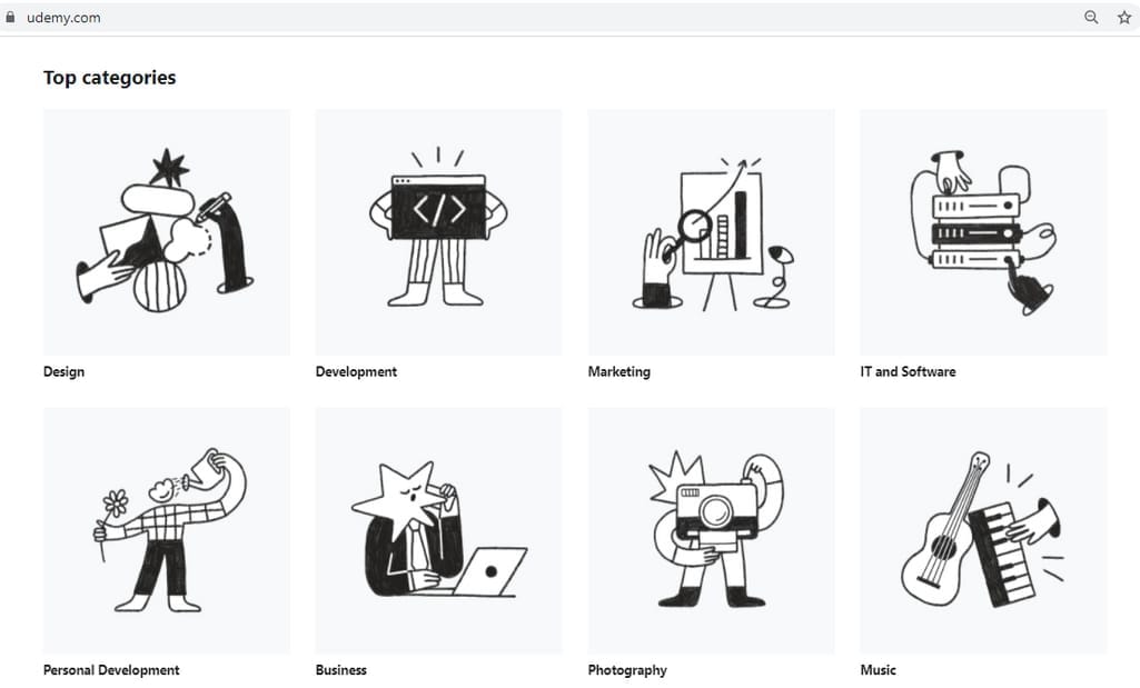
Local navigation on the Udemy website. Source: Udemy
Contextual – relates to specific content, like document, page, video-audio object, or related products. For example, in our blog, we place links to our previous materials instead of explaining everything in detail so that you can explore it only if you are interested.
These types can complement each other, but the main principle of good navigation is to avoid overloading with guiding elements.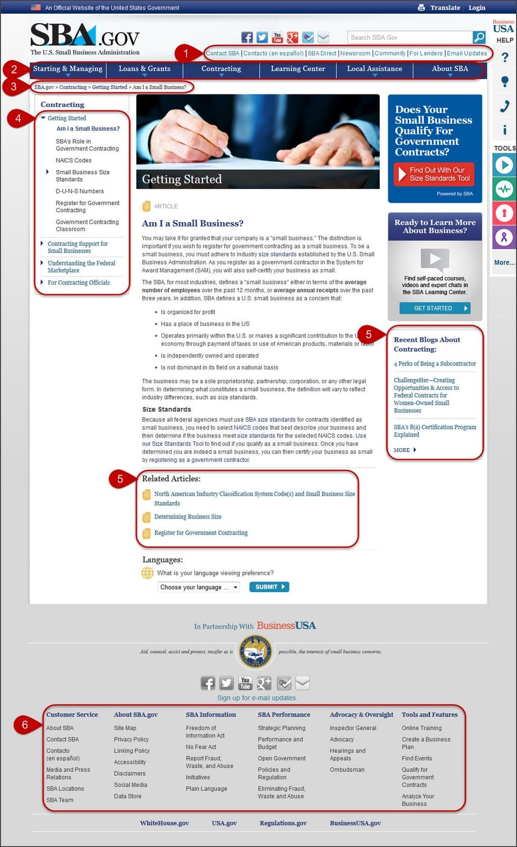
Multiple navigation components on SBA website. Source: NN Group
Sometimes navigation can be present in the form of an interactive guide, tour, or tutorial. It can navigate a user through a multi-stage process or a complex website. You can decide on the best option for location and menu type by conducting an A/B and multivariate testing for conversion optimization.
Also, if you design IA for a complex app or website with loads of information, consider complementing navigation with a searching system that will prevent users from getting lost. It’s a common practice for eCommerce, online knowledge bases, dictionaries, and other information-focused websites. You can implement a search engine and a system of filters to help users quickly find what they need.
Word search in a dictionary. Source: Merriam-Webster
Labeling
The correct label gives users proper conceptualization of the category they are dealing with. During this procedure, name all parts of IA with headings and subheadings. The purpose of labels is to attract user attention, giving a proper understanding of what to expect from clicking on a link. Examples are the best description, so illustrate your labels.
Google Travel website labeling with names and icons. Source: Google Travel
Once you outline navigation and labeling, it’s time to decide on the hierarchy design pattern.
Hierarchy design patterns
A design pattern is a way to structure the content. It allows you to choose the direction at the very beginning of IA building or website redesign activities. There are several IA design patterns, depending on the type, amount, and interrelation of your website content.
Single page model – one that serves a single purpose, for example, downloading an app or providing contact info.
Flat structure – one with linear hierarchy, where all the pages are equally important. This pattern is suitable for brochure-like websites.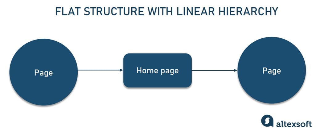
Flat structure
Index pages pattern – consists of a home page and equally important subpages. This type is one of the most common choices for websites because it’s simple, familiar, and deep enough for most use cases.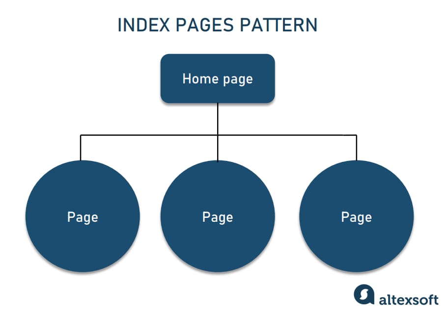
Index pages pattern
Strict hierarchy pattern – similar to index pages pattern, but more branchy: Each subpage has one or more subpages. Strict hierarchy pattern is chosen by websites that have a large number of categories such as blogs, eCommerce sites, or media.
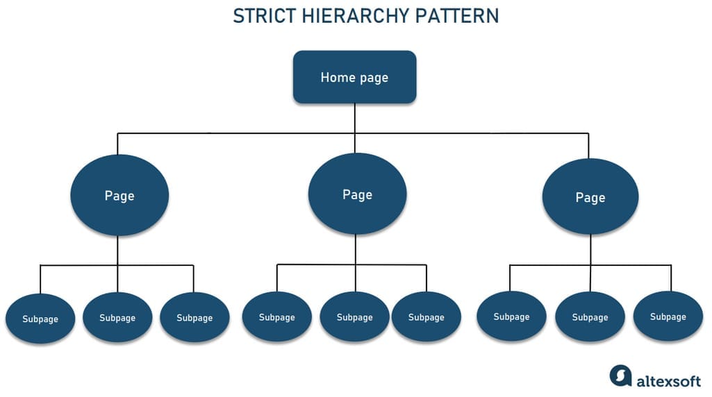
Strict hierarchy pattern
Co-existing hierarchies pattern – unites several types of hierarchies in case the information from one subpage overlaps the content of another.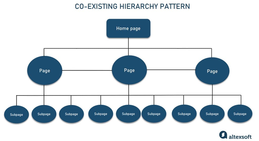
Co-existing hierarchy pattern
As soon as you have decided on a design pattern, you can apply it along with the results of card sorting in site mapping. However, site map creation is often preceded by a mind map.
Mind mapping
Mind mapping is a technique based on relations between different pages of a digital product with a detailed description of functionality. As a tool, a mind map is very useful for instruction, allowing someone to understand the structure of the content by logical sequence and to develop associations. Apply it to an app or a website to visually represent the entities of a product and follow the logical structure of the content.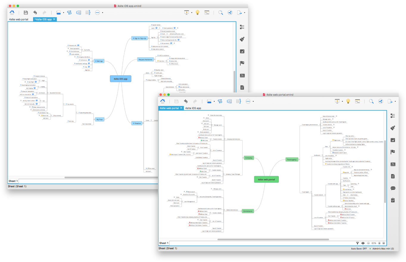
Mind map for Cornerstone information systems website and iOS app
Now, having a mind map, you can create a site map.
Information architecture diagram creation and site mapping
A sitemap is a way to illustrate the hierarchy of content and display navigation. The word sitemap is self-explanatory. It’s a map of the content and categories of a website.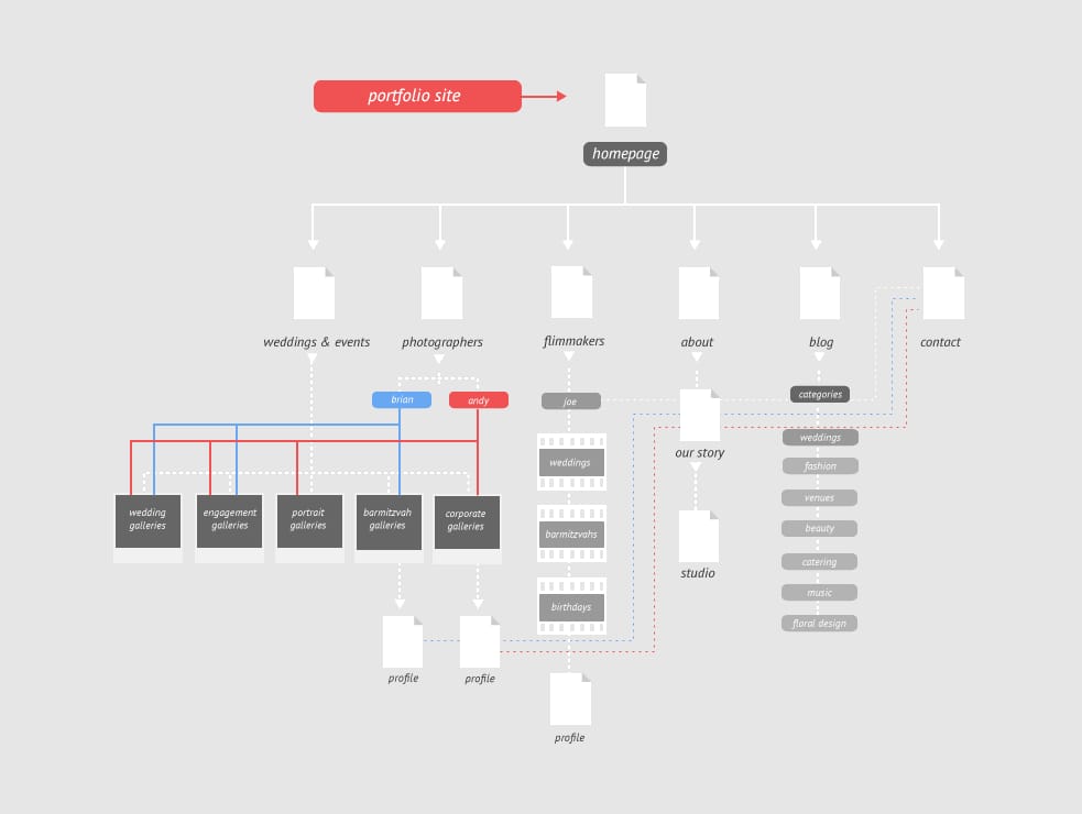
A portfolio website sitemap. Source: Kellyn Loehr on Dribble
On a sitemap, you visualize the whole hierarchy of content. You can make it on paper or using different tools like WriteMaps or MindNode.
Sitemaps for IA design are typically created in the form of diagrams and are referred to as information architecture diagrams. They can also be presented in XML or HTML formats to help search engines understand your website structure and find relevant information. XML is barely readable by users (check this example of Victorious XML sitemap), but HTML sitemaps look like usual webpages and can be read by humans and search engine robots alike. Here’s an example of an HTML sitemap of an Apple website.
Show the sitemap to stakeholders and send it to developers so that they can understand what to do next: Are there any important changes that have to be applied before a product goes into production? Still, there is one more stage before production – prototyping.
Create a UI prototype for future development
Although a sitemap is the first prototype in information architecture development, you still have to create advanced prototypes by wireframing and data modeling.
Wireframing
While a sitemap is a scheme of content hierarchy, a wireframe embodies the final look. A wireframe is a schematic representation of a website or an app that displays the navigation and interface of a website. An IA wireframe shows all the pages and screens of a product, with headlines, tags, labels, and gray boxes where the content will be placed. It’s also the first draft of a digital product’s UI.
This deliverable is a bridge between the information architect and a UX/UI designer. Using a wireframe, you can conduct user testing to understand if an IA serves its purpose. These test results will allow you to apply the changes before developers and UI designers start working on a product.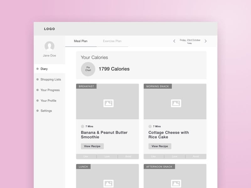
Wireframe of Back to my body web app. Source: Dribble
Wireframes are drawn on paper or using special software like Justinmind or Visio for creating digital wireframes, sitemaps, or high-fidelity prototypes. Wireframes are tested by users to define whether the structure is clear and concise.
Data modeling
The final step before development is data modeling: You can embody the content structure in data modeling systems. At this stage, you communicate the prototypes to stakeholders and developers to work on a product.
Usually, it’s done via wireframes or right through CMS (content management systems), which are the supporting systems for content publishing, like Squarespace, WordPress, and Wix. Lay the content out via CMS and later use it as the platform for website development.
Test and improve
Testing activities can be conducted at different stages of the design process to guide designers and polish IA. They are often a part of the research phase, especially if you’re looking for ways to redesign an existing app or website.
However, it’s imperative to test your information architecture as soon as the prototype is ready and before it gets to the development team. This practice can help you avoid costly mistakes like having to rebuild your product. Here, such methods as usability testing and first click testing are applied. You can test both initial prototypes (often a paper draft) and clickable prototypes to detect possible navigation or layout problems.
Usability testing
Usability testing allows you to make sure the designed structure works for your users. During usability testing, participants are required to interact with your product in a typical way, like they would’ve done in real life. For example, you can ask them to look for specific information (e.g., contact or payment details, certain item for sale, etc.) or perform a specific task (e.g., register a new account, complete a purchase, etc.). Obviously, they can’t find the answers as the content is not ready yet, but they can still indicate their course of action while interacting with your future product.
By observing their actions and collecting user feedback, you can find out which parts work right, which don’t, and what has to be fixed. The main goal here is to check if users can easily get what they need from your app or website.
First click testing
First click testing is also helpful to measure usability by defining if the first click the visitor makes on the app or website interface is easy and intuitive. It shows how users get around your site and how easy it is for them to do what they want.
During such testing, you prepare a few typical scenarios (just like with usability testing) and define the optimal ways of going through them. Then, give tasks to your users and track where they click and how long it takes them to find a correct solution. Sometimes the first click can be right, but it takes too long to find the needed button or link. At other times, the first click is wrong and it takes extra steps to get to the right page (if they get there at all.)
First click testing can detect navigation and layout problems at the prototyping stage or on a functioning website/app. As you conduct the testing, remember to collect qualitative data in addition to quantitative information on clicks. Users’ explanations on why they did what they did will help you understand your customers better and improve your product.
The eight principles of Information Architecture
No matter if your goal is to improve the user experience of a website or create a completely new app, you must take eight principles into consideration.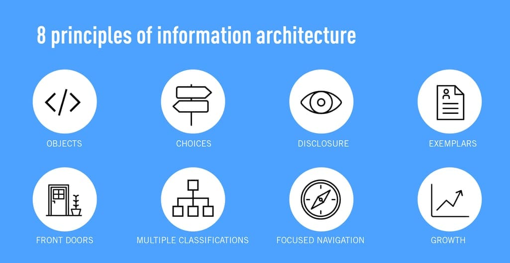
The eight principles of information architecture. Source: CareerFoundry
These eight principles were defined by Dan Brown, a co-founder of EightShapes design company. An information architect should stick to them to build a product:
- objects — a content is a living thing with its lifecycle, behaviors, and attributes;
- choices — the pages of a product should offer a number of meaningful choices to users;
- disclosure — the users mustn’t be overloaded with information; show only enough information to help them understand what kinds of information they’ll find as they dig deeper;
- exemplars — the best way to describe the content categories is to show examples of the contents;
- front doors — assume at least half of the website’s visitors will come through some page other than the home page;
- multiple classification — offer users several different classification schemes to browse the site’s content;
- focused navigation — don’t mix different categories in your navigation scheme; and
- growth — assume the content you have today is a small fraction of the content you will have tomorrow.
Applying these principles, you are likely to effectively structure existing content and leave a space for growth.
Information architecture examples
As you have already seen, almost every stage has its own deliverables. But the most important deliverable that unites the results of an information architect’s hard work is a sitemap. Now, let’s look at some actual website sitemaps to see how they structure their content.
Spotify
The original Spotify design was an example of poor information architecture. Spotify’s website featured a co-existing hierarchy pattern with reiteration and partial reiteration of some sections. This made the information architecture messy with users struggling to find what they need and getting lost in redundant menu items.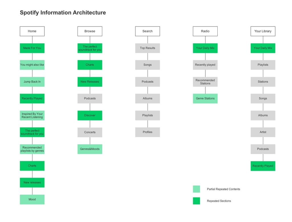
Spotify sitemap
Renee Lin, a UX designer, found a way to improve it by simplifying it and removing some sections. This is an example of how an existing website can be redesigned to make it easier for users to get around and interact with it.
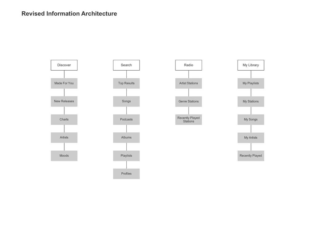
Spotify IA revised
IMDB
IMDB is the world's largest movie database that contains tons of information about movies, TV shows and celebrities. A huge database, it has a complex navigation flow.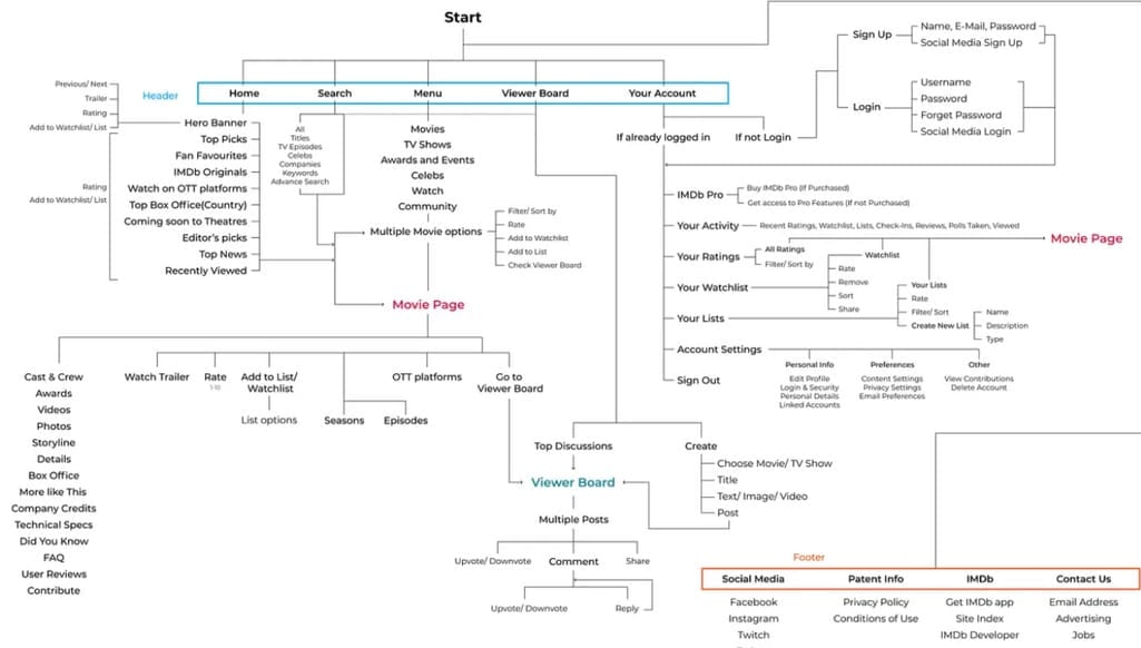
IMDB website’s navigation flow. Source: Medium
UX designers Ashutosh Kanade and Nimay Ingale suggested making some changes to the information hierarchy of IMDB's website to improve navigation. According to customer research, the main reason why users visit this resource is that they want to know a movie rating and short info about it before watching. So, the Rating and Movie Info sections should sit on the highest level of the information hierarchy.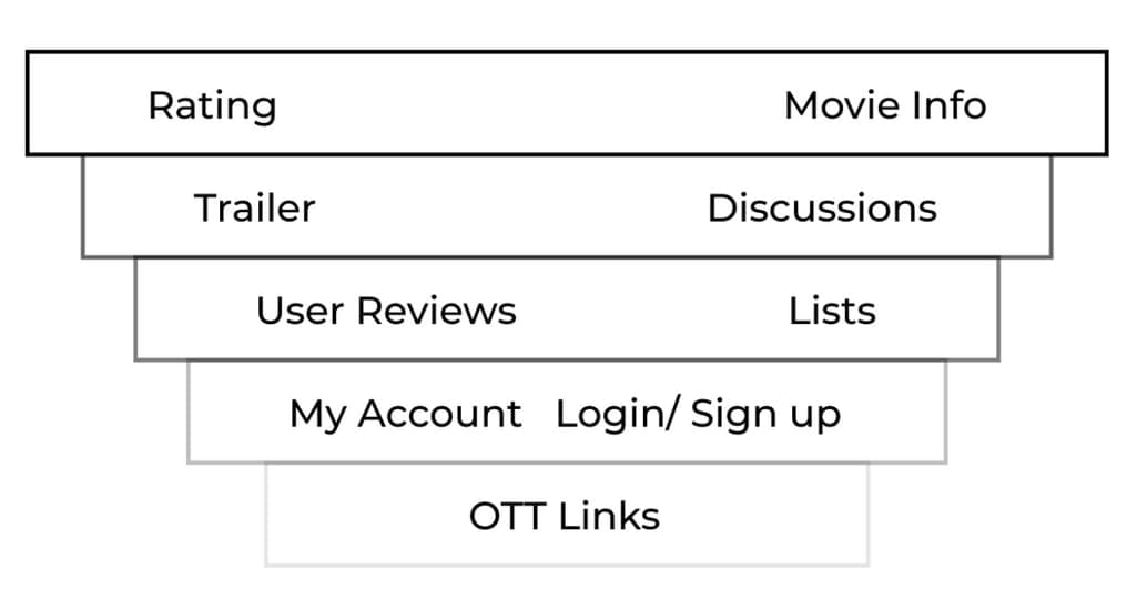
Suggested information hierarchy for IMDB website. Source: Medium
Among other important segments are Discussions, Trailers, Wishlists, and User Reviews. Less crucial appeared to be My Account, Login/Sign up, and OTT Links (links to the over-the-top media services distributing video content via the Internet.) These positions are placed as the lowest ones in the hierarchy scheme.
Typical sitemap for travel website
Here’s how a website of a tour company or an online travel agency may look. Besides such essential features as trip booking or personal account management, it might also contain various sorting options, travel tips, and other nonessential, but useful information. The suggested structure is simple and intuitive for visitors.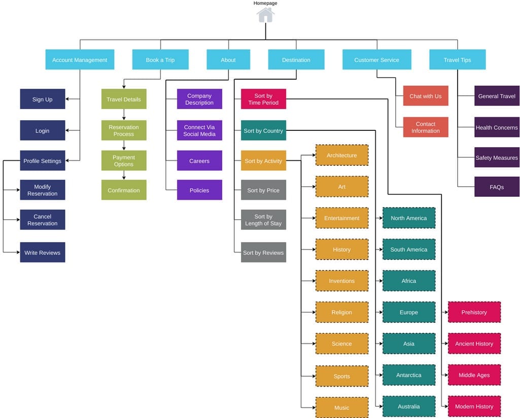
Sample travel website sitemap. Source: Visual Paradigm
Tools for IA
We’ve already mentioned some of the popular tools that are used for creating IA. Here, we’ll briefly list what can be of help at different stages.
Online card sorting tools include
- UserZoom,
- UXtweak,
- xSort, and
- Optimal Sort.
To create sitemaps online, you can use such platforms as
- WriteMaps,
- MindNode,
- Scapple,
- MindManager,
- Octopus,
- Slick Plan, or
- XMind.
Prototypes and wireframes can be created with the help of
Diagrams and flowcharts are designed and shared through such platforms as
- Lucidchart,
- Visio,
- OmniGraffle (MacOS only), or
- diagrams.net (formerly draw.io).
Testing and research can be conducted using
- Proven by Users,
- Maze,
- UserTesting,
- User Zoom, or
- Lookback.
Content management systems (CMSs) that can come in handy include
- Joomla,
- Squarespace,
- WordPress,
- Drupal, and
- Wix.
Latest information architecture trends
The heyday of AI, machine learning, and VR technologies will undoubtedly have an impact on the way users navigate through the content on websites, and applications. Two key trends are likely to drive the future of information architecture.
Zero UI. If you have ever used Google Assistant or Alexa, you know what it’s like: A user finds necessary information without even touching a screen, just by saying a couple of words or by a mere gesture. Zero UI, a new design concept, removes the need to touch the screen to control virtual reality and smart devices. Eventually, zero UI technology will allow people to communicate with various devices using not only movements or voice, but also glances and even thoughts.
AI optimized information architecture. Artificial intelligence and machine learning can improve the accuracy and efficiency of information architecture , making it easier for users to find what they need. This may involve using algorithms to automatically organize and categorize content and predict user behavior.
Why IA matters for your business
Well-structured information architecture is crucial for businesses as it significantly impacts the usability, accessibility, and overall user experience of a website or application. Improved user engagement is one of the primary benefits worth mentioning here.
By providing users with a clear and logical structure of the product, businesses help them find the necessary information faster and more efficiently. This may lead to higher conversion rates, increased user retention rates, and, ultimately, provide businesses with a greater return on investment (ROI).
What is more, a well-designed IA can enhance the search engine optimization efforts of a website. With the help of appropriate labeling information architecture improves the website’s ranking on search engine result pages. This ensures the increased website traffic and visibility, benefiting the business as a result

