This is a guest article by Iren Linnik from Onilab.
The purpose of any e-commerce website is to sell: as obvious as it sounds. In order to sell more, the store has to convince the user to buy – and this is where UX steps in.
Businesses are entering the customer-centric era where the customer’s needs are put first and business processes are adjusted correspondingly. User experience is a key to successful sales but there are certain UX practices to follow if you want your store to sell.
What makes good UX for the eCommerce website
UX is an experience that the person has upon visiting the website. This experience can be measured by how enjoyable it is, the ease of navigation, design appeal and other factors. UX's main purpose is to make the process of site browsing as easy and enjoyable as possible, while nudging the visitor to a purchase.
UX plays a great role in supporting the eCommerce sales funnel. A sales funnel is basically a path that leads the user to make a purchase, from first becoming aware of your product to the actual payment. While the sales tunnel is unique for every business, its goal remains the same: to help the user decide to buy. So if you keep the principle of sales funnel in mind, you will be able to adjust the store design and functionality correspondingly and create a seamless and solid user experience.
Best practices to boost sales with the help of UX
Even though there are trends that change every year, some things are a part of the golden rule for any eCommerce store. Once you follow them, half of your work will be done. And make sure to always keep in mind the most important thing: The user comes first. Do not make the store appealing to you – evaluate it from the user’s point of view and critically assess whether it makes you want to buy.
Make your message shine
Many business owners first work on the store design and then try to adjust the message to the site's looks. But that’s not how things should work.
In terms of eCommerce, functionality should always be in first place. So first define your message and what you want to tell the users, then build the design around it. What may help you here is identifying the product’s USPs (unique selling points) and coming up with the ideas of how to emphasize them. For example, if you are selling innovative and bold makeup for the young audience, craft a strong and appealing headline and value proposition and accent it with suitable colors and shapes. Going for a custom eCommerce theme is often the best way to achieve that.
Users should know what they will get upon entering the website so don’t confuse them.
A good example of a content-focused website is Fronks, whose product is organic nut milk. The content on the homepage is straight to the point: It says what the product is about and what makes it so good. And, since there are only 3 product categories to choose from, the design is also brief and clear, matching the message.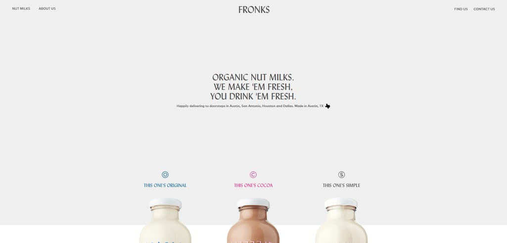
FreshFronks.com landing page
Adapt for mobile
Mobile rules the world and, to stay competitive, businesses must introduce a mobile app to retain the customers.
For eCommerce, the importance of mobile is doubled. If the user does not like the store appearance or the processes are uncomfortable, they won’t spend time sorting the issues out – they will just close the app and you won’t see them again.
Mobile and desktop store versions differ drastically so you can’t use your desktop store as a landmark. An important point to keep in mind that many business owners tend to ignore.
H&M does a great job in keeping the website mobile-friendly (not talking about the app here). Notice how the cart and the search icon are visible and stay atop so the user always knows what’s going on with the orders. This minimizes the chances of cart abandonment and leaving the store.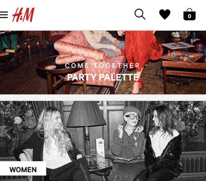
Mobile version of the H&M website
Optimize checkout
Since eCommerce is all about sales, you want to navigate the user to make a purchase. And a crucial step in this process is checkout optimization.
According to Barilliance, the average cart abandonment rate in 2017 was 78.6 percent – and complex checkout is one of the main reasons behind it. Some of the biggest mistakes about checkout are:
- Too many steps
- No progress bar
- Unexpected prices (taxes, shipping)
So, consider it important to fix these issues and make your checkout fast, transparent and easy.
It is always a good idea to visualize a certain process and keep the customer aware of what’s going on. Public Desire, a brand from the UK, played it smart and divided the checkout process into 3 steps that are easy to understand. Besides, the checkout has all the necessary information (i.e. total cost, an array of payment methods) and is thus 100 percent transparent and informative.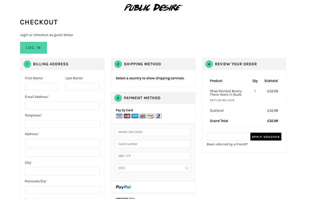
PublicDesire checkout process
Incorporate wishlists and don’t forget about guest checkout
Wishlists are an important part of any eCommerce store. They help retain customers but at the same time, due to the sharing option, help gain new visitors to the website and convert them into buyers.
Whether you offer a single wishlist or numerous ones, make sure it’s easily managed and is clear for the user. One more point that affects sales heavily is the option of a guest checkout. The majority of the users don’t want to spend too much time on registration and they’d rather abandon the website than fill in all the required fields. So your task is to keep such users and offer them an alternative.
Lush does an outstanding job with the wishlists on its website. Upon browsing the product catalog, users can immediately hit the “heart” button and add the product to the wishlist. While it seems obvious, some websites still force you to open an item window and only then add the item to the wishlist.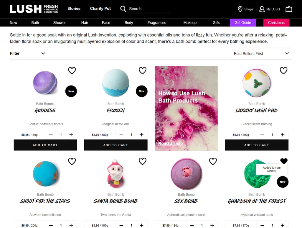
Product catalog at Lush
Make any action “natural”
Banners, CTA buttons, and the like are nice but we are talking about user experience here. As a user, you probably wouldn’t want to be interrupted with screaming “Buy now!” buttons. So use such encouraging elements wisely.
You should not abandon them but your task is to incorporate them within the store in a natural and unobtrusive way. Do not throw the CTA button in the user’s face but rather lead the user to take the desired action.
Bon Bon Bon, a Detroit-based chocolate company, made full use of its design navigation with smart CTA buttons. The images under the “Popular gifts” section are clickable - but you will see the actual CTA only upon passing the mouse over the image. The experience is 100 percent natural and the website does not overload you with information and proposals. But, once you are interested in a product, the site readily proposes an action.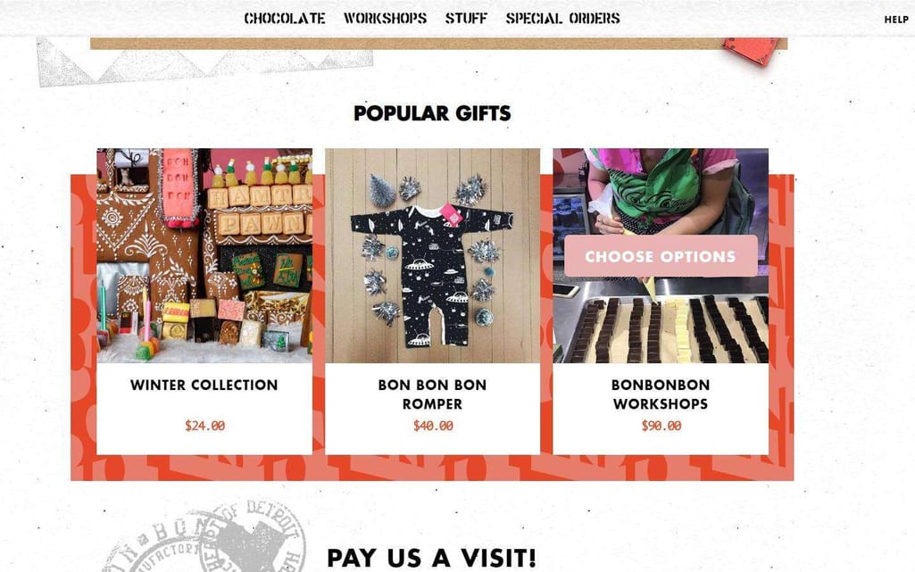
Bon Bon Bon’s “hidden” CTAs
Think about navigation
Good navigation should be intuitive – meaning, “readily understood,” per Merriam-Webster. As soon as the visitors get the grip of navigation, chances increase that they will eventually place an order and complete the purchase.
One of the de facto standards of good navigation is simplicity and a minimal number of clicks needed to perform an action. Nobody has time to spend on routine purchasing. So, test to see what the most efficient option is for the user.
A useful tip to keep in mind is using a typical eCommerce website design. That includes having a product/category list on top, a cart in the upper right corner, etc. This trick will immediately help the user feel as if they already visited your store and will make their experience easier and more pleasant.
The Sivana website follows the guidelines of good navigation: clickable elements and subcategories, proper and advanced sorting, everything visible and clear.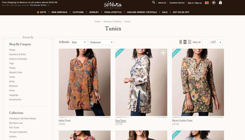
Navigation on Sivana
Incorporate personalization
Due to the adoption of the customer-centric strategy, businesses have to emphasize personalization in order to keep the customers engaged and interested in the brand.
In terms of UX, personalization may come in form of a “Recommendations” or “Suggestions” section, which proves to be extremely useful and effective for users. Feel free to do a bit of upselling or cross-selling here. We’re of course talking about machine learning-based personalization, generously used on Amazon, for example. Using data you already have, you can elevate customer experience.
Another awesome way to add personalization to your store is to allow customers to customize items, as Ralph Lauren does. Instead of offering an item “coming in all sizes and colors”, the website offers the unique experience of creating your very own product.
UX trends to expect in 2019
The secret behind one’s success is adaptability and flexibility within the ever-changing business environment. To give you some ideas for further consideration, we’ve compiled a list of the most expected UX trends for the upcoming year that can be easily incorporated within an e-commerce website.
Use of AR/VR. Augmented and virtual reality, having long ago crossed the line of the gaming industry, are now serving for the benefit of businesses. The use of AR in eCommerce permits users to “try” certain items on and see how they fit. One of the best examples of using AR in eCommerce is an app by Ikea that lets you see how a piece of furniture will look in your room.
Smarter chatbots. Chatbots have already proved to be skillful at user assistance and navigation. In 2019, we will see more chatbots with extended functionality. H&M, for example, already uses a bot that helps users choose a matching wardrobe, based on their preferences. Implementation of chatbots will save time, ease the navigation process, and add to personalization profoundly.
Voice-driven processes. Voice shopping is estimated to become a $40 billion market by 2020. Considering this, the interface of eCommerce websites will also start to become more voice-driven. Voice search, voice activation, and voice shopping – all these features will soon be incorporated into website design and are expected to become the next big thing in a couple of years.
More videos and GIFs. Numerous studies prove that users engage with animated content better. Depending on your products, you can incorporate either a GIF or a video into your online store. A video will work perfectly in your “About us” section or homepage, immediately letting the user learn about the brand and its products. It’s important though to make the video brief and entertaining, otherwise, the user will leave.
Conclusion
UX is not the only factor that affects conversion rate and sales, it impacts user behavior heavily. In order not only to attract users but make them want to come back, you have to provide them with a positive, hassle-free experience that will result in a win-win for both your customer and you.
 Iren Linnik is an eCommerce and digital marketing observer, currently contributing to Onilab. Her goal is to create informative and compelling content to help readers navigate through the vast and ever-changing business environment. With over 5 years of experience in writing, Iren has helped numerous companies communicate their message across various channels.
Find Iren at: Onilab: https://onilab.com/blog/ LinkedIn: https://www.linkedin.com/in/irina-linnik-35970554/ Twitter: https://twitter.com/LinnikIren
Want to write an article for our blog? Read our requirements and guidelines to become a contributor.

